Module 4 Univariate Summaries
Summarizing large quantities of data with few graphical or numerical summaries makes it is easier to identify meaning from data (discussed in Module 1). Numeric and graphical summaries specific to a single variable are described in this module. Interpretations from these numeric and graphical summaries are described in the next module.
4.1 Quantitative Variable
Data about the number of open pit mines in countries with open pit mines (Table 4.1)24 and Richter scale recordings for 15 major earthquakes (Table 4.2) will be used throughout this section.
| 4 | 2 | 1 | 2 | 1 | 4 | 4 | 1 | 12 | 4 | 1 | 2 | 1 | 1 | 3 | 11 | 1 | 15 | 4 | 1 | 2 | 2 | 1 | 2 | 11 | 1 |
| 7.8 | 7.7 | 6.8 | 5.5 | 7.7 | 8.1 | 7.3 | 6.5 | 6.8 | 6.3 | 7.1 | 7.3 | 6.5 | 6.9 | 7.7 |
4.1.1 Numerical Summaries
A “typical” value and the “variability” of a quantitative variable are often described from numerical summaries. Calculation of these summaries is described in this module, whereas their interpretation is described in Module 5. As you will see in Module 5, “typical” values are measures of center and “variability” is often described as dispersion (or spread). Three measures of center are the median, mean, and mode. Three measures of dispersion are the inter-quartile range, standard deviation, and range.
All measures computed in this module are summary statistics – i.e., they are computed from individuals in a sample. Thus, the name of each measure should be preceded by “sample” – e.g., sample median, sample mean, and sample standard deviation. These measures could be computed from every individual if the population was known. The values would then be parameters and would be preceded by “population” – e.g., population median, population mean, and population standard deviation.25
4.1.1.1 Median
The median is the value of the individual in the position that splits the ordered list of individuals into two equal-sized halves. In other words, if the data are ordered, half the values will be smaller than the median and half will be larger.
The process for finding the median consists of three steps,26
- Order the data from smallest to largest.
- Find the “middle position” (MP) with MP=\(\frac{n+1}{2}\).27
- If MP is an integer (i.e., no decimal), then the median is the value of the individual in that position. If MP is not an integer, then the median is the average of the value immediately below and the value immediately above the MP.
As an example, the ordered open pit data from Table 4.1 are shown below.
| 1 | 1 | 1 | 1 | 1 | 1 | 1 | 1 | 1 | 1 | 2 | 2 | 2 | 2 | 2 | 2 | 3 | 4 | 4 | 4 | 4 | 4 | 11 | 11 | 12 | 15 |
Because n=26, the MP=\(\frac{26+1}{2}\)=13.5. The MP is not an integer so the median is the average of the values in the 13th and 14th ordered positions (i.e., the two positions closest to MP). Thus, the median number of open pit mines in this sample of countries is 2 (=\(\frac{2+2}{2}\)).
Consider finding the median of the Richter Scale magnitude recorded for fifteen major earthquakes as another example (ordered data below).
| 5.5 | 6.3 | 6.5 | 6.5 | 6.8 | 6.8 | 6.9 | 7.1 | 7.3 | 7.3 | 7.7 | 7.7 | 7.7 | 7.8 | 8.1 |
Because n=15, the MP=\(\frac{15+1}{2}\)=8. The MP is an integer so the median is the value of the individual in the 8th ordered position, which is 7.1.
Don’t forget to order the data when computing the median.
4.1.1.2 Inter-Quartile Range
Quartiles are the values for the three individuals that divide ordered data into four (approximately) equal parts. Finding the three quartiles consists of finding the median, splitting the data into two equal parts at the median, and then finding the medians of the two halves.28 A concern in this process is that the median is NOT part of either half if there is an odd number of individuals. These steps are summarized as,
- Order the data from smallest to largest.
- Find the median – this is the second quartile (Q2).
- Split the data into two halves at the median. If n is odd (so that the median is one of the observed values), then the median is not part of either half.29
- Find the median of the lower half of data – this is the 1st quartile (Q1).
- Find the median of the upper half of data – this is the third quartile (Q3).
These calculations are illustrated with the open pit mine data (the median was computed in Section 4.1.1.1).
| 1 | 1 | 1 | 1 | 1 | 1 | 1 | 1 | 1 | 1 | 2 | 2 | 2 | 2 | 2 | 2 | 3 | 4 | 4 | 4 | 4 | 4 | 11 | 11 | 12 | 15 |
Because n=26 is even, the halves of the data split naturally into two halves, each with 13 individuals. Therefore, the MP=\(\frac{13+1}{2}\)=7 and the median of each half is the value of the individual in the seventh position. Thus, Q1=1 and Q3=4.
In summary, the first, second (i.e,. median), and third quartiles for the open pit mine data are 1, 2, and 4, respectively. These three values separate the ordered individuals into approximately four equally-sized groups – those with values less than (or equal to) 1, with values between (inclusive) 1 and 2, with values between (inclusive) 2 and 4, and with values greater (or equal to) than 4.
As another example, consider finding the quartiles for the earthquake data. Recall from Section 4.1.1.1 that the median (=7.1) is in the eighth position of the ordered data. The value in the eighth position will NOT be included in either half when finding the quartiles.
| 5.5 | 6.3 | 6.5 | 6.5 | 6.8 | 6.8 | 6.9 | 7.1 | 7.3 | 7.3 | 7.7 | 7.7 | 7.7 | 7.8 | 8.1 |
Thus, each half has 7 individuals such that the middle position for each half is MP=\(\frac{7+1}{2}\)=4. The median for each half is the individual in the fourth position of each half so that Q1=6.5 and Q3=7.7.
The interquartile range (IQR) is the difference between Q3 and Q1, namely Q3-Q1. However, the IQR (as strictly defined) suffers from a lack of information. For example, what does an IQR of 9 mean? It can have a completely different interpretation if the IQR is from 1 to 10 or if it is from 1000 to 1009. Thus, the IQR is more useful if presented as both Q3 and Q1, rather than as the difference. Thus, for example, the IQR for the open pit mine data is from a Q1 of 1 to a Q3 of 4 and the IQR for the earthquake data is from a Q1 of 6.5 to a Q3 of 7.
- The IQR can be thought of as the “range of the middle half of the data.”
- When reporting the IQR, explicitly state both Q1 and Q3 (i.e., do not subtract them).
4.1.1.3 Mean
The mean is the arithmetic average of the data. The sample mean is denoted by \(\bar{\text{x}}\) and the population mean by μ. The mean is simply computed by adding up all of the values and dividing by the number of individuals. If the measurement of the generic variable x on the ith individual is denoted as xi, then the sample mean is computed with these two steps,
- Sum (i.e., add together) all of the values – \(\sum_{\text{i=1}}^{\text{n}}\text{x}_{\text{i}}\).
- Divide by the number of individuals in the sample – n.
or more succinctly summarized with this equation,
\[ \bar{\text{x}} = \frac{\sum_{\text{i=1}}^{\text{n}}\text{x}_{\text{i}}}{\text{n}} \]
For example, the sample mean of the open pit mine data is computed as follows:
\[ \bar{\text{x}} = \frac{2+11+4+1+15+ ... +2+1+4+11+1}{26} = \frac{94}{26} = 3.6 \]
Note in this example with a discrete variable that it is possible (and reasonable) to present the mean with a decimal. For example, it is not possible for a country to have 3.6 open pit mines, but it IS possible for the mean of a sample of countries to be 3.6 open pit mines.
As a general rule-of-thumb, present the mean with one more decimal than the number of decimals it was recorded in.
4.1.1.4 Standard Deviation
The sample standard deviation, denoted by s, is computed with these six steps:
- Compute the sample mean (i.e., \(\bar{\text{x}}\)).
- For each value (\(\text{x}_{\text{i}}\)), find the difference between the value and the mean (i.e., \(\text{x}_{\text{i}}-\bar{\text{x}}\)).
- Square each difference (i.e., \((\text{x}_{\text{i}}-\bar{\text{x}})^{2}\)).
- Add together all the squared differences.
- Divide this sum by n-1. [Stopping here gives the sample variance, s2.]
- Square root the result from the previous step to get s.
These steps are neatly summarized with
\[ s = \sqrt{\frac{\sum_{\text{i=1}}^{\text{n}}(\text{x}_{\text{i}}-\bar{\text{x}})^{2}}{\text{n}-1}} \]
The calculation of the standard deviation of the earthquake data is facilitated with the calculations shown in Table 4.3. In Table 4.3, note that
- \(\bar{\text{x}}\) is the sum of the “Value” column divided by n=15 (i.e., \(\bar{\text{x}}\)=7.07).
- The “Diff” column is each observed value minus \(\bar{\text{x}}\) (i.e., Step 2).
- The “Diff2” column is the square of the differences (i.e., Step 3).
- The sum of the “Diff2” column is Step 4.
- The sample variance (i.e., Step 5) is equal to this sum divided by n-1=14 or \(\frac{6.773}{14}\)=0.484.
- The sample standard deviation is the square root of the sample variance or s=\(\sqrt{0.484}\)=0.696.
| Indiv | Value | Diff | Diff2 |
|---|---|---|---|
| 1 | 5.5 | -1.57 | 2.454 |
| 2 | 6.3 | -0.77 | 0.588 |
| 3 | 6.5 | -0.57 | 0.321 |
| 4 | 6.5 | -0.57 | 0.321 |
| 5 | 6.8 | -0.27 | 0.071 |
| 6 | 6.8 | -0.27 | 0.071 |
| 7 | 6.9 | -0.17 | 0.028 |
| 8 | 7.1 | 0.03 | 0.001 |
| 9 | 7.3 | 0.23 | 0.054 |
| 10 | 7.3 | 0.23 | 0.054 |
| 11 | 7.7 | 0.63 | 0.401 |
| 12 | 7.7 | 0.63 | 0.401 |
| 13 | 7.7 | 0.63 | 0.401 |
| 14 | 7.8 | 0.73 | 0.538 |
| 15 | 8.1 | 1.03 | 1.068 |
| Sum | 106.0 | 0.00 | 6.773 |
- In the standard deviation calculations don’t forget to take the square root of the variance.
- The standard deviation is greater than zero.
- Use the fact that the sum of all differences from the mean equals zero as a check of your standard deviation calculation.
The standard deviation can be thought of as “the average difference between the values and the mean.” Thus, on average, each earthquake is approximately 0.70 Richter Scale units different than the average earthquake in these data.
This interpretation of s is, however, not a strict definition because the formula for the standard deviation does not simply add the differences and divide by n as this definition would imply. Notice in Table 4.3 that the sum of the differences from the mean is 0. This will be the case for all standard deviation calculations using the correct mean, because the mean balances the distance to individuals below the mean with the distance of individuals above the mean (see Section 5.1.3). Thus, the mean difference will always be zero. This “problem” is corrected by squaring the differences before summing them. To get back to the original units, the squaring is later “reversed” by the square root. So, more accurately, the standard deviation is the square root of the average squared differences between the values and the mean. Therefore, “the average difference between the values and the mean” works as a practical definition of the meaning of the standard deviation, but it is not strictly correct.
Further note that the mean is the value that minimizes the value of the standard deviation calculation – i.e., putting any other value besides the mean into the standard deviation equation will result in a larger value.
Finally, you may be wondering why the sum of the squared differences in the standard deviation calculation is divided by n-1, rather than n. Recall (from Section 2.1) that statistics are meant to estimate parameters. The sample standard deviation is supposed to estimate the population standard deviation (σ). Theorists have shown that if we divide by n, s will consistently underestimate σ. Thus, s calculated in this way would be a biased estimator of σ. Theorists have found, though, that dividing by n-1 will cause s to be an unbiased estimator of σ. Being unbiased is generally good – it means that on average our statistic estimates our parameter (this concept is discussed in more detail in Module 11).
4.1.1.5 Mode
The mode is the value that occurs most often in a data set. For example, one open pit mine is the mode in the open pit mine data (Table 4.4).
| Number of Mines | 1 | 2 | 3 | 4 | 11 | 12 | 15 |
| Freq of Countries | 10 | 6 | 1 | 5 | 2 | 1 | 1 |
The mode for a continuous variable is the class or bin with the highest frequency of individuals. For example, if 0.5-unit class widths are used in the Richter scale data, then the modal class is 6.5-6.9 (Table 4.5).
| Richter Scale Class | 5.5-5.9 | 6-6.4 | 6.5-6.9 | 7-7.4 | 7.5-7.9 | 8-8.4 |
| Freq of Earthquakes | 1 | 1 | 5 | 3 | 4 | 1 |
Some data sets may have two values or classes with the maximum frequency. In these situations the variable is said to be bimodal.
4.1.1.6 Range
The range is the difference between the maximum and minimum values in the data and measures the ultimate dispersion or spread of the data. The range in the earthquake data is 8.1-5.5 = 2.6.
The range should never be used by itself as a measure of dispersion. The range is extremely sensitive to outliers and is best used only to show all possible values present in the data. The range (as strictly defined) also suffers from a lack of information in the same way that the IQR does (see above); thus, describe the range as from the minimum to the maximum value rather than substracting the two values.
4.1.2 Graphical Summaries
4.1.2.1 Histogram
A histogram plots the frequency of individuals (y-axis) in classes of values of the quantitative variable (x-axis). Construction of a histogram begins by creating classes of values for the variable of interest. The easiest way to create a list of classes is to divide the range (i.e., maximum minus minimum value) by a “nice” number near eight to ten, and then round up to make classes that are easy to work with. The “nice” number between eight and ten is chosen to make the division easy and will be the number of classes. For example, the range of values in the open pit mine example is 15-1 = 14. A “nice” value near eight and ten to divide this range by is seven. Thus, the classes should be two units wide (=14/7) and, for ease, will begin at 0 (Table 4.6).
| Class | 0-1 | 2-3 | 4-5 | 6-7 | 8-9 | 10-11 | 12-13 | 14-15 |
| Frequency | 10 | 7 | 5 | 0 | 0 | 2 | 1 | 1 |
The frequency of individuals in each class is then counted (shown in the second row of Table 4.6). The plot is prepared with values of the classes forming the x-axis and frequencies forming the y-axis (Figure 4.1-A). The first bar added to this skeleton plot has the bottom-left corner at 0 and the bottom-right corner at 2 on the x-axis, and a height equal to the frequency of individuals in the 0-1 class (Figure 4.1-B). A second bar is then added with the bottom-left corner at 2 and the bottom-right corner at 4 on the x-axis, and a height equal to the frequency of individuals in the 2-3 class (Figure 4.1-C). This process is continued with the remaining classes until the full histogram is constructed (Figure 4.1D).
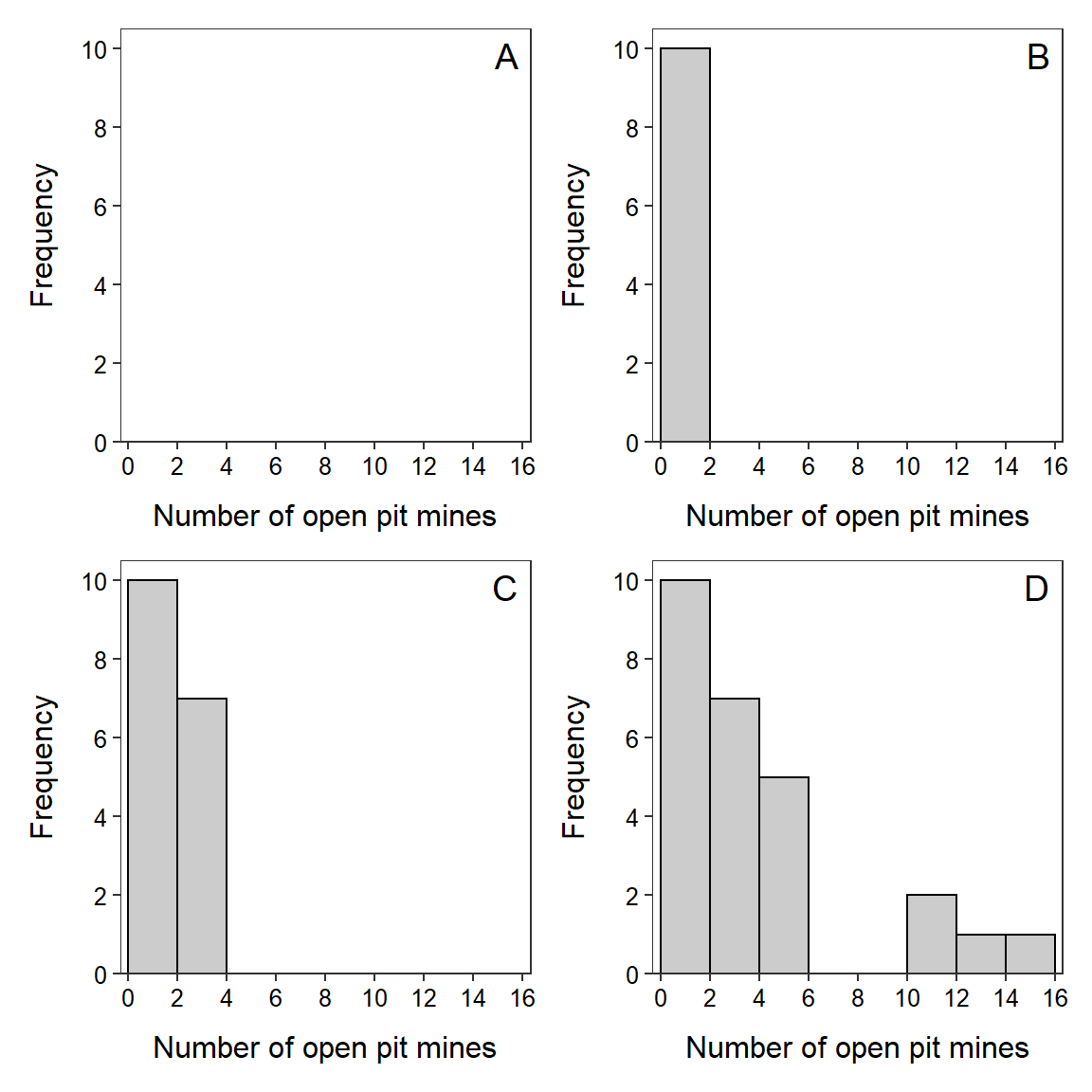
Figure 4.1: Steps (described in text) illustrating the construction of a histogram.
Ideally eight to ten classes are used in a histogram. Too many or too few bars make it difficult to identify the shape and may lead to different interpretations. A dramatic example of the effect of changing the number of classes is seen in histograms of the length of eruptions for the Old Faithful geyser (Figure 4.2).
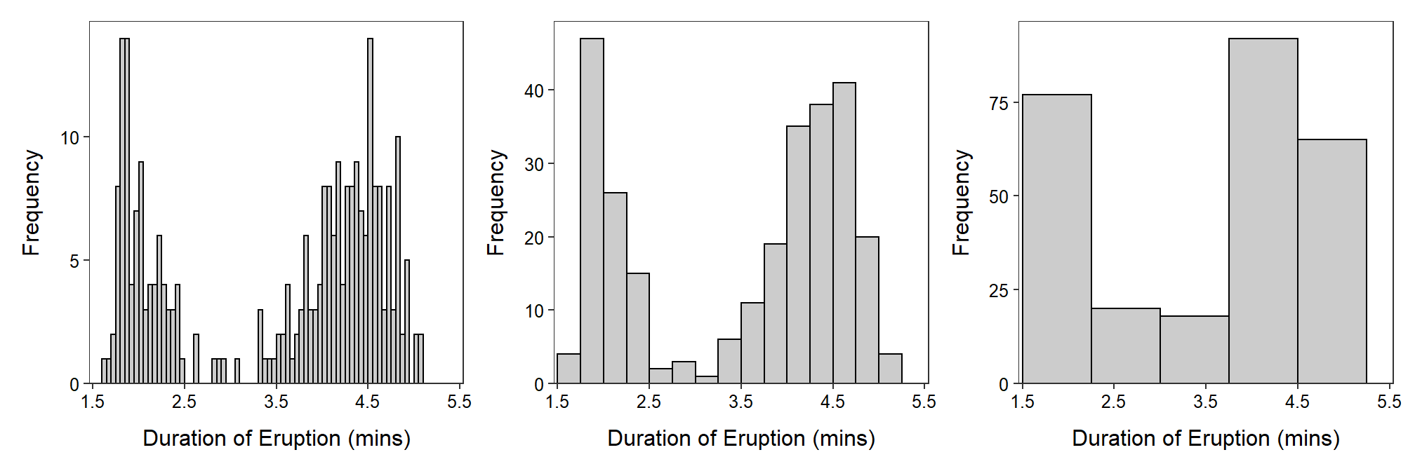
Figure 4.2: Histogram of length of eruptions for Old Faithful geyser with varying number of bins/classes.
4.1.2.2 Boxplot
The five-number summary consists of the minimum, Q1, median, Q3, and maximum values (effectively contains the range, IQR, and median). For example, the five-number summary for the open pit mine data is 1, 1, 2, 4, and 15 (all values computed in the previous sections). The five-number summary may be displayed as a boxplot. A traditional boxplot (Figure 4.3-Left) consists of a horizontal line at the median, horizontal lines at Q1 and Q3 that are connected with vertical lines to form a box, and vertical lines from Q1 to the minimum and from Q3 to the maximum. In modern boxplots (Figure 4.3-Right) the upper line extends from Q3 to the last observed value that is within 1.5 IQRs of Q3 and the lower line extends from Q1 to the last observed value that is within 1.5 IQRs of Q1. Observed values outside of the whiskers are termed “outliers” by this algorithm and are typically plotted with circles or asterisks. If no individuals are deemed “outliers” by this algorithm, then the traditional and modern boxplots will be the same.
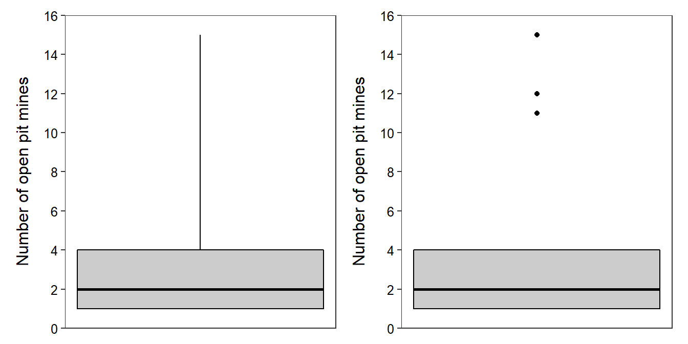
Figure 4.3: Traditional (Left) and modern (Right) boxplots of the open pit mine data.
4.2 Categorical Variable
In this section, methods to construct tables and graphs for categorical data are described. Interpretation of the results is demonstrated in the next module. The concepts are illustrated with data about MTH107 students from the Winter 2020 semester. Specifically, whether or not a student was required to take the courses and the student’s year-in-school will be summarized. Whether or not a student was required to take the course for a subset of individuals is shown in Table 4.7.
| Individual | Required | ||
|---|---|---|---|
| 1 | Y | ||
| 2 | N | ||
| 3 | N | ||
| 4 | Y | ||
| 5 | Y | ||
| 6 | Y | ||
| 7 | N | ||
| 8 | Y |
4.2.1 Numerical Summaries
4.2.1.1 Frequency and Percentage Tables
A simple method to summarize categorical data is to count the number of individuals in each level of the categorical variable. These counts are called frequencies and the resulting table (Table 4.8) is called a frequency table. From this table, it is seen that there were five students that were required and three that were not required to take MTH107.
| Required | Frequency | ||
|---|---|---|---|
| N | 3 | ||
| Y | 5 |
The remainder of this module will use results from the entire class rather than the subset used above. For example, frequency tables of individuals by sex and year-in-school for the entire class are in Table 4.9.
| Required | Frequency | Year | Frequency | |
|---|---|---|---|---|
| N | 30 | Fr | 19 | |
| Y | 38 | So | 12 | |
| Jr | 29 | |||
| Sr | 9 |
Frequency tables are often modified to show the percentage of individuals in each level. Percentage tables are constructed from frequency tables by dividing the number of individuals in each level by the total number of individuals examined (n) and then multiplying by 100. For example, the percentage tables for both whether or not MTH107 was required and year-in-school (Table 4.10) for students in MTH107 is constructed from Table 4.9 by dividing the value in each cell by 68, the total number of students in the class, and then multiplying by 100. From this it is seen that 55.9% of students were required to take the course and 13.0% were seniors (Table 4.10).
| Required | Percentage | Year | Percentage | |
|---|---|---|---|---|
| N | 44.1 | Fr | 27.5 | |
| Y | 55.9 | So | 17.4 | |
| Jr | 42.0 | |||
| Sr | 13.0 |
4.2.2 Graphical Summaries
4.2.2.1 Bar Charts
Bar charts are used to display the frequency or percentage of individuals in each level of a categorical variable. Bar charts look similar to histograms in that they have the frequency of individuals on the y-axis. However, category labels rather than quantitative values are plotted on the x-axis. In addition, to highlight the categorical nature of the data, bars on a bar chart do not touch. A bar chart for whether or not individuals were required to take MTH107 is in Figure 4.4-Left. This bar chart does not add much to the frequency table because there were only two categories. However, bar charts make it easier to compare the number of individuals in each of several categories as in Figure 4.4-Right.
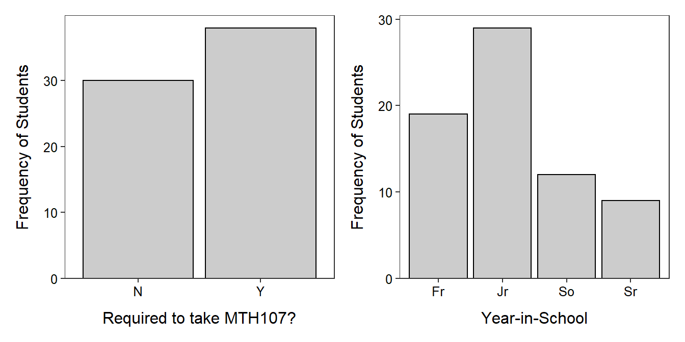
Figure 4.4: Bar charts of the frequency of individuals in MTH107 during Winter 2010 by whether or not they were required to take MTH107 (Left) and year-in-school (Right).
Bar charts are used to display the frequency of individuals in the categories of a categorical variable. Histograms are used to display the frequency of individuals in classes created from quantitative variables.
See Section 2.1 for clarification on the differences between populations and samples and parameters and statistics.↩︎
Most computer programs use a more sophisticated algorithm for computing the median and, thus, will produce different results than what will result from applying these steps.↩︎
Recall that n is the sample size or number of individuals in the sample.↩︎
You should review how a median is computed before proceeding with this section.↩︎
Some authors put the median into both halves when n is odd. The difference between the two methods is minimal for large n.↩︎