Module 8 Bivariate EDA - Quantitative
Bivariate data occurs when two variables are measured on the same individuals. For example, you may measure (i) the height and weight of students in class, (ii) depth and area of a lake, (iii) gender and age of welfare recipients, or (iv) number of mice and biomass of legumes in fields. This module is focused on describing the bivariate relationship between two quantitative variables. Bivariate relationships between two categorical variables is described in Module 10.
Data on the weight (lbs) and highway miles per gallon (HMPG) for 93 cars from the 1993 model year are used as an example throughout this module. Ultimately, the relationship between highway MPG and the weight of a car is described. A sample of these data are shown below.
| MFG | Model | Type | CMPG | HMPG | Weight | Cyls |
|---|---|---|---|---|---|---|
| Acura | Integra | Small | 25 | 31 | 2705 | 4 |
| Acura | Legend | Midsize | 18 | 25 | 3560 | 6 |
| Audi | 90 | Compact | 20 | 26 | 3375 | 6 |
| Volkswagen | Corrado | Sporty | 18 | 25 | 2810 | 6 |
| Volvo | 240 | Compact | 21 | 28 | 2985 | 4 |
| Volvo | 850 | Midsize | 20 | 28 | 3245 | 5 |
8.1 Response and Explanatory Variables
The response variable is the variable that one is interested in explaining something (i.e., variability) or in making future predictions about. The explanatory variable is the variable that may help explain or allow one to predict the response variable. In general, the response variable is thought to depend on the explanatory variable. Thus, the response variable is often called the dependent variable, whereas the explanatory variable is often called the independent variable.
One may identify the response variable by determining which of the two variables most likely depends on the other. For example, in the car data, highway MPG is the response variable because gas mileage is most likely affected by the weight of the car (e.g., hypothesize that heavier cars get worse gas mileage), rather than vice versa.
In some situations it is not obvious which variable is the response. For example, does the number of mice in the field depend on the number of legumes (lots of food=lots of mice) or the other way around (lots of mice=not much food left)? Similarly, does area depend on depth or does depth depend on area of the lake? In these situations, the context of the research question is needed to identify the response variable. For example, if the researcher hypothesized that number of mice will be greater if there are more legumes, then number of mice is the response variable. In many cases, the more difficult variable to measure will likely be the response variable. For example, researchers likely wish to predict area of a lake (hard to measure) from depth of the lake (easy to measure).
Which variable is the response may depend on the context of the research question.
8.2 Summaries
8.2.1 Scatterplots
A scatterplot is a graph where each point simultaneously represents the values of both the quantitative response and quantitative explanatory variable. The value of the explanatory variable gives the x-coordinate and the value of the response variable gives the y-coordinate of the point plotted for an individual. For example, the first individual in the cars data is plotted at x (Weight) = 2705 and y (HMPG) = 31, whereas the second individual is at x = 3560 and y = 25 (Figure 8.1).
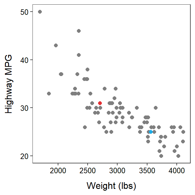
Figure 8.1: Scatterplot between the highway MPG and weight of cars manufactured in 1993. For reference to the main text, the first individual is red and the second individual is blue.
8.2.2 Correlation Coefficient
The sample correlation coefficient, abbreviated as r, is calculated with
\[ \text{r} = \frac{\sum_{\text{i}=1}^{n}\left[\left(\frac{\text{x}_{\text{i}}-\bar{\text{x}}}{\text{s}_{\text{x}}}\right)\left(\frac{\text{y}_{\text{i}}-\bar{\text{y}}}{\text{s}_{\text{y}}}\right)\right]}{\text{n}-1} \]
where sx and sy are the sample standard deviations for the explanatory and response variables, respectively.35 The formulae in the two sets of parentheses in the numerator are standardized values; thus, the value in each parenthesis is called the standardized x or standardized y, respectively. Using this terminology, the equation for r reduces to these steps:
- For each individual, standardize x and standardize y.36
- For each individual, find the product of the standardized x and standardized y.
- Sum all of the products from step 2.
- Divide the sum from step 3 by n-1.
Table 8.2 illustrates these calculations for the first five individuals in the cars data.37 Note that the “i” column is an index for each individual, the xi and yi columns are the observed values of the two variables for individual i, \(\bar{\text{x}}\) was computed by dividing the sum of the xi column by n, sx was computed by dividing the sum of the (xi-\(\bar{\text{x}})\)2 column by n-1 and taking the square root, and the “std x” column are the standardized x values found by dividing the values in the xi-\(\bar{\text{x}}\) column by sx. Similar calculations were made for the y variable. The final correlation coefficient is the sum of the last column divided by n-1. Thus, the correlation between car weight and highway mpg for these five cars is -0.54.
| i | \(\text{y}_{\text{i}}\) | \(\text{x}_{\text{i}}\) | \(\text{y}_{\text{i}}-\bar{\text{y}}\) | \(\text{x}_{\text{i}}-\bar{\text{x}}\) | \((\text{y}_{\text{i}}-\bar{\text{y}})^{2}\) | \((\text{x}_{\text{i}}-\bar{\text{x}})^{2}\) | std. y | std. x | (std. y)(std. x) |
|---|---|---|---|---|---|---|---|---|---|
| 1 | 31 | 2705 | 3.4 | -632 | 11.56 | 399424 | 1.258 | -1.709 | -2.151 |
| 2 | 25 | 3560 | -2.6 | 223 | 6.76 | 49729 | -0.962 | 0.603 | -0.580 |
| 3 | 26 | 3375 | -1.6 | 38 | 2.56 | 1444 | -0.592 | 0.103 | -0.061 |
| 4 | 26 | 3405 | -1.6 | 68 | 2.56 | 4624 | -0.592 | 0.184 | -0.109 |
| 5 | 30 | 3640 | 2.4 | 303 | 5.76 | 91809 | 0.888 | 0.819 | 0.728 |
| Sum | 138 | 16685 | 0.0 | 0 | 29.20 | 547030 | 0.000 | 0.000 | -2.173 |
The meaning and interpretation of r is discussed in more detail in the next section.
8.3 Bivariate Items to Describe
Four characteristics should be described for a bivariate EDA with two quantitative variables:
- form of the relationship,
- presence (or absence) of outliers, and
- association or direction of the relationship,
- strength of the relationship.
All four of these items can be described from a scatterplot. However, for linear relationships, strength is best described from the correlation coefficient.
8.3.1 Form and Outliers
The form of a relationship is determined by whether the “cloud” of points on a scatterplot forms a line or some sort of curve (Figure 8.4). For the purposes of this introductory course, if the “cloud” appears linear then the form will be said to be linear, whereas if the “cloud” is curved then the form will be nonlinear. Scatterplots should be considered linear unless there is an OBVIOUS curvature in the points.
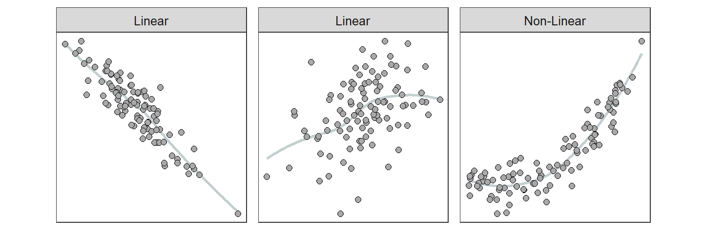
Figure 8.2: Depictions of two linear and one nonlinear relationship. A smoother is shown to highlight the general form of the relationship.
An outlier is a point that is far removed from the main cluster of points (Figure 8.3). Keep in mind (as always) that just because a point is an outlier doesn’t mean it is wrong.
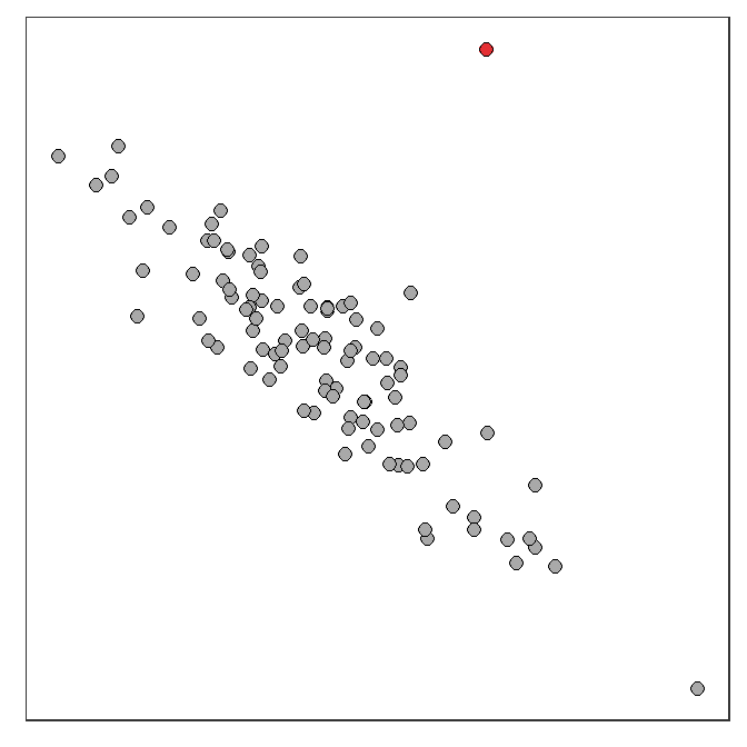
Figure 8.3: Depiction of an outlier (red point) in an otherwise linear scatterplot.
8.3.2 Association or Direction
A positive association is when the scatterplot resembles an increasing function (i.e., increases from lower-left to upper-right; Figure 8.4-Left). For a positive association, most of the individuals are above average or below average for both of the variables. A negative association is when the scatterplot looks like a decreasing function (i.e., decreases from upper-left to lower-right; Figure 8.4-Right). For a negative association, most of the individuals are above average for one variable and below average for the other variable. No association is when the scatterplot looks like a “shotgun blast” of points (Figure 8.4-Center). For no association, there is no tendency for individuals to be above or below average for one variable and above or below average for the other variable.
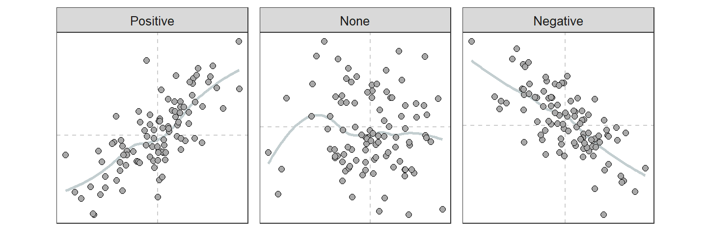
Figure 8.4: Depiction of three types of association present in scatterplots. Dashed vertical lines are at the means of each variable.
8.3.3 Strength (and Association, Again)
Strength is a summary of how closely the points cluster around the general form of the relationship. For example, if a linear form exists, then strength is how closely the points cluster around the line. Strength is difficult to define from a scatterplot because it is a relative term. However, the correlation coefficient (r; Section 8.2.2) is a measure of strength and association between two variables, if the form is linear.
To better understand how r is a measure of association and strength, reconsider the steps in calculating r from Section 8.2.2. The scatterplots in Figure 8.5 represent different associations. These scatterplots have dashed lines at the mean of both the x- and y-axis variables. Because the mean is subtracted from observed values when standardizing, points that fall above the mean will have positive standardized values and points that fall below the mean will have negative standardized values. The sign for the standardized values are depicted along the axes.
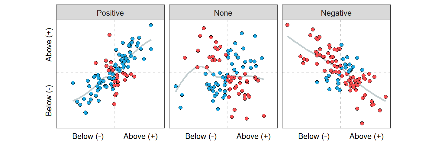
Figure 8.5: Scatterplot with mean lines (dashed lines) and the signs of standardized values for both x and y shown for different associations. Blue points have a positive product of standardized values, whereas red points have a negative product of standardized values.
Now consider the product of standardized x’s and y’s in each quadrant of the scatterplots in Figure 8.5. The product of standardized values is positive (blue points) in the quadrant where both standardized values are above average (i.e., both positive signs) and both are below average. The product of standardized values is negative (red points) in the other two quadrants.
Thus, for a positive association (Figure 8.5-Left) the numerator of the correlation coefficient is positive because it is the sum of many positive (blue points) and few negative (red points) products of standardized values. Therefore, r for a positive association is positive (because the denominator of n-1 is always positive). Conversely, for a negative association (Figure 8.5-Right) the numerator of the correlation coefficient is negative because it is the sum of few positive (blue points) and many negative (red points) products of standardized values. Therefore, r for a negative association is negative.
Correlations range from -1 to 1. Absolute values of r equal to 1 indicate a perfect association (i.e., all points exactly on a line). A correlation of 0 indicates no association. Thus, absolute values of r near 1 indicate strong relationships and those near 0 are weak. How strength and association of the relationship change along the range of r values is illustrated in Figure 8.6. Guidelines in Table 8.3 can be used to convert values of r into words that describe the strength of relationship between two variables.
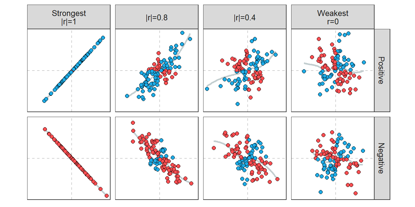
Figure 8.6: Scatterplots along the continuum of r values.
| Statement | Observational (Uncontrolled) | Experimental (Controlled) |
|---|---|---|
| Strong | >0.8 | >0.98 |
| Moderate | >0.6 | >0.95 |
| Weak | >0.4 | >0.9 |
| None | <0.4 | <0.9 |
8.4 Example Interpretations
When performing a bivariate EDA for two quantitative variables, the form, presence (or absence) of outliers, association, and strength should be specifically addressed. In addition, you should state how you assessed strength. Specifically, you should use r to assess strength (see Section 8.3.3) IF the relationship is linear without any outliers. However, if the relationship is nonlinear, has outliers, or both, then strength should be subjectively assessed from the scatterplot.
Two other points should be considered when performing a bivariate EDA with quantitative variables. First, if outliers are present, do not let them completely influence your conclusions about form, association, and strength. In other words, assess these items ignoring the outlier(s). If you have raw data and the form excluding the outlier is linear, then compute r with the outlier eliminated from the data. Second, the form of weak relationships is difficult to describe because, by definition, there is very little clustering to a form. As a rule-of-thumb, if the scatterplot is not obviously curved, then it is described as linear by default.
- Outliers should not influence the descriptions of association, strength, and form.
- The form is linear unless there is an OBVIOUS curvature.
Finally, in the examples below note that 1) form, outliers, association, and strength are specifically assessed in each; 2) strength is assessed from the correlation coefficient (and Table 8.3) only if the form is linear and there are no outliers, 3) the position of outliers is specifically identified, and 4) how whether strength was assessed from the correlation coefficient or not was described.
Highway MPG and Weight
The following overall bivariate summary for the relationship between highway MPG and weight is made using the scatterplot (Figure 8.1) and correlation coefficient from the previous sections.
The relationship between highway MPG and weight of cars appears to be slightly nonlinear (a slight concavity is apparent), negative, and moderately strong. The three points at (2400,46), (2500,27), and (1800,33) might be considered SLIGHT outliers (these are not far enough removed for me to consider them outliers, but some people may). The correlation coefficient was not used to assess strength because I deemed the relationship to be nonlinear.
State Energy Usage
A 2001 report from the Energy Information Administration of the Department of Energy details the total consumption of a variety of energy sources by state in 2001. Construct a proper EDA for the relationship between total petroleum and coal consumption (in trillions of BTU).
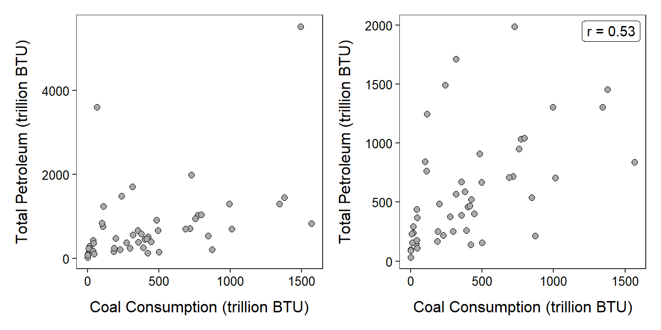
Figure 8.7: Scatterplot of the total consumption of petroleum versus the consumption of coal (in trillions of BTU) by all 50 states and the District of Columbia. The points shown in the left with total petroleum values greater than 3000 trillion BTU are deleted in the right plot.
The relationship between total petroleum and coal consumption is generally linear, with two outliers at total petroleum levels greater than 3000 trillions of BTU, positive, and weak (Figure 8.7-Left). I did not use the correlation coefficient because of the outliers. If the two outliers (Texas and California) are removed then the relationship is linear, with no additional outliers, positive, and weak (r=0.53) (Figure 8.7-Right).
Hatch Weight and Incubation Time of Geckos
A hobbyist hypothesized that there would be a positive association between length of incubation (days) and hatchling weight (grams) for Crested Geckos (Rhacodactylus ciliatus). To test this hypothesis she collected the incubation time and weight for 21 hatchlings with the results shown below. Construct a proper EDA for the relationship between incubation time and hatchling weight.
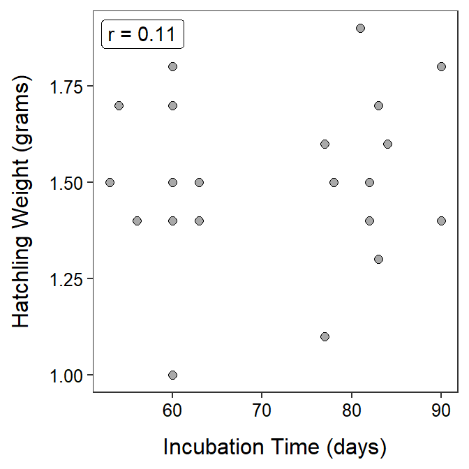
Figure 8.8: Scatterplot of hatchling weight versus incubation time for Crested Geckos.
The relationship between hatchling weight and incubation time for the Crested Geckos is linear, without obvious outliers (though some may consider the small hatchling at 60 days to be an outlier), without a definitive association, and weak (r=0.11) (Figure 8.8). I did compute r because no outliers were present and the relationship was linear (or, at least, it was not nonlinear).
8.5 Cautions About Correlation
Examining relationships between pairs of quantitative variables is common practice. Using r can be an important part of this analysis, as described above. However, r can be abused through misapplication and misinterpretation. Thus, it is important to remember the following characteristics of correlation coefficients:
- Variables must be quantitative (i.e., if you cannot make a scatterplot, then you cannot calculate r).
- The correlation coefficient only measures strength of LINEAR relationships (i.e., if the form of the relationship is not linear, then r is meaningless and should not be calculated).
- The units that the variables are measured in do not matter (i.e., r is the same between heights and weights measured in inches and lbs, inches and kg, m and kg, cm and kg, and cm and inches). This is because the variables are standardized when calculating r.
- The distinction between response and explanatory variables is not needed to compute r. That is, the correlation of GPA and ACT scores is the same as the correlation of ACT scores and GPA.
- Correlation coefficients are between -1 and 1.
- Correlation coefficients are strongly affected by outliers (simply, because both the mean and standard deviation, used in the calculation of r, are strongly affected by outliers).
Additionally, correlation is not causation! In other words, just because a strong correlation is observed it does not mean that the explanatory variable caused the response variable (an exception may be in carefully designed experiments). For example, it was found above that highway gas mileage decreased linearly as the weight of the car increased. One must be careful here to not state that increasing the weight of the car CAUSED a decrease in MPG because these data are part of an observational study and several other important variables were not considered in the analysis. For example, the scatterplot in Figure 8.9, coded for different numbers of cylinders in the car’s engine, indicates that the number of cylinders may be inversely related to highway MPG and positively related to weight of the car. So, does the weight of the car, the number of cylinders, or both, explain the decrease in highway MPG?
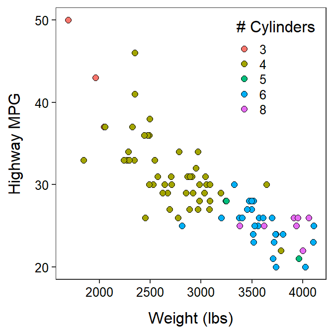
Figure 8.9: Scatterplot between the highway MPG and weight of cars manufactured in 1993 separated by number of cylinders.
More interesting examples that further demonstrate that “correlation is not causation” can be found on the Spurious Correlations website (e.g., high correlation between number of people who drowned by falling into a pool and the annual number of films that Nicolas Cage appeared in).
Finally, the word “correlation” is often misused in everyday language. “Correlation” should only be used when discussing the actual correlation coefficient (i.e., r). When discussing the association between two variables, one should use “association” or “relationship” rather than “correlation.” For example, one might ask “What is the relationship between age and rate of cancer?” but should not ask (unless specifically interested in r) “What is the correlation between age and rate of cancer?”