Module 9 One-Way Summary
Specific parts of a full One-Way ANOVA analysis were described in Modules 5-8. In this module, a workflow for a full analysis is offered and that workflow is demonstrated with several examples.
9.1 Suggested Workflow
The process of fitting and interpreting linear models is as much an art as it is a science. The “feel” for fitting these models comes with experience. The following is a process to consider for fitting a one-way ANOVA model. Consider this process as you learn to fit one-way ANOVA models, but don’t consider this to be a concrete process for all models.
- Briefly introduce the study (i.e., provide some background for why this study is being conducted).
- State the hypotheses to be tested.
- Show the sample size per group using
xtabs()and comment on whether the study was balanced (i.e., same sample size per group) or not. - Address the independence assumption.
- If this assumption is not met then other analysis methods should be used.45
- Fit the untransformed full model (i.e., separate group means) with
lm(). - Check the other three assumptions for the untransformed model with
assumptionCheck().- Check equality of variances with a Levene’s test and residual plot.
- Check normality of residuals with an Anderson-Darling test and histogram of residuals.
- Check for outliers with an outlier test, residual plot, and histogram of residuals.
- If an assumption or assumptions are violated, then attempt to find a transformation where the assumptions are met.
- Use the trial-and-error method with
lambday=inassumptionCheck(), theory, or experience to identify a possible transformation. Always try the log transformation first. - If only an outlier exists (i.e., there are equal variances and normal residuals) and no transformation corrects the outlier then consider removing the outlier from the data set.
- Fit the ultimate full model with the transformed response or reduced data set.
- Use the trial-and-error method with
- Construct an ANOVA table for the full model with
anova()and make a conclusion about the equality of means from the p-value. - If differences among group means exist, then use a multiple comparison technique with
emmeans()andsummary()to identify specific differences. Discuss specific differences using confidence intervals.- If the data were log-transformed then discuss specific ratios of means using back-transformed differences (use
tran=inemmeans()andtype="response"insummary()to compute the back-transformations).
- If the data were log-transformed then discuss specific ratios of means using back-transformed differences (use
- Create a summary graphic of observations with group means on the original scale and 95% confidence intervals using
ggplot()and results fromemmeans(). - Write a succinct conclusion of your findings.
9.2 Nematodes (No Transformation)
Root-Knot Nematodes (Meloidogyne spp.) are microscopic worms found in soil that may negatively affect the growth of plants through their trophic dynamics. Tomatoes are a commercially important plant species that may be negatively affected by high densities of nematodes in culture situations.
A science fair student designed an experiment to determine the effect of increased densities of nematodes on the growth of tomato seedlings. The student hypothesized that nematodes would negatively affect the growth of tomato seedlings – i.e., growth of seedlings would be lower at higher nematode densities. The statistical hypotheses to be examined were
\[ \begin{split} \text{H}_{\text{0}}&: \mu_{0} = \mu_{1000} = \mu_{5000} = \mu_{10000} \\ \text{H}_{\text{A}}&:\text{At least one pair of means is different} \end{split} \]
where \(\mu\) is the mean growth of the tomato seedlings and the subscripts identify densities of nematodes (see below).
The student had 16 pots of a homogeneous soil type in which he “stocked” a known density of nematodes. The densities of nematodes used were 0, 1000, 5000, or 10000 nematodes per pot. The density of nematodes to be stocked in each pot was randomly assigned. After stocking the pots with nematodes, tomato seedlings, which had been selected to be as nearly identical in size and health as possible, were transplanted into each pot. The exact pot that a seedling was transplanted into was again randomly selected. Each pot was placed under a growing light in the same laboratory and allowed to grow for six weeks. Watering regimes and any other handling necessary during the six weeks was kept the same as much as possible among the pots. After six weeks, the plants were removed from the growing conditions and the growth of the seedling (in cm) from the beginning of the experiment was recorded.
This study was “balanced” as the number of pots at each nematode density was the same (Table 9.1). The sample size, though, is quite small.
| density | Freq |
|---|---|
| 0 | 4 |
| 1000 | 4 |
| 5000 | 4 |
| 10000 | 4 |
Independence appears to be largely met in this experiment. Each tomato plant was planted in a randomly selected individual pot that had been randomly assigned a number of nematodes. Thus, the growth of an individual plant should not effect the growth of another individual plant. I would be concerned if the pots were not randomly placed around the laboratory. For example, if all pots of a certain treatment were placed in one corner of the laboratory then conditions in that one corner may affect growth for those pots. There is no indication that this happened, however, so I will assume that it did not.
Note the detailed discussion of independence.
Variances among treatments appear to be approximately equal (Levene’s p=0.8072; Figure 9.1-Right), the residuals appear to be approximately normally distributed (Anderson-Darling p=0.9268) and the histogram of residuals does not indicate any major skewness (Figure 9.1-Left), and there does not appear to be any major outliers in the data (outlier test p=0.6712; Figure 9.1). The analysis will proceed with untransformed data because the assumptions of the one-way ANOVA were met.
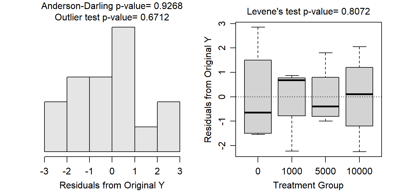
Figure 9.1: Histogram (Left) and boxplot (Right) of residuals from the utransformed One-Way ANOVA model for the tomato seedling growth at each nematode density.
Note the succinct writing with respect to testing the assumptions and references to specific p-values and figures.
There appears to be a significant difference in mean tomato seedling growth among at least some of the four treatments (p=0.0006; Table 9.2).
| Df | Sum Sq | Mean Sq | F value | Pr(>F) | |
|---|---|---|---|---|---|
| density | 3 | 100.65 | 33.55 | 12.08 | 0.00062 |
| Residuals | 12 | 33.33 | 2.78 |
Note the use of ANOVA table to first identify any differences.
It appears that mean growth of tomatoes does not differ at densities 0 and 1000 (p=0.9974) and 5000 and 10000 (p=0.9992), but does differ for all other pairs of nematode densities (p≤0.0070) (Table 9.3).
| contrast | estimate | lower.CL | upper.CL | p.value |
|---|---|---|---|---|
| 0 - 1000 | 0.225 | -3.274 | 3.724 | 0.9974 |
| 0 - 5000 | 5.050 | 1.551 | 8.549 | 0.0050 |
| 0 - 10000 | 5.200 | 1.701 | 8.699 | 0.0041 |
| 1000 - 5000 | 4.825 | 1.326 | 8.324 | 0.0070 |
| 1000 - 10000 | 4.975 | 1.476 | 8.474 | 0.0056 |
| 5000 - 10000 | 0.150 | -3.349 | 3.649 | 0.9992 |
The student’s hypothesis was generally supported (Figure 9.2). However, it does not appear that tomato seedling growth is negatively affected for all increases in nematode density. For example, seedling growth declined for an increase from 1000 to 5000 nematodes per pot but not for increases from 0 to 1000 nematodes per pot or from 5000 to 10000 nematodes per pot. Specifically, it appears that the mean growth of the tomato seedlings is between 1.3 and 8.3 cm lower at a density of 5000 nematodes than at a density of 1000 nematodes (Table 9.2).
Note use of a confidence interval and specific direction (i.e., “lower”) when describing the “difference.”
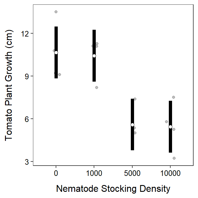
Figure 9.2: Mean (with 95% confidence interval) of tomato growth at each nematode density.
From this analysis, it appears that there is a “critical” density of nematodes for tomato growth somewhere between 1000 and 5000 nematodes per pot. The experimenter may want to redo this experiment for densities between 1000 and 5000 nematodes per pot in an attempt to more specifically identify a “critical” nematode density below which there is very little affect on growth and above which there is a significant negative affect on growth.
R Code and Results
TN <- read.csv("http://derekogle.com/Book207/data/TomatoNematode.csv")
TN$density <- factor(TN$density)
lm.tn <- lm(growth~density,data=TN)
xtabs(~density,data=TN)
assumptionCheck(lm.tn)anova(lm.tn)
mc.tn <- emmeans(lm.tn,specs=pairwise~density)
( mcsum.tn <- summary(mc.tn,infer=TRUE) )
ggplot() +
geom_jitter(data=TN,mapping=aes(x=density,y=growth),alpha=0.25,width=0.1) +
geom_errorbar(data=mcsum.tn$emmeans,
mapping=aes(x=density,y=emmean,ymin=lower.CL,ymax=upper.CL),
size=2,width=0) +
geom_point(data=mcsum.tn$emmeans,mapping=aes(x=density,y=emmean),
size=2,pch=21,fill="white") +
labs(x="Nematode Stocking Density",y="Tomato Plant Growth (cm)") +
theme_NCStats()
9.3 Ant Foraging (Transformation)
Red wood ants (Formica rufa) forage for food (mainly insects and “honeydew” produced by aphids) both on the ground and in the canopies of trees. Rowan, Oak, and Sycamore trees support very different communities of insect herbivores (including aphids) and it would be interesting to know whether the foraging efficiency of ant colonies is affected by the type of trees available to them. As part of an investigation of the foraging of Formica rufa, observations were made of the prey being carried by ants down trunks of trees. The total biomass of prey being transported was measured over a 30-minute sampling period on different tree specimens. The results were expressed as the biomass (dry weight in mg) of prey divided by the total number of ants leaving the tree to give a rate of food collected per ant per half hour.46
The statistical hypotheses to be examined are
\[ \begin{split} \text{H}_{\text{0}}&: \mu_{Oak} = \mu_{Rowan} = \mu_{Sycamore} \\ \text{H}_{\text{A}}&:\text{At least one pair of means is different} \end{split} \]
where \(\mu\) is the mean foraging rate of the ants and the subscripts identify the type of tree examined.
This study was slightly “unbalanced” as the number of ants recorded on each tree is similar, but not the same (Table 9.4).
| Tree | Freq |
|---|---|
| Oak | 27 |
| Rowan | 28 |
| Sycamore | 26 |
The data appear to be independent as long as the separate trees were not in close proximity to each other. It is possible that the researchers examined one species of tree entirely within one “forest” of those trees. This would mean that the individuals within a species were somehow related, which would violate the independence assumption. In addition, the researchers could have looked at one specimen of each species all in a certain location, such that one tree could influence another tree. This again would violate the independence assumption. There is no indication that either of the scenarios occurred so I will assume that the individuals are independent both within- and among-groups.
Note careful discussion of independence here.
Variances among treatments for the untransformed data appear to be non-constant (Levene’s p=0.0036; Figure 9.3-Right). The residuals appear to be not normally distributed (Anderson-Darling p=0.0002) with a fairly strong skew in the histogram (Figure 9.3-Left). There also appears to be a significant outlier (outlier test p=0.0012) that has a large residual in the Oak group (Figure 9.3). None of the assumptions are met so transforming the food rate was considered.
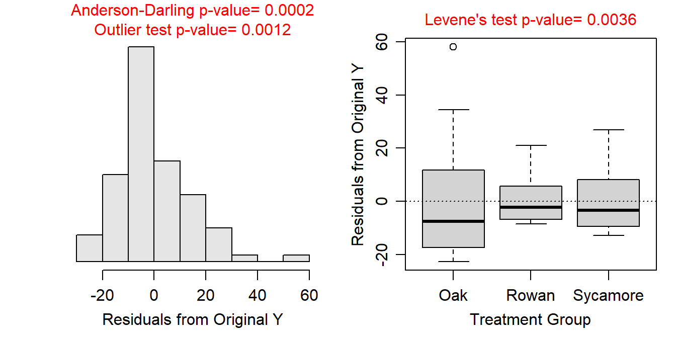
Figure 9.3: Histogram of residuals (Left) and boxplot of residual (Right) from the one-way ANOVA on untransformed foraging rate of ants.
A log transformation of foraging rate resulted in equal variances (Levene’s p=0.4815; Figure 9.4-Right), normal (Anderson-Darling p=0.0603) or at least not skewed (Figure 9.4-Left) residuals, and no significant outliers (outlier test p>1). Thus, the assumptions of the One-Way ANOVA model appeared to have been adequately met on the log scale.
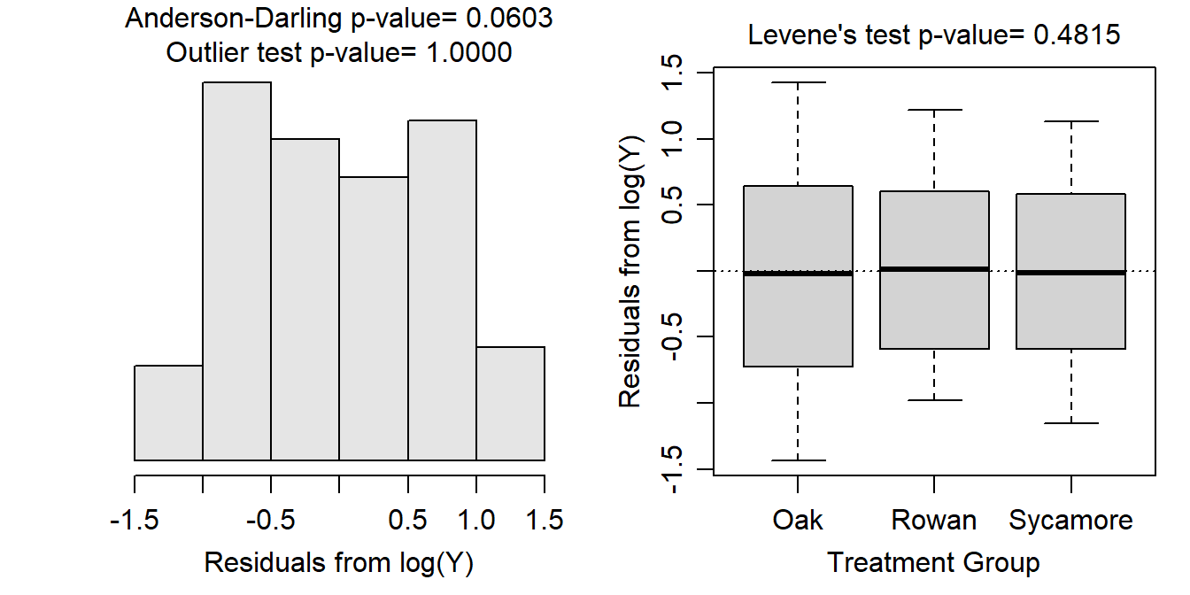
Figure 9.4: Histogram of residuals (Left) and boxplot of residual (Right) from the one-way ANOVA on log transformed foraging rate of ants.
Note that I tried the log transformation first and because the assumptions were met with this transformation there was no need to assess other possible transformations.
There appears to be a significant difference in mean log foraging rate of the ants among some of the tree species (p=0.0013; Table 9.5).
| Df | Sum Sq | Mean Sq | F value | Pr(>F) | |
|---|---|---|---|---|---|
| Tree | 2 | 7.479 | 3.739 | 7.287 | 0.00126 |
| Residuals | 78 | 40.028 | 0.513 |
Note the careful use of the transformation name when discussing the overall ANOVA results.
Tukey multiple comparisons indicate that the mean foraging rate was greater for ants on Oak trees than ants on Rowan trees (p=0.0008; Table 9.6). Specifically, the mean foraging rate for ants on an Oak tree was between 1.318 and 3.318 times higher than the mean foraging rate for ants on a Rowan tree (Table 9.6). However, there was no significant difference in mean foraging rate between ants on Sycamore trees and ants on Oak (p=0.1559) or Rowan (p=0.1457; Table 9.6) trees.
| contrast | ratio | lower.CL | upper.CL | t.ratio | p.value |
|---|---|---|---|---|---|
| Oak / Rowan | 2.091 | 1.318 | 3.318 | 3.8172 | 0.0008 |
| Oak / Sycamore | 1.443 | 0.902 | 2.310 | 1.8647 | 0.1559 |
| Rowan / Sycamore | 0.690 | 0.433 | 1.100 | -1.8991 | 0.1457 |
Note how the back-transformed difference in means forms a ratio that is interpreted as a multiplicative change.
These results indicate that there is a difference in the mean foraging rate of ants, but only between those on Oak and Rowan trees, where ants on Oak trees had approximately double the mean foraging rate as ants on Rowan trees (Figure 9.5). There was no difference in mean foraging rates for ants on Sycamore trees and either Oak or Rowan trees.
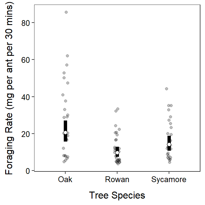
Figure 9.5: Back-transformed mean (with 95% confidence interval) foraging rate of ants on each tree species. The mean foraging rate differed only between Oak and Rown trees.
It is possible with a log to back-transform both means and differences in means.
R Code and Results
AF <- read.csv("http://derekogle.com/Book207/data/Ants.csv")
lm.af <- lm(Food~Tree,data=AF)
xtabs(~Tree,data=AF)
assumptionCheck(lm.af)assumptionCheck(lm.af,lambday=0)AF$logFood <- log(AF$Food)
lm.aft <- lm(logFood~Tree,data=AF)
anova(lm.aft)
mc.aft <- emmeans(lm.aft,specs=pairwise~Tree,tran="log")
( mcsum.afbt <- summary(mc.aft,infer=TRUE,type="response") )
ggplot() +
geom_jitter(data=AF,mapping=aes(x=Tree,y=Food),alpha=0.25,width=0.05) +
geom_errorbar(data=mcsum.afbt$emmeans,
mapping=aes(x=Tree,y=response,ymin=lower.CL,ymax=upper.CL),
size=2,width=0) +
geom_point(data=mcsum.afbt$emmeans,mapping=aes(x=Tree,y=response),
size=2,pch=21,fill="white") +
labs(x="Tree Species",y="Foraging Rate (mg per ant per 30 mins)") +
theme_NCStats()
9.4 Peak Discharge (Transformation)
Mathematical models are used to predict flood flow frequency and estimates of peak discharge for the Mississippi River watershed. These models are important for forecasting potential dangers to the public. A civil engineer was interested in determining whether four different methods for estimating flood flow frequency produce equivalent estimates of peak discharge when applied to the same watershed. The statistical hypotheses to be examined are
\[\begin{split} \text{H}_{\text{0}}&: \mu_{1} = \mu_{2} = \mu_{3} = \mu_{4} \\ \text{H}_{\text{A}}&:\text{At least one pair of means is different} \end{split} \]
where \(\mu\) is the mean peak discharge estimate and the subscripts generically identify the four different methods for estimating peak discharge.
Each estimation method was used six times on the watershed and the resulting discharge estimates (in cubic feet per second) were recorded (Table 9.7).
| method | Freq |
|---|---|
| 1 | 6 |
| 2 | 6 |
| 3 | 6 |
| 4 | 6 |
At first glance, the data do not appear to be independent either within- or among-groups as the same methods were applied to the same watershed. However, the single watershed is the engineer’s “population” of interest; thus, this form of data collection is not problematic unless the engineer (or you) attempt to make strict inferences to other watersheds. In addition, measurements from the same method may seem dependent, but this is the factor that is being examined, thus this is not a within-group dependency issue.
Note careful discussion of independence here.
Variances among estimation methods for the untransformed data appear to be non-constant (Levene’s p=0.0136; Figure 9.6-Right). The residuals appear normally distributed (Anderson-Darling p=0.4106) or at least only slightly skewed (Figure 9.6-Left) and there are no significant outliers (outlier test p=0.3572). Unequal variances violates a critical assumption so transforming the discharge estimates was considered.
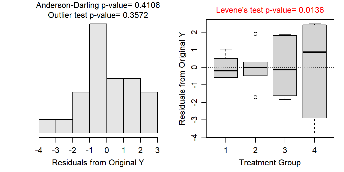
Figure 9.6: Histogram of residuals (Left) and boxplot of residual (Right) from the one-way ANOVA on untransformed peak discharge data.
A square root transformation for the peak discharge estimates resulted in equal variances (Levene’s p=0.8680; Figure 9.7-Right), normal residuals (Anderson-Darling p=0.4207) or at least only slightly skewed (Figure 9.7-Left), and no significant outliers (outlier test p>1). Thus, the assumptions of the One-Way ANOVA model appear to have been adequately met on the square-root scale.
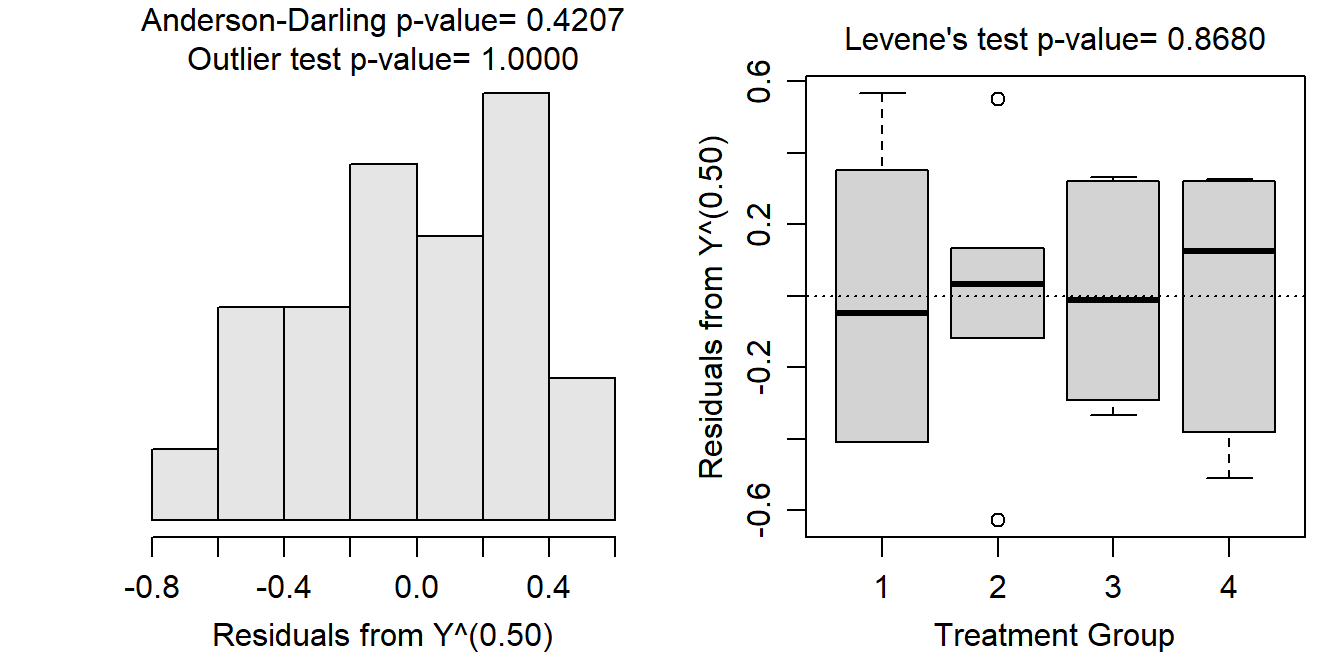
Figure 9.7: Histogram of residuals (Left) and boxplot of residual (Right) from the one-way ANOVA on square root transformed peak discharge data.
Note that I tried a log-transformation first but the assumptions were not met, so I then started working through the other power transformations.
There appears to be a significant difference in mean square root peak discharge among the four methods (p<0.00005; Table 9.8).
| Df | Sum Sq | Mean Sq | F value | Pr(>F) | |
|---|---|---|---|---|---|
| method | 3 | 32.684 | 10.895 | 81.049 | 0 |
| Residuals | 20 | 2.688 | 0.134 |
Note the careful use of the transformation name when discussion the overall results from the ANOVA table.
Tukey multiple comparisons indicate that no two mean square root peak discharges were equal (p≤0.0046; Table 9.9). It appears that the mean square root of estimated peak discharge increases from Method 1 to Method 2 to Method 3 to Method 4. For example, the mean square root of estimated peak discharge was between 2.471 and 3.656 units greater for Method 4 than for Method 1 (Table 9.9).
| contrast | estimate | lower.CL | upper.CL | p.value |
|---|---|---|---|---|
| 1 - 2 | -0.825 | -1.417 | -0.232 | 0.0046 |
| 1 - 3 | -2.046 | -2.638 | -1.453 | 0.0000 |
| 1 - 4 | -3.063 | -3.656 | -2.471 | 0.0000 |
| 2 - 3 | -1.221 | -1.814 | -0.629 | 0.0001 |
| 2 - 4 | -2.239 | -2.831 | -1.646 | 0.0000 |
| 3 - 4 | -1.018 | -1.610 | -0.425 | 0.0006 |
These results indicate that the mean peak discharge estimate differed significantly, with a higher peak discharge estimated for each method from Method 1 to Method 4 (Figure 9.8).
It is possible with a square root to back-transform means, but not differences in means.
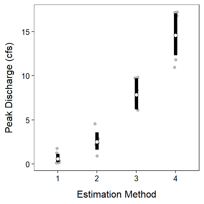
Figure 9.8: Back-transformed mean (with 95% confidence interval) estimates of peak discharge (cubic feet per second, cfs) by each estimation method. The transformed means were different among all estimationg methods.
R Code and Results
PD <- read.csv("http://derekogle.com/Book207/data/PeakDischarge.csv")
PD$method <- factor(PD$method)
lm.pd <- lm(discharge~method,data=PD)
xtabs(~method,data=PD)
assumptionCheck(lm.pd)assumptionCheck(lm.pd,lambday=0.5)PD$sqrtdischarge <- sqrt(PD$discharge)
lm.pdt <- lm(sqrtdischarge~method,data=PD)
anova(lm.pdt)
mc.pdt <- emmeans(lm.pdt,specs=pairwise~method,tran="sqrt")
( mcsum.pdt <- summary(mc.pdt,infer=TRUE) )
( mcsum.pdbt <- summary(mc.pdt,infer=TRUE,type="response") )
ggplot() +
geom_jitter(data=PD,mapping=aes(x=method,y=discharge),
alpha=0.25,width=0.05) +
geom_errorbar(data=mcsum.pdbt$emmeans,
mapping=aes(x=method,y=response,ymin=lower.CL,ymax=upper.CL),
size=2,width=0) +
geom_point(data=mcsum.pdbt$emmeans,mapping=aes(x=method,y=response),
size=2,pch=21,fill="white") +
labs(x="Estimation Method",y="Peak Discharge (cfs)") +
theme_NCStats()This will not be the case in this course.↩︎
This example is directly from https://dzchilds.github.io/stats-for-bio/↩︎