Module 15 SLR Inference
The best-fit line is computed from a sample and is thus a statistic that is subject to sampling variability. In other words, the best-fit line will vary from sample to sample taken from the same population (Figure 15.1).
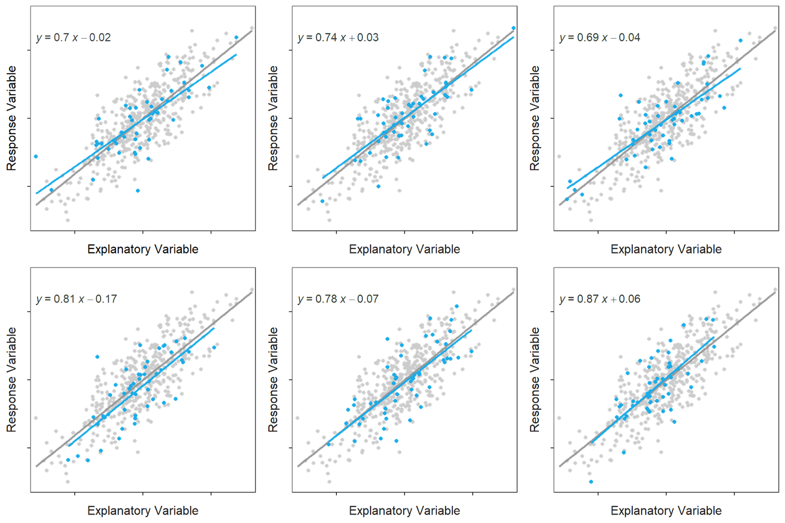
Figure 15.1: Scatterplot for a population of 500 points with the population line shown in gray. Each of 100 samples of 50 points and their respective best-fit line is shown in blue in each frame of the animation. Note how each sample produces a similar but ultimately different best-fit line.
Given the above, any statistic derived from the best-fit line – such as \(\hat{\alpha}\), \(\hat{\beta}\), and \(\hat{\mu}_{Y|X=x_{i}}\) introduced in Module 14 – will also be subject to sampling variability. Thus, to construct confidence intervals and perform hypothesis tests with these statistics we need to measure their standard error (SE).
In this module, a measurement for variability around the line is introduced and then used to derive SE for \(\hat{\alpha}\), \(\hat{\beta}\), and \(\hat{\mu}_{Y|X=x_{i}}\). These are then used to make inferences (confidence intervals and hypothesis tests) for \(\alpha\), \(\beta\), and \(\mu_{Y|X=x_{i}}\).
\(\hat{\alpha}\), \(\hat{\beta}\), and \(\hat{\mu}_{Y|X=x_{i}}\) are all subject to sampling variability.
15.1 Variability Around the Line
The SEs for statistics related to the best-fit line (i.e., \(\hat{\alpha}\), \(\hat{\beta}\), and \(\hat{\mu}_{Y|X=x_{i}}\)) depend on the variability of observations around the best-fit line. The variability of observations around the line can be visualized as an “envelope” that contains most of the observations (Figure 15.2). The “bigger” the envelope then the more variability among observations there is.
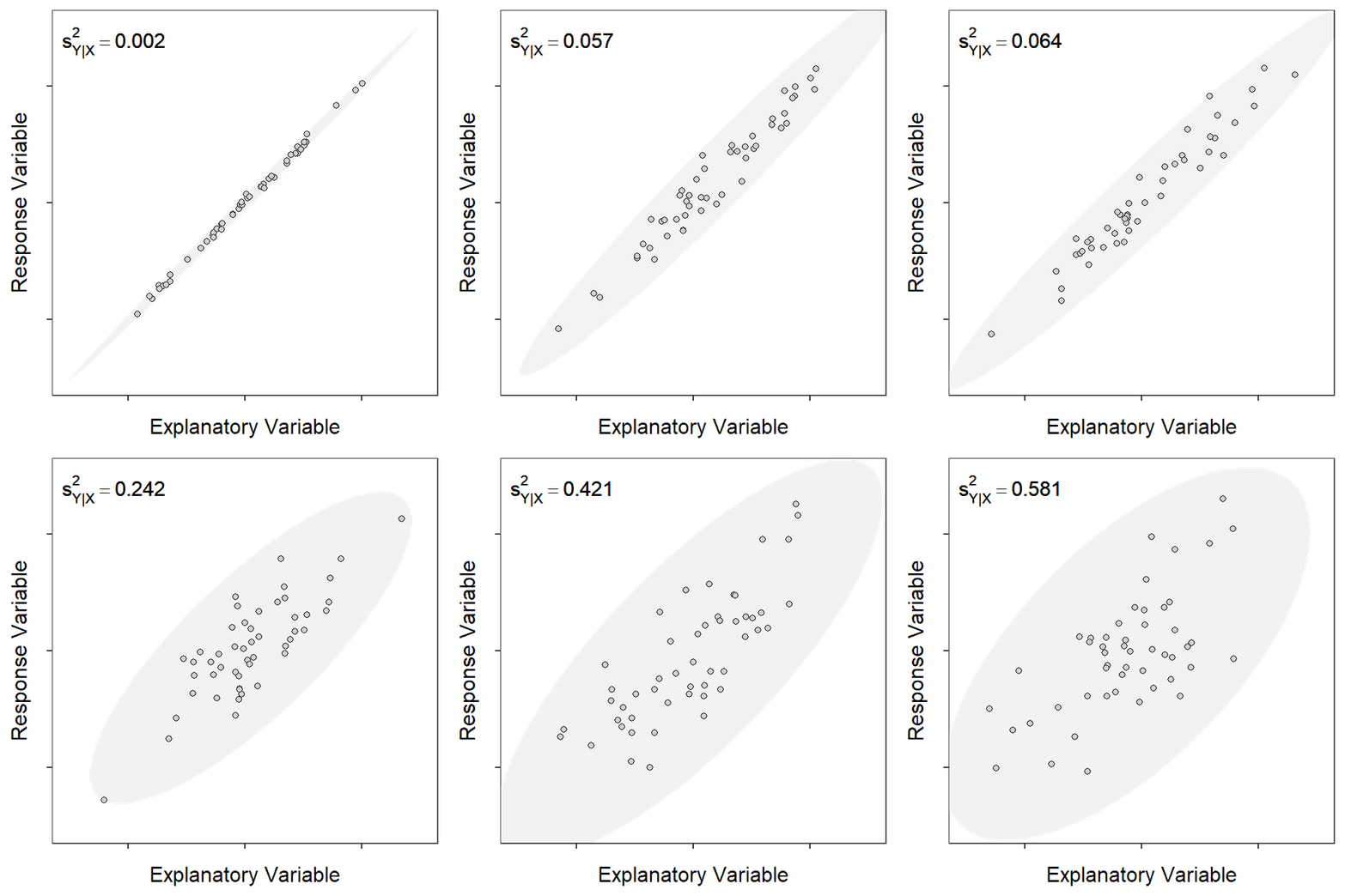
Figure 15.2: Scatterplot for different samples of 50 observations showing an ellipse that captures most of the points and the measure of natural variability around the line. Note how the measure increases with increasing spread of the observations (i.e., larger ellipse).
However, a more objective measure of variability around the line is needed. Recall from Section 14.2 that a residual measures the distance that an observation is from the line and the RSS is a synthetic measure of how far (in squared units) all individuals are from the line. Dividing the RSS by the corresponding df=\(n-2\) makes a mean-square, which is a true variance.73 Thus, the variance of individuals around the line is
\[ s^{2}_{Y|X} = \frac{RSS}{n-2} = \frac{\sum_{i=1}^{n}\left(y_{i}-\hat{\mu}_{Y|X=x_{i}}\right)^{2}}{n-2} \]
where \(s^{2}_{Y|X}\) is read as “the variance of \(Y\) at a given \(X\).” Because of the homoscedasticity assumption, which you are familiar with from your introductory statistics course but will be discussed in more detail in Module 17, this variance is the same for all values of \(X\) and, thus, \(s^{2}_{Y|X}\) can be interpreted as the “the variance of \(Y\) around the best-fit line.” It is seen in Figure 15.2 that \(s^{2}_{Y|X}\) increases as the variability of observations around the line increases.
The natural variability of individuals around the best-fit line is measured by \(s^{2}_{Y|X}\).
Intuitively, if there is more natural variability around the line, then the best-fit line from different samples will vary more, statistics from the different lines will vary more, and their SEs will be larger. This is the same principle you learned in your introductory statistics course – more natural variability (observations around the line) leads to more sampling variability (statistics related to the line).
The SEs of \(\hat{\alpha}\), \(\hat{\beta}\), and \(\hat{\mu}_{Y|X=x_{i}}\) are all positively related to \(s^{2}_{Y|X}\).
15.2 Slope
The sampling distribution of \(\hat{\beta}\) follows a normal distribution,74 is unbiased (so centered on \(\beta\)), and has a standard error of
\[ SE_{\hat{\beta}} = \sqrt{\frac{s^{2}_{Y|X}}{(n-1)s_{X}^{2}}} \]
Don’t memorize this formula; rather note how \(SE_{\hat{\beta}}\) increases with increasing \(s^{2}_{Y|X}\) but decreases with increasing \(n\) or \(s_{X}^{2}\).
Variability in the slope increases with increasing variability of observations around the line, decreases with increasing sample size, and decreases with increasing variability in the explanatory variable.
Hypotheses of the form
\[ \begin{split} H_{0}&: \beta = \beta_{0} \\ H_{A}&: \beta \neq \beta_{0} \end{split} \]
where \(\beta_{0}\) represents a specific value for \(\beta\) can be tested with a t test statistic of
\[ t=\frac{\hat{\beta}-\beta_{0}}{SE_{\hat{\beta}}} \]
which has \(n-2\) df. Familiarly, a confidence interval for \(\beta\) is constructed with \(\hat{\beta} \pm t^{*}SE_{\hat{\beta}}\).
The most common hypothesis to test in SLR is whether the slope is equal to zero or not. A slope of zero represents a “flat” best-fit line (Figure 15.3) which indicates that the mean of \(Y\) does not increase or decrease with increasing \(X\). If this is the case then \(Y\) and \(X\) are not related. Thus, testing \(H_{0}: \beta = 0\) versus \(H_{A}: \beta \ne 0\) is testing whether \(Y\) and \(X\) are statistically related or not – a key question in SLR!
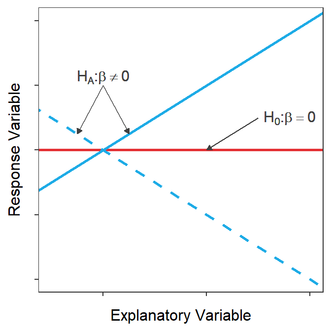
Figure 15.3: Demonstration of what the best-fit lines would like for the null hypothesis that the slope is zero or there is no relationship between Y and X (red) or the alternative hypothesis that the slope is not zero and there is a relationship between Y and X (blue). Note that two possibilities are shown for the alternative hypothesis because the slope could be positive (solid) or negative (dashed)
Testing that the slope of the best-fit line is 0 (or not) is the most important hypothesis test in SLR as it is the same as testing if the response and explanatory variables are related or not.
15.3 Intercept
The sampling distribution of \(\hat{\alpha}\) is normally distributed,75 unbiased (so centered on \(\alpha\)), and has a standard error of
\[ SE_{\hat{\alpha}} = \sqrt{s^{2}_{Y|X}\left(\frac{1}{n}+\frac{\overline{X}^{2}}{(n-1)s_{X}^{2}}\right)} \]
Again, don’t memorize this formula; rather note that \(SE_{\hat{\alpha}}\), as did \(SE_{\hat{\beta}}\), increases with \(s^{2}_{Y|X}\) but decreases with increasing \(n\) and \(s_{X}^{2}\). However, also note that \(SE_{\hat{\alpha}}\) increases with increasing \(\overline{X}\). This positive relationship between \(SE_{\hat{\alpha}}\) and \(\overline{X}\) indicates that \(\hat{\alpha}\) is more variable the further \(\overline{X}\) is from \(x=0\). In other words, \(\hat{\alpha}\) is more variable when the intercept is more of an extrapolation.
Variability in the intercept increases with increasing variability of observations around the line and increasing mean of the explanatory variable, but decreases with increasing sample size and increasing variability in the explanatory variable.
Hypotheses of the form
\[ \begin{split} H_{0}&: \alpha = \alpha_{0} \\ H_{A}&: \alpha \neq \alpha_{0} \end{split} \]
where \(\alpha_{0}\) represents a specific value for \(\alpha\) can be tested with a t test statistic of
\[ t=\frac{\hat{\alpha}-\alpha_{0}}{SE_{\hat{\alpha}}} \]
which has \(n-2\) df. Familiarly, a confidence interval for \(\alpha\) is constructed with \(\hat{\alpha} \pm t^{*}SE_{\hat{\alpha}}\).
A common automatically computed hypothesis test in SLR is whether the intercept is equal to zero or not. This effectively tests whether the best-fit line “goes” through the origin or not.76 This hypothesis is rarely of interest because the intercept is often either an extreme extrapolation (i.e., \(X=0\) is far from the observed values of \(X\)) or \(Y=0\) does not make sense for \(Y\). For example, both of these issues are illustrated by asking whether it makes sense to test if the mean gas mileage (\(Y\)) is 0 for a car that weighs (\(X\)) 0 lbs?
Testing if the y-intercept of the best-fit line (fit to raw data) is rarely of much interest as the intercept is often an extrapolation or a response value of 0 is non-sensical.
The y-intercept, and tests about the y-intercept, can be made more useful by centering the explanatory variable. A variable is centered by subtracting the mean from every observation of that variable. For example, a new variable \(X^{*}\) is constructed by centering \(X\); i.e., \(X^{*}=X-\overline{X}\). Centering \(X\) simply horizontally shifts the plot to being centered on \(X^{*}=0\) rather than on \(X=\overline{X}\) (Figure 15.4).
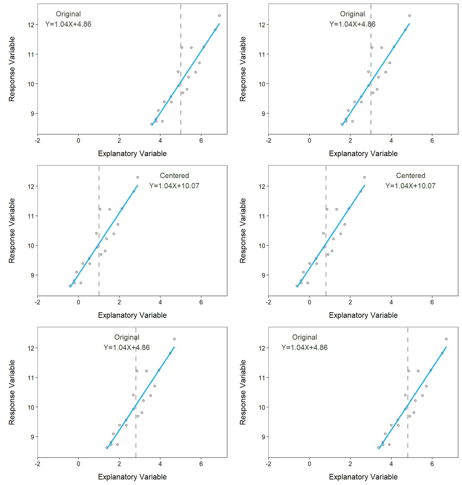
Figure 15.4: Example of centering the explanatory variable. The original data is centered on 5, whereas the centered data is centered on 0. The vertical dashed line highlights the mean value of ‘X’ for the original and centered data. Note how the intercept but not the slope of the equation changes after centering.
When examining Figure 15.4 note that the slope did not change because the general shape of the scatterplot is unchanged. However, the intercept changed dramatically because the intercept before centering was the mean value of \(Y\) when \(X\)=0 but after centering the intercept is the mean value of \(Y\) when \(X^{*}\)=0, which is the same as \(X=\overline{X}\). Thus, the intercept from the centered model is the mean value of \(Y\) at the mean value of \(X\). For example, the centered intercept would be the mean miles per gallon at the mean weight of cars. The intercept after centering is imminently interpretable!!
Despite this, it is not necessary in this course to center the explanatory variable unless you plan to interpret or perform a test with the intercept. Centering does have some added value in multiple linear regression and will be revisited when we learn Indicator Variable Regressions.
The intercept after centering the explanatory variable represents the mean value of the response variable when the original explanatory variable is equal to its mean. Thus, the interpretation of the centered intercept is always interpretable. The interpretation of the slope is unaffected by centering.
15.4 Slope and Intercept in R
As shown in Section 14.3 a concise table of the estimated intercept and slope with 95% confidence intervals for the Mount Everest temperature data is constructed as below.
lm1.ev <- lm(MeanAirTemp~Altitude,data=ev)
cbind(Est=coef(lm1.ev),confint(lm1.ev))
#R> Est 2.5 % 97.5 %
#R> (Intercept) 21.388856057 17.442040728 25.335671386
#R> Altitude -0.005634136 -0.006822147 -0.004446125While not discussed there, these confidence intervals were computed using \(SE_{\hat{\alpha}}\) and \(SE_{\hat{\beta}}\) and the confidence interval formulae discussed above.
More summary information may be extracted by submitting the saved lm() object to summary().
summary(lm1.ev)#R> Coefficients:
#R> Estimate Std. Error t value Pr(>|t|)
#R> (Intercept) 21.3888561 1.7447131 12.26 6.42e-07
#R> Altitude -0.0056341 0.0005252 -10.73 1.99e-06
#R>
#R> Residual standard error: 1.462 on 9 degrees of freedom
#R> Multiple R-squared: 0.9275, Adjusted R-squared: 0.9194
#R> F-statistic: 115.1 on 1 and 9 DF, p-value: 1.987e-06There are two portions of output from summary(). The top portion under “Coefficients:” contains information about the intercept in the row labeled “(Intercept)” and information about the slope in the row labeled with the name of the explanatory variable. Thus \(\hat{\alpha}\) (=21.39) and \(\hat{\beta}\) (=-0.0056) are under “Estimate” and the \(SE_{\hat{\alpha}}\) (=1.74) and \(SE_{\hat{\beta}}\) (=0.00053) are under “Std. Error.”
The values under “t value” and “Pr(>|t|)” are the t test statistic and corresponding p-value for testing that the corresponding parameter is equal to zero or not. Because the specific value in the tests is zero, the t test statistic shown here is simply the “Estimate” divided by the “Std. Error.” For example, the test statistic for testing \(H_{0}: \beta = 0\) versus \(H_{A}: \beta \ne 0\) is \(t=\frac{-0.0056}{0.0005}\) = -10.73. The corresponding p-value (0.000002) suggests that \(H_{0}\) should be rejected and one would conclude that there is a significant relationship between the actual mean air temperature and the altitude lapse rate.
The default p-values printed by most softwares are ONLY for the specific \(H_{0}\) that the corresponding parameter is equal to zero (vs. that it is not).
The remaining output from summary() is largely redundant with what will be discussed more thoroughly in Module 16. However, it should be noted that \(s_{Y|X}\) is given after “Residual standard error:” Thus, in this case, the standard deviation of observations around the best-fit line is 1.462. The variance of the observations around the best fit line (\(s_{Y|X}^{2}\)) discussed in Section 15.1 is this value squared or 1.4622=2.137.
15.5 Predicting Means
One of the major goals of linear regression is to use the best-fit line and a known value of the explanatory variable (generically labeled as \(x_{0}\)) to predict a future value of the response variable. This prediction is easily made by plugging \(x_{0}\) into the equation of the best-fit line for \(X\). Generically, this is
\[ \hat{\mu}_{Y|X=x_{0}} = \hat{\alpha} + \hat{\beta}x_{0} \]
Example predictions were made “by hand” and using predict() in R in Section 14.3.
These predictions are the best estimate of the mean response for all individuals with an explanatory variable of \(x_{0}\) – i.e., \(\hat{\mu}_{Y|X=x_{0}}\) and is called a fitted value because the best-fit line actually “fits” the mean values of \(Y\) at a given value of \(X\).
Fitted value: Predicted mean value of the response variable for all individuals with a given value of the explanatory variable – i.e., \(\hat{\mu}_{Y|X=x_{0}}\)
Fitted values have a sampling distributions that is normally distributed77 with a mean equal to \(\hat{\mu}_{Y|X=x_{0}}\) and a standard error of
\[ \text{SE}_{\text{fits}} = \sqrt{s_{Y|X}^{2}\left(\frac{1}{n}+\frac{\left(x_{0}-\bar{X}\right)^{2}}{(n-1)s_{x}^{2}}\right)} \]
Once again, don’t memorize this formula but again note that \(\text{SE}_{\text{fits}}\) increases with increasing \(s_{Y|X}^{2}\) and decreases with increasing \(n\) and \(s_{x}^{2}\). However, also note that the \(\text{SE}_{\text{fits}}\) increases as \(x_{0}\) is further from \(\overline{X}\). In other words, there is more variability in predicting the mean of \(Y\) for values of \(X\) further from the mean of \(X\). Thus, the most precise prediction of the mean of \(Y\) is made when \(X=\overline{X}\).
A confidence interval for \(\mu_{Y|X=x_{0}}\) is computed with \(\hat{\mu}_{Y|X=x_{0}}\pm t^{*}\text{SE}_{\text{fits}}\). Computing this confidence interval for all values of \(x_{0}\) and plotting it produces what is called a confidence band (Figure 15.5). Confidence bands will always have a “saddle shape” because, as stated above, the prediction of \(\mu_{Y|X=x_{0}}\) is always most precise (narrowest) when \(X=\overline{X}\).
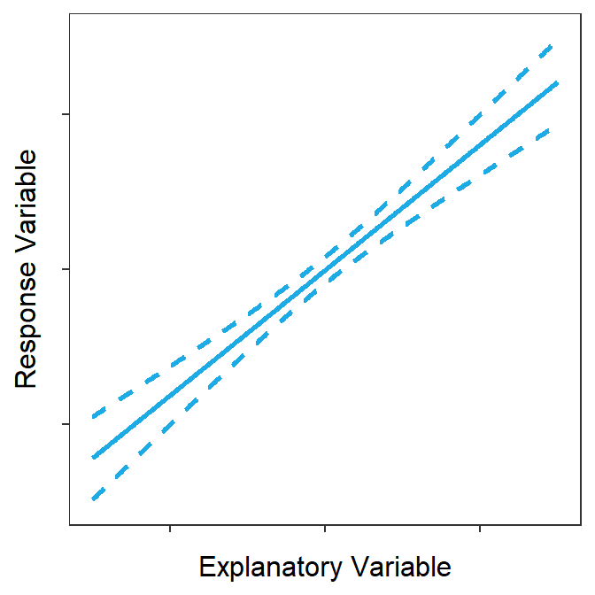
Figure 15.5: Confidence bands around a best-fit line.
The confidence band shown in Figure 15.5 is a 95% “confidence interval” related to the placement of the line. To demonstrate this, lines from 100 random samples from the same population are plotted in Figure 15.6 along with the confidence band from Figure 15.5. At the end of this animation, it is evident that most (95%-ish) of the random regression lines were contained within the 95% confidence band.
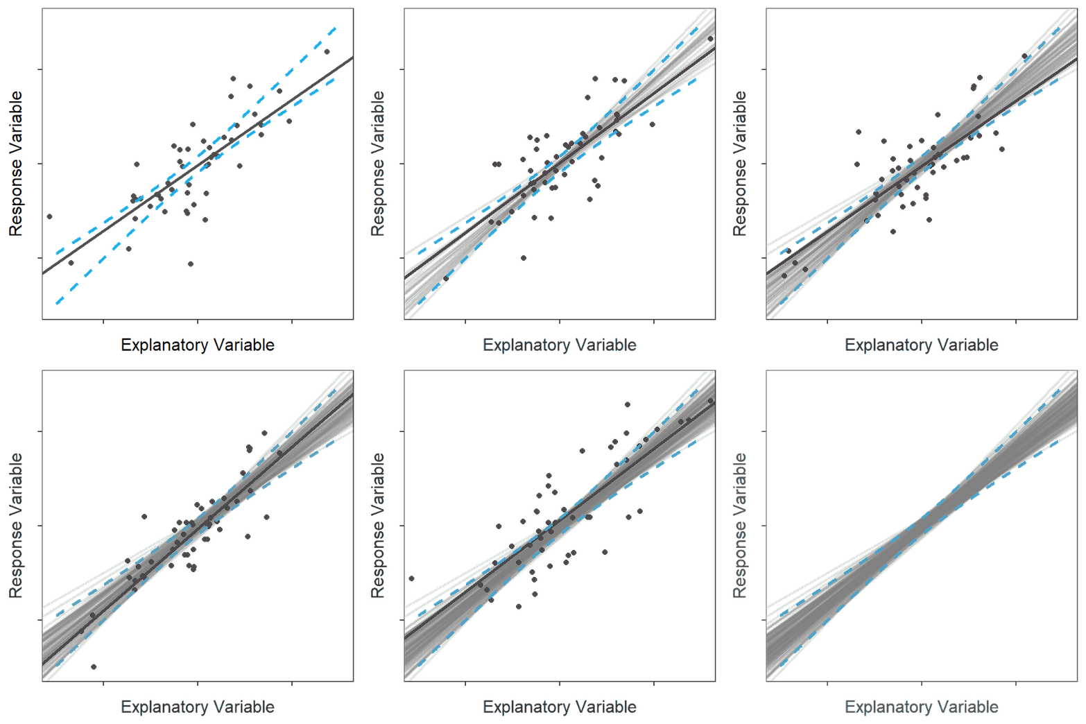
Figure 15.6: Animation of 100 samples with corresponding regression lines and how most of the regression lines fit within the confidence bands shown in the previous figure.
Confidence bands are built from \(\text{SE}_{\text{fits}}\) and are confidence intervals for \(\mu_{Y|X=x_{0}}\) and “the placement of the best-fit line.”
15.6 Predicting Individuals
In addition to predicting the mean value of the response for all individuals with a given value of the explanatory variable, it is common to predict the value of the response for an individual. Given that our best guess for an individual is that they “are average,” this prediction is the same as that used for the mean, but will be labeled as \(\hat{Y}|X=x_{0}\) to help keep it separate. This second objective (predict the individual) is called finding a predicted value.
Predicted value: Predicted value of the response variable for an individual with a given value of the explanatory variable. – i.e., \(\hat{Y}|X=x_{0}\)
Predicted values have a sampling distribution that is normally distributed78 with a mean equal to \(\hat{Y}|X=x_{0}\) and a standard error of
\[ \text{SE}_{\text{prediction}} = \sqrt{s_{Y|X}^{2}\left(\frac{1}{n}+\frac{\left(x_{0}-\bar{X}\right)^{2}}{(n-1)s_{x}^{2}}\right)+s_{Y|X}^{2}} \]
This formula has two parts separated at the second plus sign. The first part in front of the plus sign is exactly the same as \(\text{SE}_{\text{fits}}\) and represents variability in placement of the line. The second part is \(s_{Y|X}^{2}\) and represents variability of individuals around the line. Thus, variability in predicting an individual consists of variability in placing the line AND then variability of individuals around that line.
A confidence interval for \(Y|X=x_{0}\) is computed with \(\hat{Y}|X=x_{0}\pm t^{*}\text{SE}_{\text{prediction}}\), but is called a prediction interval to keep it distinct from the prediction of the mean response. Computing this prediction interval for all values of \(x_{0}\) and plotting it produces what is called a prediction band (Figure 15.7). Prediction bands will always have a “saddle shape” from “predicting the line placement” and will be wider than the confidence bands because of the added variability of predicting an individual.
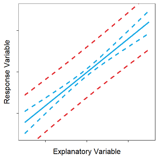
Figure 15.7: Prediction (red) and confidence bands (blue) around a best-fit line.
The prediction band shown in Figure 15.7 is a 95% “confidence interval” related to the placement of points. To demonstrate this, points and lines from 100 random samples from the same population are plotted in Figure 15.879 along with the prediction band from Figure 15.7. At the end of this animation, it is evident that most (95%-ish) of the random points were contained within the 95% prediction band.
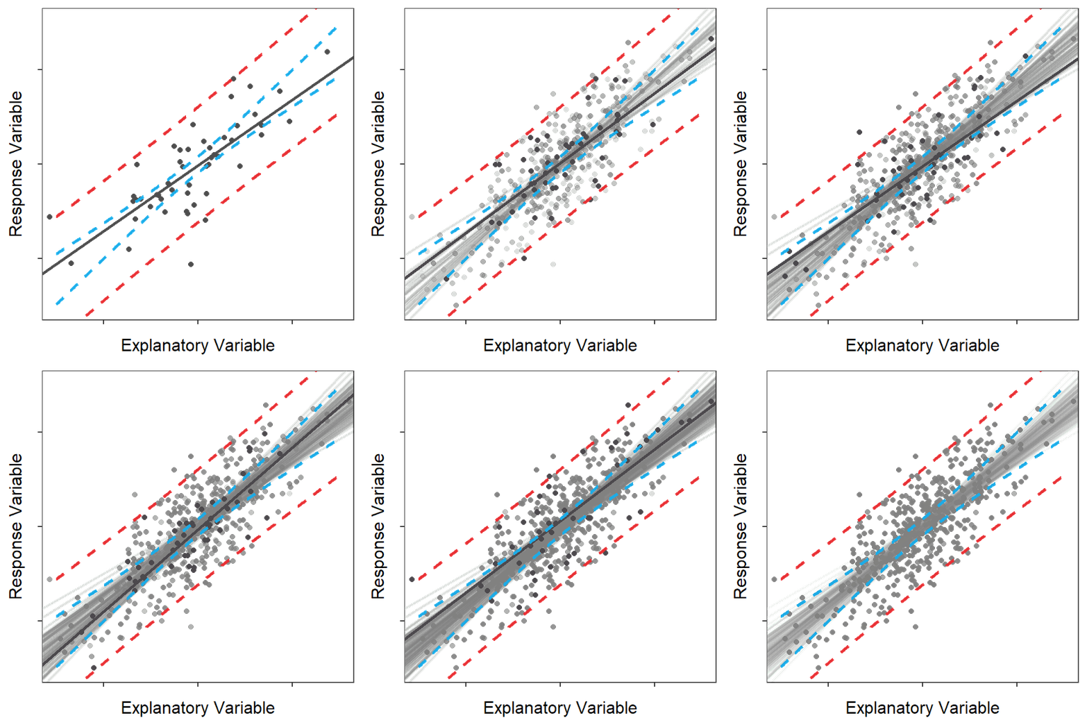
Figure 15.8: Animation of 100 samples with corresponding regression lines and points and how most of the points fit within the prediction bands shown in the previous figure.
Prediction bands are built from \(\text{SE}_{\text{prediction}}\) and are confidence intervals for \(Y|X=x_{0}\) and “the placement of individuals around the best-fit line.”
\(\text{SE}_{\text{fits}}\) measures only sampling variability related to predicting the mean value of the response variable at a given value of the explanatory variable. \(\text{SE}_{\text{prediction}}\) measures both sampling variability related to predicting the mean value of the response variable and natural variability related to predicting an individual’s difference from that mean.
Finally, note that making a prediction (i.e., plugging a value of \(X\) into the equation of a best-fit line) is simultaneously a prediction of (1) the mean value of the response variable for all individuals with a given value of the explanatory variable and (2) the value of the response variable for an individual with a given value of the explanatory variable. The difference is that the confidence interval for the mean value is narrower than the prediction interval for the individual.
15.7 Predictions in R
As shown in Section 14.3 a prediction can be made in R with predict() using the saved lm() object as the first argument and a data.frame with the value of the explanatory variable set equal to the name of the explanatory variable in the lm() object. A confidence or prediction interval can be constructed by including interval="confidence" or interval="prediction", respectively.
nd <- data.frame(Altitude=2552)  # create data.frame first to save typing
predict(lm1.ev,newdata=nd,interval="confidence")
#R> fit lwr upr
#R> 1 7.010541 5.740331 8.28075predict(lm1.ev,newdata=nd,interval="prediction")#R> fit lwr upr
#R> 1 7.010541 3.468216 10.55287Thus, one is 95% confident that the mean actual mean air temperature is between 5.74 and 8.28oC for all stations when the altitude lapse rate is 2552 C/km. In contrast one is 95% confident that the actual mean air temperature is between 3.47 and 10.55oC for a station when the altitude lapse rate is 2552 C/km.
Note that multiple predictions can be made at once by including more values in the data frame given to predict().
nd <- data.frame(Altitude=c(2552,3000))
predict(lm1.ev,newdata=nd,interval="confidence")
#R> fit lwr upr
#R> 1 7.010541 5.740331 8.280750
#R> 2 4.486448 3.457386 5.515509predict(lm1.ev,newdata=nd,interval="prediction")#R> fit lwr upr
#R> 1 7.010541 3.468216 10.552866
#R> 2 4.486448 1.023270 7.949626The confidence band can be added to the scatterplot with the best-fit line (as shown in Section 14.3) by leaving off se=FALSE in geom_smooth(). Use color= to change the color of the best-fit line and fill= to change the color of the confidence band (if so desired).
ggplot(data=ev,mapping=aes(x=Altitude,y=MeanAirTemp)) +
  geom_point(pch=21,color="black",fill="lightgray") +
  labs(x="Altitude Lapse Rate (C/km)",y="Mean Air Temperature (C)") +
  theme_NCStats() +
  geom_smooth(method="lm",color="black",fill="lightgray")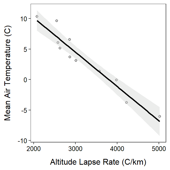
Scatterplots depicting the best-fit line should usually be augmented with the confidence band.
Adding the prediction bands is more work because it is not automatically computed within any geom_.
Here this means the mathematical origin where (\(X\),\(Y\))=(0,0).↩︎