Module 5 Univariate EDA
5.1 Quantitative Variable
A univariate Exploratory Data Analysis (EDA) for a quantitative variable is concerned with describing the distribution of values for that variable; i.e., describing what values occurred and how often those values occurred. Specifically, the distribution is described with these four attributes:
- shape of the distribution,
- presence of outliers,
- center of the distribution, and
- dispersion of the distribution.
Graphs are used to identify shape and the presence of outliers and to get a general feel for center and dispersion. Numerical summaries, however, are used to specifically describe center and dispersion of the variable. Computing and constructing the required numerical and graphical summaries was described in Module 4. Those summaries are interpreted here to provide an overall description of the distribution of the quantitative variable.
The same two data sets used in Module 4 are used here.
- Number of open pit mines in countries with open pit mines (Table 4.1).
- Richter scale recordings for 15 major earthquakes (Table 4.2).
5.1.1 Interpreting Shape
A distribution has two tails – a left-tail of smaller or more negative values and a right-tail of larger or more positive values (Figure 5.1). The relative appearance of the tails is used to identify the shape of a distribution. If the left- and right-tail are approximately equal in length and height, then the distribution is approximately symmetric. If the left-tail is stretched out or is longer and flatter than the right-tail, then the distribution is left-skewed. If the right-tail is stretched out or is longer and flatter than the left-tail, then the distribution is right-skewed.30
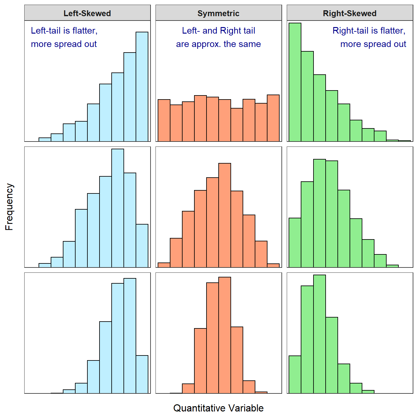
Figure 5.1: Examples of left-skewed, approximately symmetric, and right-skewed histograms. The skewed distributions are more skewed in the top row and less skewed in the bottom row.
The longer tail defines the type of skew; a longer right-tail means the distribution is right-skewed and a longer left-tail means it is left-skewed.
In practice, these labels form a continuum (Figure 5.1). For example, it may be difficult to discern whether the shape is approximately symmetric or skewed. To partially address this issue, “slightly” or “strongly” may be used with “skewed” to distinguish whether the distribution is obviously skewed (i.e., “strongly skewed”) or nearly symmetric (i.e., “slightly skewed”).
Shape terms may be modified with “approximately,” “slightly,” or “strongly.”
A distribution is bimodal if there are two distinct peaks (Figure 5.2). The shape may be “bimodal left-skewed” if the left peak is shorter, “bimodal symmetric” if the two peaks are the same height, or “bimodal right-skewed” if the right peak is shorter.
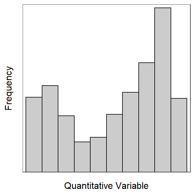
Figure 5.2: Example of a bimodal left-skewed histograms.
Shape may be identified from a histogram or a boxplot (Figure 5.3). Shape is most easily determined from a histogram, as you can focus simply on the “longest” tail. With boxplots, one must examine the relative length from the median to Q1 and the median to Q3 (i.e., the position of the median line in the box). If the distribution is left-skewed (i.e., lesser-valued individuals are “spread out”), then the median-Q1 will be greater than Q3-median. In contrast, if the distribution is right-skewed (i.e., larger-valued individuals are spread out), then the Q3-median will be greater than median-Q1. Thus, the median is nearer the top of the box for a left-skewed distribution, nearer the bottom of the box for a right-skewed distribution, and nearer the center of the box for a symmetric distribution (Figure 5.3).
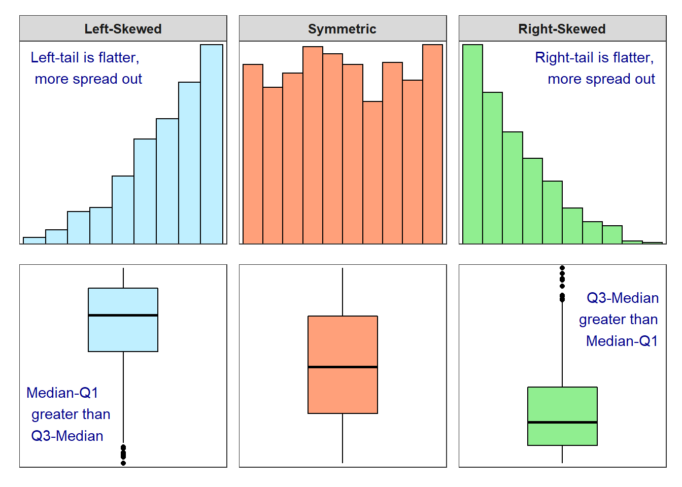
Figure 5.3: Histograms and boxplots for several different shapes of distributions.
Shape is easier to describe from a histogram than a boxplot.
5.1.2 Interpreting Outliers
An outlier is an individual whose value is widely separated from the main cluster of values in the sample. On histograms, outliers appear as bars that are separated from the main cluster of bars by “white space” or areas with no bars (Figure 5.4). In general, outliers must be on the margins of the histogram, should be separated by one or two missing bars, and should only be one or two individuals.
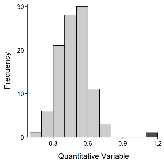
Figure 5.4: Example histogram with an outlier to the right (dark gray).
An outlier may be a result of human error in the sampling process and, thus, it should be corrected or removed. Other times an outlier may be an individual that was not part of the population of interest – e.g., an adult animal that was sampled when only immature animals were being considered – and, thus, it should be removed from the sample. Still other times, an outlier is part of the population and should generally not be removed from the sample. In fact you may wish to highlight an outlier as an interesting observation! Regardless, it is important to construct a histogram to determine if outliers are present or not.
Don’t let outliers completely influence how you define the shape of a distribution. For example, if the main cluster of values is approximately symmetric and there is one outlier to the right of the main cluster (as illustrated in Figure 5.4), DON’T call the distribution right-skewed. You should describe this distribution as approximately symmetric with an outlier to the right.
- Not all outliers warrant removal from your sample.
- Don’t let outliers completely influence how you define the shape of a distribution.
5.1.3 Comparing the Median and Mean
As mentioned previously, numerical measures will be used to describe the center and dispersion of a distribution. However, which values should be used? Should one use the mean or the median as a measure of center? Should one use the IQR or the standard deviation as a measure of dispersion? Which measures are used depends on how the measures respond to skew and the presence of outliers. Thus, before stating a rule for which measures should be used, a fundamental difference among the measures discussed in Module 4 is explored here.
The following discussion is focused on comparing the mean and the median. However, note that the IQR is fundamentally linked to the median (i.e., to find the IQR, the median must first be found) and the standard deviation is fundamentally linked to the mean (i.e., to find the standard deviation, the mean must first be found). Thus, the median and IQR will always be used together to measure center and dispersion, as will the mean and standard deviation.
The mean and median measure center differently. The median balances the number of individuals smaller and larger than it. The mean, on the other hand, balances the sum of the distances to all points smaller than it and the sum of the distances to all points greater than it. Thus, the median is primarily concerned with the position of the value rather than the value itself, whereas the mean is concerned with the values for each individual (i.e., the values are used to find the “distance” from the mean).
A plot of the Richter scale data against the corresponding ordered individual numbers is shown in Figure 5.5-Top. The median (blue line) is the Richter scale value that corresponds to the middle position (i.e., move right from the individual number until the point is intercepted and then move down to the x-axis). Thus, the median (blue line) has the same number of individuals (i.e., points) above and below it. In contrast, the mean finds the Richter scale value that has the same total distance to values below it as total distance to values above it. In other words, the mean (vertical red line) is placed such that the total length of the horizontal dashed red lines (distances from mean to point) is the same to the left as to the right.
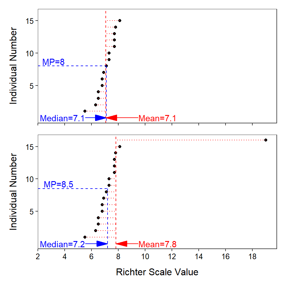
Figure 5.5: Plot of the individual number versus Richter scale values for the original earthquake data (Top) and the earthquake data with an extreme outlier (Bottom). The median value is shown as a blue vertical line and the mean value is shown as a red vertical line. Differences between each individual value and the mean value are shown with horizontal red lines.
- The actual values of the data (beyond ordering data) are not considered when calculating the median; whereas the actual values are considered when calculating the mean.
- The mean balances the distance to individuals above and below the mean. The median balances the number of individuals above and below the median.
- The sum of all differences between individual values and the mean equals zero.
The mean and median differ in their sensitivity to outliers (Figure 5.5). For example, suppose that an incredible earthquake with a Richter Scale value of 19.0 was added to the earthquake data set. With this additional individual, the median increases only from 7.1 to 7.2, but the mean increases from 7.1 to 7.8. The outlier impacts the value of the mean more than the value of the median because of the way that each statistic measures center. The mean will be pulled towards an outlier because it must “put” many values on the “side” of the mean away from the outlier so that the sum of the differences to the larger values and the sum of the differences to the smaller values will be equal. In this example, the outlier creates a large difference to the right of the mean such that the mean has to “move” to the right to make this difference smaller, move more individuals to the left side of the mean, and increase the differences of individuals to the left of the mean to balance this one large individual. The median on the other hand will simply “put” one more individual on the side opposite of the outlier because it balances the number of individuals on each side of it. Thus, the median has to move very little to the right to accomplish this balance.
The mean is more sensitive (i.e., changes more) to outliers than the median; it will be “pulled” towards the outlier more than the median.
The shape of the distribution, even if outliers are not present, also has an impact on the mean and median (Figure 5.6). If a distribution is approximately symmetric, then the median and mean (along with the mode) will be nearly identical. If the distribution is left-skewed, then the mean will be less than the median. Finally, if the distribution is right-skewed, then the mean will be greater than the median.
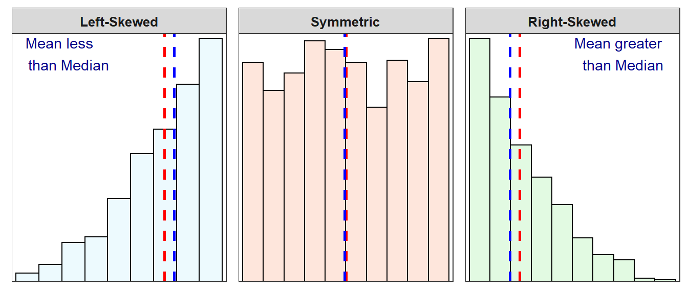
Figure 5.6: Three histograms with vertical dashed lines marking the median (blue) and the mean (red).
The mean is pulled towards the long tail of a skewed distribution. Thus, the mean is greater than the median for right-skewed distributions and the mean is less than the median for left-skewed distributions.
As shown above, the mean and median measure center differently. The question now becomes “which measure of center is better?” The median is a “better” measure of center when outliers are present. In addition, the median gives a better measure of a typical individual when the data are skewed. Thus, in this course, the median is used when outliers are present or the distribution of the data is skewed. If the distribution is symmetric, then the purpose of the analysis will dictate which measure of center is “better.” However, in this course, use the mean when the data are symmetric or, at least, not strongly skewed.
As noted above, the IQR and standard deviation behave similarly to the median and mean, respectively, in the face of outliers and skews. Specifically, the IQR is less sensitive to outliers than the standard deviation.
In this course, center and dispersion will be measured by the median and IQR if outliers are present or the distribution is more than slightly skewed, and the mean and standard deviation will be used if no outliers are present and the distribution is symmetric or only slightly skewed.
5.1.4 Synthetic Interpretations
The graphical and numerical summaries from Module 4 and the rationale described above can be used to construct a synthetic description of the shape, outliers, center, and dispersion of the distribution of a quantitative variable. In the examples below specifically note that
- shape and outliers are described from the histogram,
- center and dispersion are described ONLY from the mean and standard deviation OR the median and IQR,
- the specific position of outliers (if present) is explained,
- an explanation is given for why either the median and IQR or the mean and standard deviation were used, and
- the range was not used alone as a measure of dispersion.
5.1.4.1 Number of Open Pit Mines
Construct a proper EDA for the number of open pit mines in countries that have open pit mines as summarized in Table 5.1 and Figure 5.7.
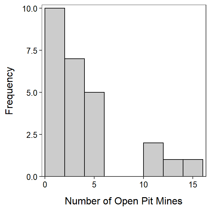
Figure 5.7: Histogram of number of open pit mines in countries with open pit mines.
| n | mean | sd | min | Q1 | median | Q3 | max |
|---|---|---|---|---|---|---|---|
| 26 | 3.62 | 3.97 | 1 | 1 | 2 | 4 | 15 |
The number of open pit mines in countries with open pit mines is strongly right-skewed with no outliers present (Figure 5.7). [I did not call the group of four countries with 10 or more open pit mines outliers because there were more than one or two countries there.] The center of the distribution is best measured by the median, which is 2 (Table 5.1). The range of open pit mines in the sample is from 1 to 15 while the dispersion as measured by the inter-quartile range (IQR) from a Q1 of 1.0 to a Q3 of 4.0 (Table 5.1). I chose to use the median and IQR because the distribution was strongly skewed.
5.1.4.2 Lake Superior Ice Cover
Thoroughly describe the distribution of number of days of ice cover at ice gauge station 9004 in Lake Superior from Figure 5.8 and Table 5.2.
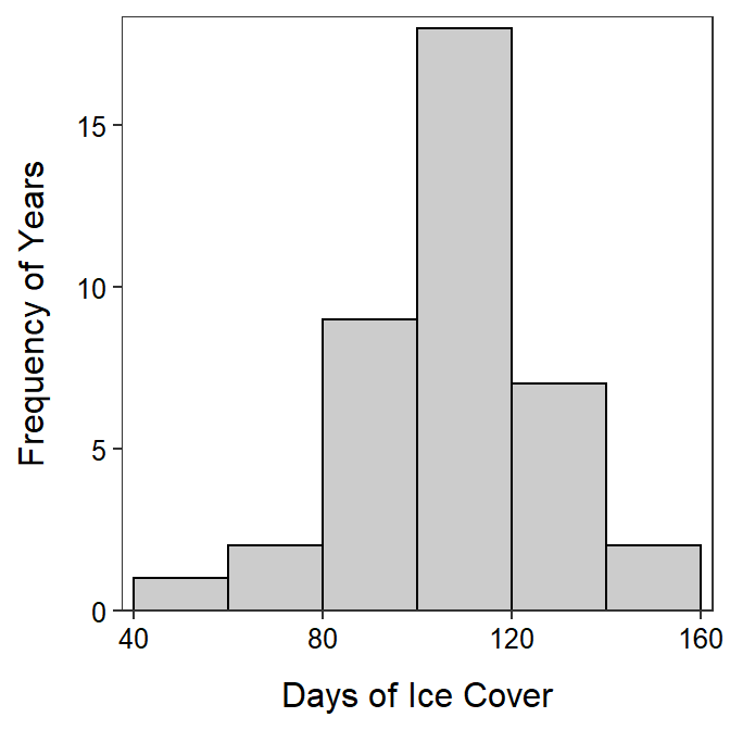
Figure 5.8: Histogram of number of days of ice cover at ice gauge 9004 in Lake Superior.
| n | nvalid | mean | sd | min | Q1 | median | Q3 | max |
|---|---|---|---|---|---|---|---|---|
| 42 | 39 | 107.8 | 21.6 | 48 | 97 | 114 | 118 | 146 |
The shape of number of days of ice cover at gauge 9004 in Lake Superior is approximately symmetric with no obvious outliers (Figure 5.8). The center is at a mean of 107.8 days and the dispersion is a standard deviation of 21.6 days (Table 5.2). The mean and standard deviation were used because the distribution was not strongly skewed and no outlier was present.
5.1.4.3 Crayfish Temperature Selection
Peck (1985) examined the temperature selection of dominant and subdominant crayfish (Orconectes virilis) together in an artificial stream. The temperature (oC) selection by the dominant crayfish in the presence of subdominant crayfish in these experiments was recorded below. Thoroughly describe all aspects of the distribution of selected temperatures from Figure 5.9 and Table 5.3.
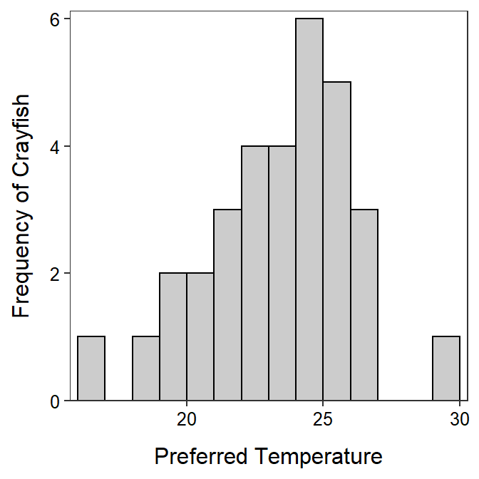
Figure 5.9: Histogram of crayfish temperature preferences.
| n | mean | sd | min | Q1 | median | Q3 | max |
|---|---|---|---|---|---|---|---|
| 32 | 22.88 | 2.79 | 16 | 21 | 23 | 25 | 30 |
The shape of temperatures selected by the dominant crayfish is slightly left-skewed (Figure 5.9) with a possible weak outlier at the maximum value of 30oC (Table 5.3). The center is best measured by the median, which is 23oC (Table 5.3) and the dispersion is best measured by the IQR, which is from 21 to 25oC (Table 5.3). I used the median and IQR because of the (combined) skewed shape and outlier present.
5.2 Categorical Variable
An appropriate EDA for a categorical variable consists of identifying the major characteristics among the categories. Shape, center, dispersion, and outliers are NOT described for categorical data because the data is not numerical and, if nominal, no order exists. In general, the major characteristics of the table or graph are described from an intuitive basis; the numerical values in the graph or table are not simply repeated.
Do NOT describe shape, center, dispersion, and outliers for a categorical variable.
5.2.1 Example Interpretations
5.2.1.1 Mixture Seed Count
A bag of seeds was purchased for seeding a recently constructed wetland. The purchaser wanted to determine if the percentage of seeds in four broad categories – “grasses,” “sedges,” “wildflowers,” and “legumes” – was similar to what the seed manufacturer advertised. The purchaser examined a 0.25-lb sample of seeds from the bag and displayed the results in Figure 5.10. Use these results to describe the distribution of seed counts into the four broad categories.
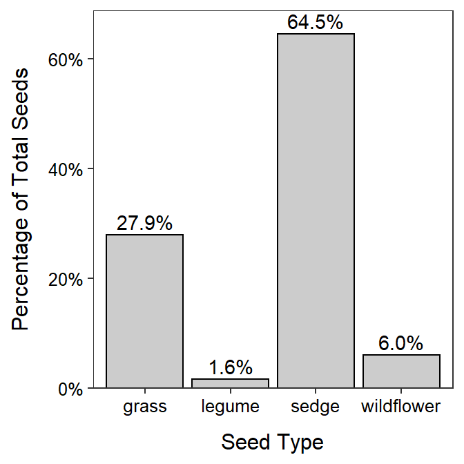
Figure 5.10: Bar chart of the percentage of wetland seeds by type.
The majority of seeds were either sedge or grass, with sedge being more than twice as abundant as grass (Figure 5.10). Very few legumes or wildflowers were found in the sample.
5.2.1.2 GSS Recycling
The General Sociological Survey (GSS) is a very large survey that has been administered 25 times since 1972. The purpose of the GSS is to gather data on contemporary American society in order to monitor and explain trends in attitudes, behaviors, and attributes. One question that was asked in a recent GSS was “How often do you make a special effort to sort glass or cans or plastic or papers and so on for recycling?” The results are displayed in Figure 5.11 and Table 5.4. Use these results to describe the distribution of answers to the question.
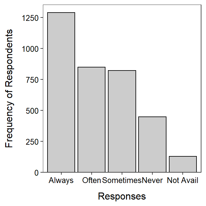
Figure 5.11: Barplot of the percentage of wetland seeds by type.
| Always | Often | Sometimes | Never | Not Avail |
|---|---|---|---|---|
| 1289 | 850 | 823 | 448 | 129 |
More than twice as many respondents always recycled compared to never recycled, with approximately equal numbers in between that often or sometimes recycled.
Some people use “negatively skewed” instead of “left-skewed” and “positively skewed” instead of “right-skewed.” When using these think that “left” means more towards “negaive” values and “right” means more towards “positive” values.↩︎