Module 9 Linear Regression
Linear regression analysis is used to model the relationship between two quantitative variables for two related purposes:
- explaining variability in the response variable and
- predicting future values of the response variable.
Examples include predicting future sales of a product from its price, family expenditures on recreation from family income, an animal’s food consumption in relation to ambient temperature, and a person’s score on a German assessment test based on how many years the person studied German.
Exact predictions cannot be made because of natural variability. For example, two people with the same intake of mercury (from consumption of fish) will likely not have the same level of mercury in their blood stream. Thus, the best that can be accomplished is to predict the average or expected value for a person with a particular intake value. This is accomplished by finding the line that best “fits” the points on a scatterplot of the data and using that line to make predictions. Finding and using the “best-fit” line is the topic of this module.
9.1 Response and Explanatory Variables
Recall from Section 8.1 that the response (or dependent) variable is the variable to be predicted or explained and the explanatory (or independent) variable is the variable that will help do the predicting or explaining. In the examples mentioned above, future sales, family expenditures on recreation, the animal’s food consumption, and score on the assessment test are response variables and product price, family income, temperature, and years studying German are explanatory variables, respectively. The response variable is on the y-axis and the explanatory variable is on the x-axis of scatterplots.
9.2 Slope and Intercept
The equation of a line is commonly expressed as,
\[ y = m\times x + b \]
where both \(x\) and \(y\) are variables, \(m\) represents the slope of the line, and \(b\) represents the y-intercept.38 It is important that you can look at the equation of a line and identify the response variable, explanatory variable, slope, and intercept. The response variable will always appear by itself on the left side of the equation. The explanatory variable (e.g., \(x\)) will be on the right side of the equation and will be multiplied by the slope. The value or symbol by itself on the right side of the equation is the intercept. For example, in
\[ \text{blood} = 0.579\times\text{intake}+3.501 \]
blood is the response variable, intake is the explanatory variable, 0.579 is the slope (it is multiplied by the explanatory variable), and 3.501 is the intercept (it is not multiplied by anything on the right side). The same conclusions would be made if the equation had been written as
\[ \text{blood} = 3.501 + 0.579\times\text{intake} \]
In the equation of a line, the slope is always multiplied by the explanatory variable and the intercept is always by itself.
In addition to being able to identify the slope and intercept of a line you also need to be able to interpret these values. Most students define the slope as “rise over run” and the intercept as “where the line crosses the y-axis.” These “definitions” are loose geometric representations. For our purposes, the slope and intercept must be more strictly defined.
To define the slope, first think of “plugging” two values of intake into the equation discussed above. For example, if intake=100, then blood=3.501+0.579×100=61.401 and if intake is one unit larger at 101, then blood=3.501+0.579×101=61.980.39 The difference between these two values is 61.980-61.401=0.579, which is the same as the slope. Thus, the slope is the change in the AVERAGE value of the response variable FOR A SINGLE UNIT CHANGE in the value of the explanatory variable (Figure 9.1). That is, mercury in the blood changes 0.579 units FOR A SINGLE UNIT CHANGE in mercury intake, ON AVERAGE. So, if an individual increases mercury intake by one unit, then mercury in the blood will increase by 0.579 units, ON AVERAGE. Alternatively, if one individual has one more unit of mercury intake than another individual, then the first individual will have 0.579 more units of mercury in their blood, ON AVERAGE.
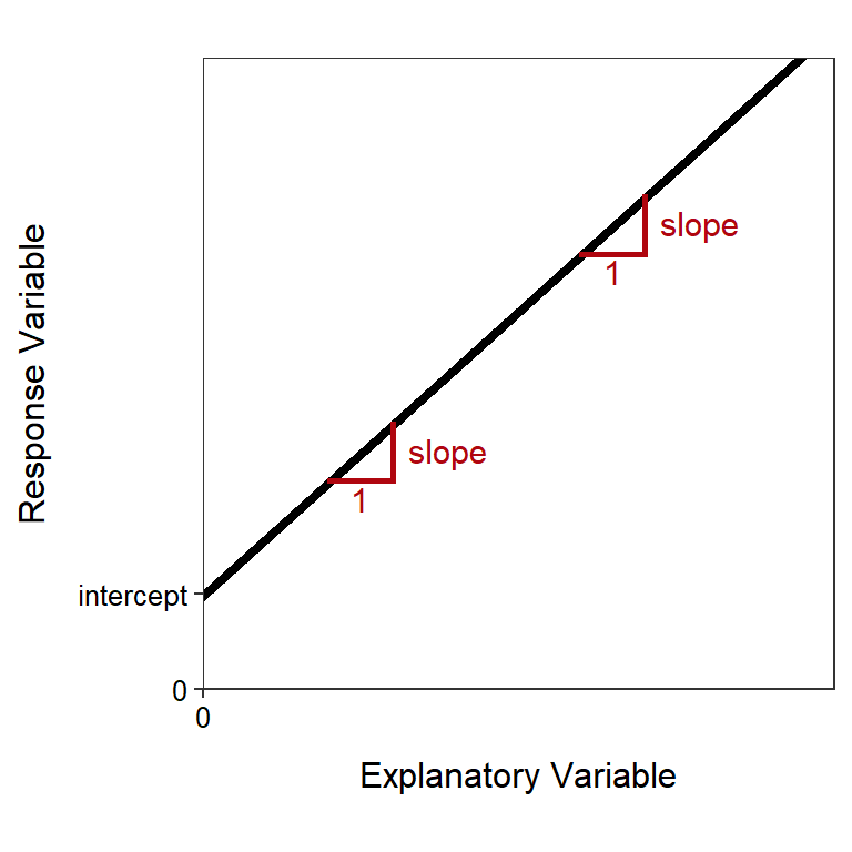
Figure 9.1: Schematic representation of the meaning of the intercept and slope in a linear equation.
To define the intercept, first “plug” intake=0 into the equation discussed above; i.e., blood=3.501+0.579×0 = 3.501. Thus, the intercept is the value of the response variable when the explanatory variable is equal to zero (Figure 9.1). In this example, the AVERAGE mercury in the blood for an individual with no mercury intake is 3.501. Many times, as is true with this example, the interpretation of the intercept will be nonsensical. This is because x=0 will likely be outside the range of the data collected and, perhaps, outside the range of possible data that could be collected.
The equation of the line is a model for the relationship depicted in a scatterplot. Thus, the interpretations for the slope and intercept represent the average change or the average response variable. Thus, whenever a slope or intercept is being interpreted it must be noted that the result is an average or on average.
9.3 Predictions
Once a best-fit line has been identified (criteria for doing so is discussed in Section 9.5), the equation of the line can be used to predict the average value of the response variable for individuals with a particular value of the explanatory variable. For example, the best-fit line for the mercury data shown in Figure 9.2 is
\[ \text{blood} = 3.501 + 0.579\times\text{intake} \]
Thus, the predicated average level of mercury in the blood for an individual that consumed 240 ug HG/day is found with
\[ \text{blood} = 3.501 + 0.579\times240 = 142.461 \]
Similarly, the predicted average level of mercury in the blood for an individual that consumed 575 ug HG/day is found with
\[ \text{blood} = 3.501 + 0.579\times575 = 336.426 \]
A prediction may be visualized by finding the value of the explanatory variable on the x-axis, drawing a vertical line until the best-fit line is reached, and then drawing a horizontal line over to the y-axis where the value of the response variable is read (Figure 9.2).
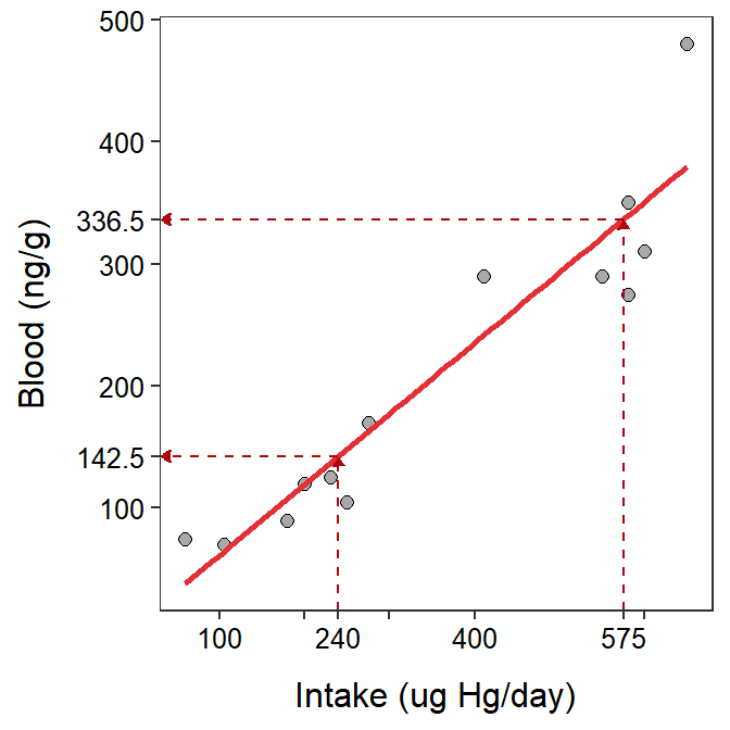
Figure 9.2: Scatterplot between the intake of mercury in fish and the mercury in the blood stream of individuals with superimposed best-fit regression line illustrating predictions for two values of mercury intake.
When predicting values of the response variable, it is important to not extrapolate beyond the range of the data. In other words, predictions with values outside the range of observed values of the explanatory variable are an extrapolation and should be made cautiously (if at all). An excellent example would be to consider height “data” collected during the early parts of a human’s life (say the first ten years). During these early years there is likely a good fit between height (the response variable) and age. However, using this relationship to predict an individual’s height at age 40 would likely result in a ridiculous answer (e.g., over ten feet). The problem here is that the linear relationship only holds for the observed data (i.e., the first ten years of life); it is not known if the same linear relationship exists outside that range of years. In fact, with human heights, it is generally known that growth first slows, eventually quits, and may, at very old ages, actually decline. Thus, the linear relationship found early in life does not hold for later years. Critical mistakes can be made when using a linear relationship to extrapolate outside the range of the data.
9.4 Residuals
The predicted value is a “best-guess” for an individual based on the best-fit line. The actual value for any individual is likely to be different from this predicted value. The residual is a measure of how “far off” the prediction is from what is actually observed. Specifically, the residual for an individual is found by subtracting the predicted value (given the individual’s observed value of the explanatory variable) from the individual’s observed value of the response variable, or
\[ \text{residual}=\text{observed response}-\text{predicted response}\]
For example, consider an individual that has an observed intake of 650 and an observed level of mercury in the blood of 480. As shown in the previous section, the predicted level of mercury in the blood for this individual is
\[ \text{blood} = 3.501 + 0.579\times650 = 379.851\]
The residual for this individual is then 480-379.851 = 100.149. This positive residual indicates that the observed value is approximately 100 units GREATER than the average for individuals with an intake of 650.40 As a second example, consider an individual with an observed intake of 250 and an observed level of mercury in the blood of 105. The predicted value for this individual is
\[ \text{blood} = 3.501 + 0.579\times250 = 148.251\]
and the residual is 105-148.251 = -43.251. This negative residual indicates that the observed value is approximately 43 units LESS than the average for individuals with an intake of 250.
Visually, a residual is the vertical distance between an individual’s point and the best-fit line (Figure 9.3).
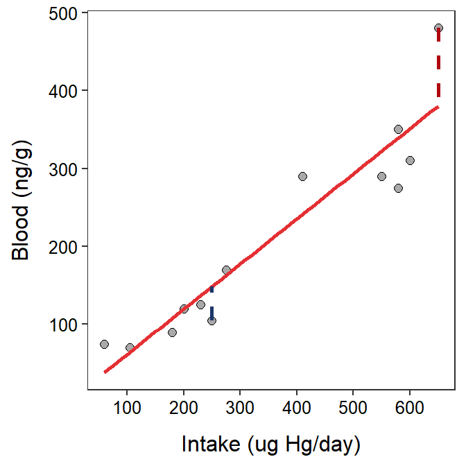
Figure 9.3: Scatterplot between the intake of mercury in fish and the mercury in the blood stream of individuals with superimposed best-fit regression line illustrating the residuals for the two individuals discussed in the main text.
9.5 Best-fit Criteria
An infinite number of lines can be placed on a graph, but many of those lines do not adequately describe the data. In contrast, many of the lines will appear, to our eye, to adequately describe the data. So, how does one find THE best-fit line from all possible lines. The least-squares method described below provides a quantifiable and objective measure of which line best “fits” the data.
Residuals are a measure of how far an individual is from a candidate best-fit line. Residuals computed from all individuals in a data set measure how far all individuals are from the candidate best-fit line. Thus, the residuals for all individuals can be used to identify the best-fit line.
The residual sum-of-squares (RSS) is the sum of all squared residuals. The least-squares criterion says that the “best-fit” line is the one line out of all possible lines that has the minimum RSS (Figure 9.4).
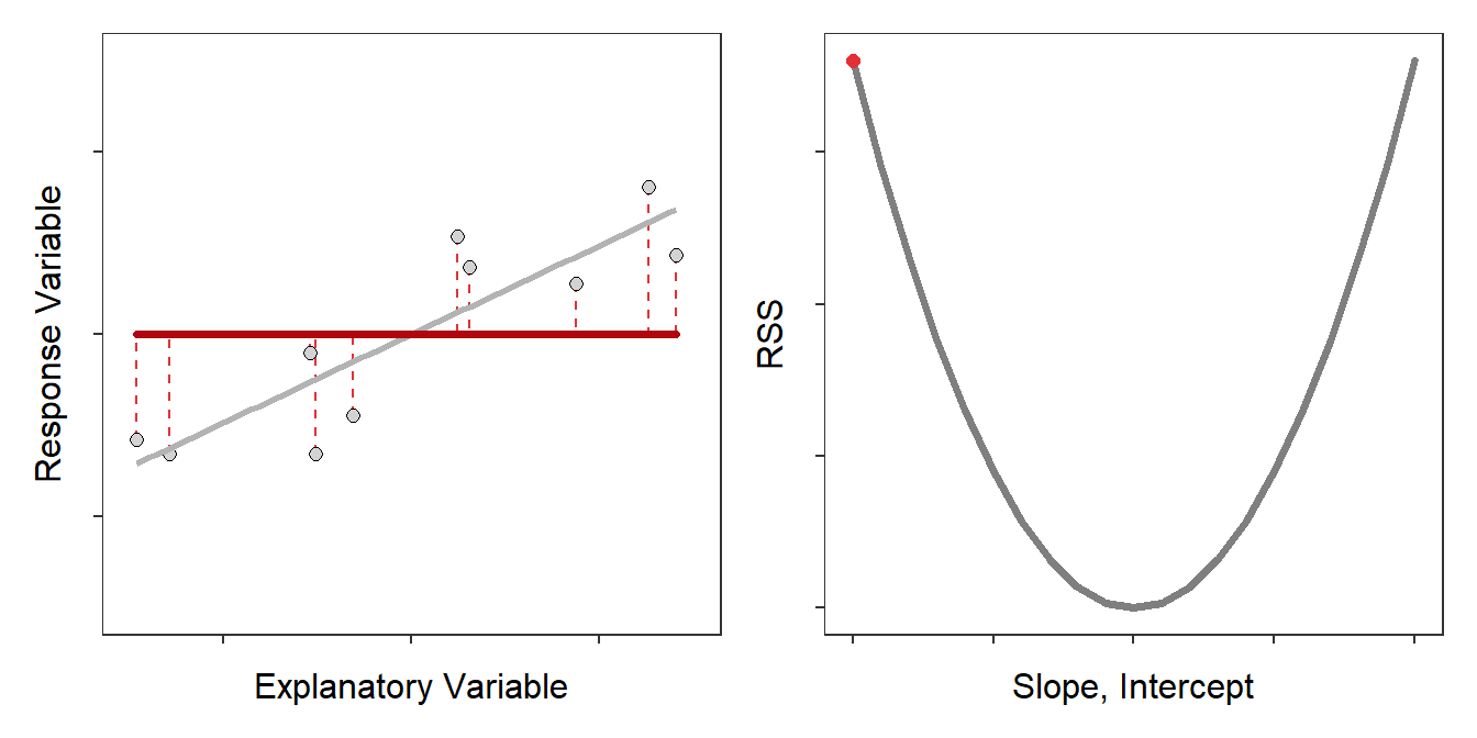
Figure 9.4: Scatterplot with the best-fit line (light gray) and candidate best-fit lines (red line) and residuals (vertical red dashed lines) in the left pane and the residual sum-of-squares for all candidate lines (gray) with the current line highlighted with a red dot. Note how the candidate line is on the best-fit line when the RSS is smallest.
The discussion thusfar implies that all possible lines must be “fit” to the data and the one with the minimum RSS is chosen as the “best-fit” line. As there are an infinite number of possible lines, this would be impossible to do. Theoretical statisticians have shown that the application of the least-squares criterion always produces a best-fit line with a slope given by
\[ \text{slope} = \text{r}\frac{\text{s}_{\text{y}}}{\text{s}_{\text{x}}} \]
and an intercept given by
\[ \text{intercept} = \bar{\text{y}}-\text{slope}\times\bar{\text{x}} \]
where \(\bar{\text{x}}\) and sx are the sample mean and standard deviation of the explanatory variable, \(\bar{\text{y}}\) and sy are the sample mean and standard deviation of the response variable, and r is the sample correlation coefficient between the two variables. Thus, using these formulae finds the slope and intercept for the line, out of all possible lines, that minimizes the RSS.
In this module the slope and intercept will not be computed from the given formulae; rather you will be given the values and asked to interpret them and use them in further calculations (see Section 9.8).
9.6 Assumptions
The least-squares method for finding the best-fit line only works appropriately if each of the following five assumptions about the data has been met.
- A line describes the data (i.e., a linear form).
- Homoscedasticity.
- Normally distributed residuals at a given x.
- Independent residuals at a given x.
- The explanatory variable is measured without error.
While all five assumptions of linear regression are important, only the first two are vital when the best-fit line is being used primarily as a descriptive model for data.41 Description is the primary goal of linear regression used in this course and, thus, only the first two assumptions are considered further.
The linearity assumption appears obvious – if a line does not represent the data, then don’t try to fit a line to it! Violations of this assumption are evident by a non-linear or curving form in the scatterplot.
The homoscedasticity assumption states that the variability about the line is the same for all values of the explanatory variable. In other words, the dispersion of the data around the line must be the same along the entire line. Violations of this assumption generally present as a “funnel-shaped” dispersion of points from left-to-right on a scatterplot.
Violations of these assumptions are often evident on a “fitted-line plot,” which is a scatterplot with the best-fit line superimposed (Figure 9.5).42 If the points look more-or-less like random scatter around the best-fit line, then neither the linearity nor the homoscedasticity assumption has been violated. A violation of one of these assumptions should be obvious on the scatterplot. In other words, there should be a clear curvature or funneling on the plot.
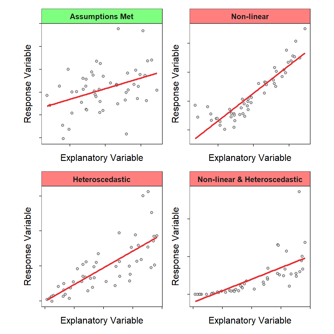
Figure 9.5: Fitted-line plots illustrating when the regression assumptions are met (upper-left) and three common assumption violations.
In this course, if an assumption has been violated, then one should not continue to interpret the linear regression. However, in many instances, an assumption violation can be “corrected” by transforming one or both variables to a different scale. Transformations are not discussed in this course.
If the regression assumptions are not met, then the regression results should not be interpreted.
9.7 Coefficient of Determination
The coefficient of determination (r2) is the proportion of the total variability in the response variable that is explained away by knowing the value of the explanatory variable and the best-fit model. In simple linear regression, r2 is literally the square of r, the correlation coefficient.43 Values of r2 are between 0 and 1.44
The meaning of r2 can be examined by making predictions of the response variable with and without knowing the value of the explanatory variable. First, consider predicting the value of the response variable without any information about the explanatory variable. In this case, the best prediction is the sample mean of the response variable (represented by the dashed blue horizontal line in Figure 9.6). However, because of natural variability, not all individuals will have this value. Thus, the prediction might be “bracketed” by predicting that the individual will be between the observed minimum and maximum values (solid blue horizontal lines). Loosely speaking, this range is the “total variability in the response variable” (blue box).
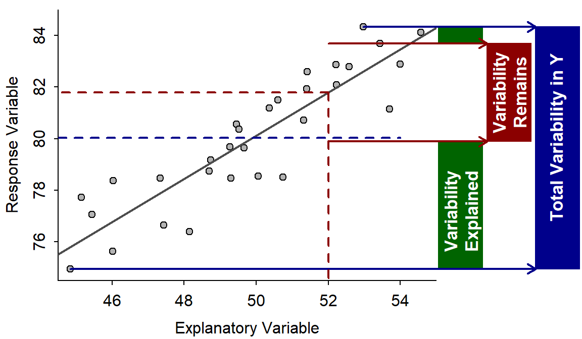
Figure 9.6: Fitted line plot with visual representations of variabilities explained and unexplained. A full explanation is in the main text.
Suppose now that the response variable is predicted for an individual with a known value of the explanatory variable (e.g., at the dashed vertical red line in Figure 9.6). The predicted value for this individual is the value of the response variable at the corresponding point on the best-fit line (dashed horizontal red line). Again, because of natural variability, not all individuals with this value of the explanatory variable will have this exact value of the response variable. However, the prediction is now “bracketed” by the minimum and maximum value of the response variable ONLY for those individuals with the same value of the explanatory variable (solid red horizontal lines). Loosely speaking, this range (red box) is the “variability in the response variable remaining after knowing the value of the explanatory variable” or “the variability in the response variable that cannot be explained away (by the explanatory variable).”
The portion of the total variability in the response variable that was explained away consists of all the values of the response variable that would no longer be entertained as possible predictions once the value of the explanatory variable is known (green box in Figure 9.6).
Now, by its definition, r2 can be visualized as the area of the green box divided by the area of the blue box. This calculation does not depend on which value of the explanatory variable is chosen as long as the data are evenly distributed around the line (i.e., homoscedasticity exists – see Section 9.6).
If the variability explained away (green box) approaches the total variability in the response variable (blue box), then r2 approaches 1. This will happen only if the variability around the line approaches zero. In contrast, the variability explained (green box) will approach zero if the slope is zero (i.e., no relationship between the response and explanatory variables). Thus, values of r2 also indicate the strength of the relationship; values near 1 are stronger than values near 0. Values near 1 also mean that predictions will be very precise – i.e., there is little variability remaining after knowing the explanatory variable.
A value of r2 near 1 represents a strong relationship between the response and explanatory variables that will lead to precise predictions.
9.8 Examples
There are twelve questions that are commonly asked about linear regression results. These twelve questions are listed below with some thoughts about things to remember when answering some of the questions. Two examples of these questions in context are then provided.
- What is the response variable?
- Identify which variable is to be predicted or explained, which variable is dependent on the other variable, which would be hardest to measure, or which is on the y-axis.
- What is the explanatory variable?
- The remaining variable after identifying the response variable.
- Comment on linearity and homoscedasticity.
- Examine fitted-line plot for curvature (i.e., non-linearity) or a funnel-shape (i.e., heteroscedasticity). If there is no curvature (i.e., linear) and no funnel-shape (i.e., homoscedasticity) then both assumptions of linearity and homoscedasticity have been met.
- What is the equation of the best-fit line?
- In the generic equation of the line (y=m×x+b) replace y with the name of the response variable, x with the name of the explanatory variable, m with the value of the slope, and b with the value of the intercept.
- Interpret the value of the slope.
- State how the response variable changes by the slope amount for each one unit change of the explanatory variable, on average.
- Interpret the value of the intercept.
- State how the response variable equals the intercept, on average, if the explanatory variable is zero.
- Make a prediction given a value of the explanatory variable.
- Plug the given value of the explanatory variable into the equation of the best-fit line. Make sure that this is not an extrapolation.
- Compute a residual given values of both the explanatory and response variables.
- Make a prediction (see previous question) and then subtract this value from the observed value of the response variable. Make sure that the prediction is not an extrapolation.
- Identify an extrapolation in the context of a prediction problem.
- Identify the prediction as an extrapoloation if the observed value of the explanatory variable is outside the range of values on the x-axis scale.
- What is the proportion of variability in the response variable explained by knowing the value of the explanatory variable?
- This is r2.
- What is the correlation coefficient?
- This is the square root of r2. Make sure to put a negative sign on the result if the slope is negative.
- How much does the response variable change if the explanatory variable changes by X units?
- This is an alternative to asking for an interpretation of the slope. If the explanatory variable changes by X units, then the response variable will change by X×slope units, on average.
- All interpretations should be “in terms of the variables of the problem” rather than the generic terms of x, y, response variable, and explanatory variable.
- Questions about the slope, intercept, and predictions need to explicitly identify that the answer is an “average” or “on average.”
- Make sure to use proper units when reporting the intercept, slope, predictions, and residuals.
Chimp Hunting Parties
Stanford (1996) gathered data to determine if the size of the hunting party (number of individuals hunting together) affected the hunting success of the party (percent of hunts that resulted in a kill) for wild chimpanzees (Pan troglodytes) at Gombe. The results of their analysis for 17 hunting parties is shown in the figure below.45 Use these results to answer the questions below.

- What is the response variable?
- The response variable is the percent of successful hunts because the authors are attempting to see if success depends on hunting party size. Additionally, the percent of successful hunts is shown on the y-axis.
- What is the explanatory variable?
- The explanatory variable is the size of the hunting party.
- Comment on linearity and homoscedasticity.
- The data appear to be very slightly curved but there is no evidence of a funnel-shape. Thus, the data may be slightly non-linear but they appear homoscedastic.
- In terms of the variables of the problem, what is the equation of the best-fit line?
- The equation of the best-fit line is % Success of Hunt = 24.21 + 3.71×Number of Hunting Party Members.
- Interpret the value of the slope in terms of the variables of the problem.
- The slope indicates that the percent of successful hunts increases by 3.71%, on average, for every increase of one member to the hunting party.
- Interpret the value of the intercept in terms of the variables of the problem.
- The intercept indicates that the percent of successful hunts is 24.21%, on average, for hunting parties with no members. This is nonsensical because 0 hunting members is an extrapolation.
- What is the predicted hunt success if the hunting party consists of 20 chimpanzees?
- The predicted hunt success for parties with 20 individuals is an extrapolation, because 20 is outside the range of number of members observed on the x-axis of the fitted-line plot.
- What is the predicted hunt success if the hunting party consists of 12 chimpanzees?
- The predicted hunt success for parties with 12 individuals is 24.21 + 3.71×12 = 68.7%.
- What is the residual if the hunt success for 10 individuals is 50%?
- The predicted hunt success for 10 indviduals is (24.21 + 3.71×10) = 61.3%.
- Thus, the residual in this case is 50-61.3 = -11.3. Therefore, it appears that the success of this hunting party is 11.3% lower than average for this size of hunting party.
- What proportion of the variability in hunting success is explained by knowing the size of the hunting party?
- The proportion of the variability in hunting success that is explained by knowing the size of the hunting party is r2=0.88.
- What is the correlation between hunting success and size of hunting party?
- The correlation between hunting success and size of hunting party is r=0.94. [Note that this is the square root of r2.]
- How much does hunt success decrease, on average, if there are two fewer individuals in the party?
- If the hunting party has two fewer members, then the hunting success would decrease by 7.4% (i.e., -2×3.71), on average. [Note that this is two times the slope, with a negative as it asks about “fewer” members.]
Car Weight and MPG
In Module 8, an EDA for the relationship between HMPG (the highway miles per gallon) and Weight (lbs) of 93 cars from the 1993 model year was performed. This relationship will be explored further here as an example of a complete regression analysis. The best-fit line equation and r2 for these data are shown in Figure 9.7.
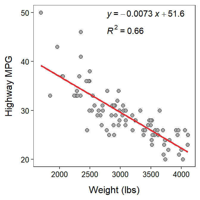
Figure 9.7: Fitted line plot of the regression of highway MPG on weight of 93 cars from 1993.
- What is the response variable?
- The response variable in this analysis is the highway MPG, because that is the variable that we are trying to learn about or explain the variability of. In addition, it is presented on the y-axis of the fitted line plot.
- What is the explanatory variable?
- The explanatory variable in this analysis is the weight of the car (by process of elimination).
- Comment on linearity and homoscedasticity.
- In terms of the variables of the problem, what is the equation of the best-fit line?
- The equation of the best-fit line for this problem is HMPG = 51.6 - 0.0073×Weight.
- Interpret the value of the slope in terms of the variables of the problem.
- The slope indicates that for every increase of one pound of car weight the highway MPG decreases by 0.0073, on average.
- Interpret the value of the intercept in terms of the variables of the problem.
- The intercept indicates that a car with 0 weight will have a highway MPG value of 51.6, on average. [Note that this is the correct interpretation of the intercept. However, it is nonsensical because it is an extrapolation; i.e., no car will weigh 0 pounds.]
- What is the predicted highway MPG for a car that weighs 3100 lbs?
- The predicted highway MPG for a car that weighs 3100 lbs is 51.6 - 0.0073×3100 = 29.0 MPG.
- What is the predicted highway MPG for a car that weighs 5100 lbs?
- The predicted highway MPG for a car that weighs 5100 lbs should not be computed with the results of this regression, because 5100 lbs is outside the domain of the data (Figure 9.7).
- What is the residual for a car that weights 3500 lbs and has a highway MPG of 24?
- The predicted highway MPG for a car that weighs 3500 lbs is 51.6 - 0.0073×3500 = 26.1. Thus, the residual for this car is 24 - 26.1 = -2.1. Therefore, it appears that this car gets 2.1 MPG LESS than an average car with the same weight.
- What proportion of the variability in highway MPG is explained by knowing the weight of the car?
- The proportion of the variability in highway MPG that is explained by knowing the weight of the car is r2=0.66.
- What is the correlation between highway MPG and car weight?
- The correlation between highway MPG and car weight is r=-0.81. [Not that this is the square root of r2, but as a negative because form of the relationship between highway MPG and weight is negative.]
- How much is the highway MPG expected to change if a car is 1000 lbs heavier?
- If the car was 1000 lbs heavier, you would expect the car’s highway MPG to decrease by 7.33. [Note that this is 1000 slopes.]
Hereafter, simply called the “intercept.”↩︎
For simplicity of exposition, the actual units are not used in this discussion. However, “units” would usually be replaced with the actual units used for the measurements.↩︎
In other words, the observed value is “above” the line.↩︎
In contrast to using the model to make inferences about a population model.↩︎
Residual plots, not discussed in this text, are another plot that often times is used to better assess assumption violations.↩︎
Simple linear regression is the fitting of a model with a single explanatory variable and is the only model considered in this module and this course. See Section 8.2.2 for a review of the correlation coefficient.↩︎
It is common for r2 to be presented as a percentage.↩︎
In advanced statistics books, objective measures for determining whether there is significant curvature or heteroscedasticity in the data are used. In this book, we will only be concerned with whether there is strong evidence of curvature or heteroscedasticity. There does not seem to be either here.↩︎