Introduction
We are deprecating fitPlot() from the next version of FSA (v0.9.0). It will likely be removed at the end of the year 2001. We are taking this action to make FSA more focused on fisheries applications and to eliminate “black box” functions. fitPlot() was originally designed for students to quickly visualize the results of one- and two-way ANOVAs and simple, indicator variable, and logistic regressions.1
We now feel that students are better served by learning how to create these visualizations using methods provided by ggplot2, which require more code, but are more modern, flexible, and transparent.
The basic plots produced by fitPlot() are recreated here using ggplot2 to provide a resource to help users that relied on fitPlot() transition to ggplot2.
The examples below require the following additional packages.
library(tidyverse)  # for dplyr and ggplot2
library(FSA)        # fitPlot() code may not run after >v0.9.0
library(emmeans)
Most examples below use the Mirex data set from FSA, which contains the concentration of mirex in the tissue and the body weight of two species of salmon (chinook and coho) captured in six years. The year variable is converted to a factor below for modeling purposes and a new variable is created that indicates if the mirex concentration was greater that 0.2 or not. This new variable is used to demonstrate a logistic regression.
Mirex$year <- factor(Mirex$year)
Mirex$gt2 <- ifelse(Mirex$mirex>0.2,1,0)
FSA::peek(Mirex,n=10)  # examine a portion of the data frame
## year weight mirex species gt2
## 1 1977 0.41 0.16 chinook 0
## 14 1977 3.29 0.23 coho 1
## 27 1982 0.70 0.10 coho 0
## 41 1982 5.09 0.27 coho 1
## 54 1986 1.82 0.12 chinook 0
## 68 1986 8.40 0.13 chinook 0
## 81 1992 10.00 0.48 chinook 1
## 95 1996 5.70 0.16 coho 0
## 108 1999 5.11 0.11 coho 0
## 122 1999 11.82 0.09 chinook 0
One-Way ANOVA
The code below fits a one-way ANOVA model to examine if mean weight differs by species.
aov1 <- lm(weight~species,data=Mirex)
anova(aov1)
## Analysis of Variance Table
##
## Response: weight
## Df Sum Sq Mean Sq F value Pr(>F)
## species 1 282.4 282.399 27.657 6.404e-07
## Residuals 120 1225.3 10.211
There are at least two simple ways to visualize results from a one-way ANOVA. First, summarized means of raw data with 95% confidence intervals derived from the standard deviation, sample size, and degrees-of-freedom specific to each group are shown.
sumdata <- Mirex %>%
  dplyr::group_by(species) %>%
  dplyr::summarize(n=dplyr::n(),
                   mn=mean(weight),
                   se=FSA::se(weight)) %>%
  dplyr::mutate(lci=mn-qt(0.975,df=n-1)*se,
                uci=mn+qt(0.975,df=n-1)*se)
sumdata
## # A tibble: 2 x 6
## species n mn se lci uci
## <fct> <int> <dbl> <dbl> <dbl> <dbl>
## 1 chinook 67 6.31 0.474 5.37 7.26
## 2 coho 55 3.26 0.279 2.70 3.82
Second, marginal means may be predicted or estimated from the fitted model (discussed in detail in this vignette from the emmeans package). However, the main difference from above is that the confidence intervals for the marginal means use an “overall” standard deviation and degrees-of-freedom estimated from across all groups. The predicted or estimated marginal means may be computed with predict() …
predict(aov1,
        newdata=data.frame(species=c("chinook","coho")),
        interval="confidence")
## fit lwr upr
## 1 6.314776 5.541847 7.087705
## 2 3.257091 2.403999 4.110183or, equivalently, with emmeans() from the emmeans package …
aov1mc <- emmeans::emmeans(aov1,specs=pairwise~species)
aov1mcs <- summary(aov1mc)
aov1mcs$emmeans
## species emmean SE df lower.CL upper.CL
## chinook 6.31 0.390 120 5.54 7.09
## coho 3.26 0.431 120 2.40 4.11
##
## Confidence level used: 0.95
fitPlot() from FSA (before v0.9.0) uses the first method to display means with 95% confidence intervals for both species.
FSA::fitPlot(aov1)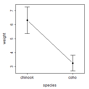
Using Manually Summarized Means
The summarized means saved in sumdata above can be plotted as shown below to recreate the fitPlot() result. Note width=0.1 in geom_errorbar() is used to reduce the width of the “caps” at the confidence values and group=1 is needed in geom_line() as there is only one point for each factor level. Changes (themes, colors, labels, etc) to this basic plot can be made as usual for ggplot()s (and is illustrated further below).
ggplot(data=sumdata,mapping=aes(x=species)) +
  geom_errorbar(aes(ymin=lci,ymax=uci),width=0.1) +
  geom_line(aes(y=mn,group=1)) +
  geom_point(aes(y=mn))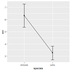
Using Built-In Functions for Summarized Means
This plot can also be created using stat_summary() from ggplot coupled with mean_cl_normal() and mean(). Take note of how each geom= in each stat_summary() mirrors what was used above. Also note the use of width=0.1 and group=1 here as done above.
ggplot(data=Mirex,mapping=aes(x=species,y=weight)) +
  stat_summary(fun.data=mean_cl_normal,geom="errorbar",width=0.1) +
  stat_summary(fun=mean,geom="line",aes(group=1)) +
  stat_summary(fun=mean,geom="point")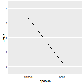
Using Marginal Means from emmeans
The estimated marginal means may be plotted similarly to the manually summarized means but by using the aov1mcs$emmeans object created above.
ggplot(data=aov1mcs$emmeans,mapping=aes(x=species)) +
  geom_errorbar(aes(ymin=lower.CL,ymax=upper.CL),width=0.1) +
  geom_line(aes(y=emmean,group=1)) +
  geom_point(aes(y=emmean))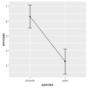
Two-Way ANOVA
The code below fits a two-way ANOVA model to examine if mean weight differs by species, by year, or by the interaction between species and year.
aov2 <- lm(weight~year*species,data=Mirex)
anova(aov2)
## Analysis of Variance Table
##
## Response: weight
## Df Sum Sq Mean Sq F value Pr(>F)
## year 5 281.86 56.373 6.9954 1.039e-05
## species 1 221.69 221.689 27.5099 7.648e-07
## year:species 5 117.69 23.538 2.9208 0.01628
## Residuals 110 886.44 8.059
The fitPlot() from FSA (before v0.9.0) shows the mean with 95% confidence interval for all combinations of species and year.
FSA::fitPlot(aov2)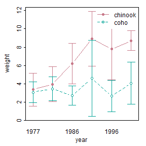
Using Built-In Functions for Summarized Means
Again, the stat_summary() function can be used to efficiently calculate and then plot the 95% confidence intervals and means similar to what was shown above for a one-way ANOVA. However, there are three major differences.
First, in the main ggplot() call the color of the points and lines is mapped to one of the two factor variables (species in this case) whereas the other factor variable is mapped to x=.2 Second, the group= aesthetic for the line geom must be set to the factor that describes how the lines should be connected (e.g., species in this case). Third, the intervals and (possibly) the points at each level on the x-axis will overlap if they are not “dodged” a small amount.3 The “dodge” amount should be set outside the geom()s so that each geom uses the same amount of “dodging.” This will assure that the intervals, points, and connecting lines for each level defined by the colors align. Below this “dodge” amount is set with position_dodge() and saved to an object called pd which is then set equal to position= in each geom().
pd <- position_dodge(width=0.2)
ggplot(data=Mirex,mapping=aes(x=year,y=weight,color=species)) +
  stat_summary(fun.data=mean_cl_normal,geom="errorbar",width=0.2,position=pd) +
  stat_summary(fun=mean,geom="line",aes(group=species),position=pd) +
  stat_summary(fun=mean,geom="point",position=pd)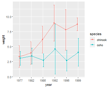
Using Marginal Means from emmeans
The plot with marginal means is constructed similarly as shown below. Note, however, year:species in emmeans() is used so that the marginal means and confidence intervals are estimated for each combination of year and species.
aov2mc <- emmeans::emmeans(aov2,specs=pairwise~year:species)
aov2mcs <- summary(aov2mc)
aov2mcs$emmeans
## year species emmean SE df lower.CL upper.CL
## 1977 chinook 3.35 0.819 110 1.723 4.97
## 1982 chinook 3.94 0.819 110 2.319 5.57
## 1986 chinook 6.20 0.819 110 4.571 7.82
## 1992 chinook 8.91 1.073 110 6.788 11.04
## 1996 chinook 7.79 0.856 110 6.090 9.48
## 1999 chinook 8.71 0.787 110 7.148 10.27
## 1977 coho 3.06 0.819 110 1.436 4.68
## 1982 coho 3.43 0.819 110 1.808 5.06
## 1986 coho 2.71 0.819 110 1.090 4.34
## 1992 coho 4.60 1.270 110 2.084 7.12
## 1996 coho 2.67 1.004 110 0.681 4.66
## 1999 coho 4.05 1.159 110 1.753 6.35
##
## Confidence level used: 0.95pd <- position_dodge(width=0.2)
ggplot(data=aov2mcs$emmeans,
mapping=aes(x=year,color=species)) +
geom_errorbar(aes(ymin=lower.CL,ymax=upper.CL),width=0.2,position=pd) +
geom_line(aes(y=emmean,group=species),position=pd) +
geom_point(aes(y=emmean),position=pd)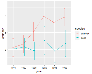
Simple Linear Regression
The code below fits a simple linear regression for examining the relationship between mirex concentration and salmon weight.
slr <- lm(mirex~weight,data=Mirex)
anova(slr)
## Analysis of Variance Table
##
## Response: mirex
## Df Sum Sq Mean Sq F value Pr(>F)
## weight 1 0.22298 0.222980 26.556 1.019e-06
## Residuals 120 1.00758 0.008396
fitPlot() from FSA (before v0.9.0) shows the best-fit line with a 95% confidence band.
FSA::fitPlot(slr,interval="confidence")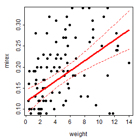
Using Manually Predicted Values
One method for recreating this plot is to create a new data frame that first has the two variables of observed data and then adds on predicted values of the response at each observed value of the explanatory variable with 95% confidence intervals. The two observed variables are selected from the original data frame with dplyr::select(). If this new data frame is given to newdata= in predict() with interval="confidence" then the predicted values (and 95% confidence intervals) will be constructed at each value of the explanatory variable. The two data frames are then column-bound together with cbind() to make one data frame for plotting (further below).
slrdf <- dplyr::select(Mirex,weight,mirex)
slrdf <- cbind(slrdf,predict(slr,newdata=slrdf,interval="confidence"))
FSA::peek(slrdf,n=6)
## weight mirex fit lwr upr
## 1 0.41 0.16 0.1226593 0.09588108 0.1494376
## 24 7.75 0.34 0.2119229 0.19088398 0.2329618
## 49 0.34 0.02 0.1218080 0.09477073 0.1488453
## 73 1.90 0.10 0.1407796 0.11907549 0.1624837
## 98 9.10 0.29 0.2283406 0.20287925 0.2538019
## 122 11.82 0.09 0.2614192 0.22530410 0.2975342The confidence band is first plotted as a “ribbon” with the best-fit line then added followed by the observed points. In this plot, weight is globally mapped to x= in ggplot() so that it will be used for each geom. The lower and upper confidence values to ymin= and ymax= in geom_ribbon(), whereas the predicted or “fit”ted values are mapped to y= geom_line() to make the line and the observed mirex concentrations are mapped to y= in geom_point() to plot the observed points. Further note the use of alpha= to make the confidence band semi-transparent and size= to make the fitted line slightly larger than the default. Again all aspects of this plot can be changed in the usual ggplot way.
ggplot(slrdf,aes(x=weight)) +
  geom_ribbon(aes(ymin=lwr,ymax=upr),alpha=0.2) +
  geom_line(aes(y=fit),size=1) +
  geom_point(aes(y=mirex))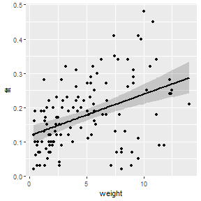
Using A Built-In Function
The best-fit line can also be added to a scatterplot with geom_smooth().
ggplot(Mirex,aes(x=weight,y=mirex)) +
  geom_smooth(method="lm",alpha=0.2) +
  geom_point()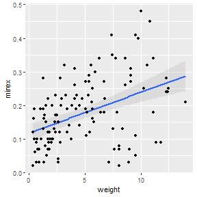
Indicator Variable Regression
The code below fits an indicator variable regression to examine if the relationship between mirex concentration and salmon weight differs betwen species.
ivr <- lm(mirex~weight*species,data=Mirex)
anova(ivr)
## Analysis of Variance Table
##
## Response: mirex
## Df Sum Sq Mean Sq F value Pr(>F)
## weight 1 0.22298 0.222980 26.8586 9.155e-07
## species 1 0.00050 0.000498 0.0600 0.80690
## weight:species 1 0.02744 0.027444 3.3057 0.07158
## Residuals 118 0.97964 0.008302
The fitPlot() from FSA (before v0.9.0) shows the best-fit line for both species.
FSA::fitPlot(ivr,interval="confidence")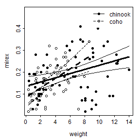
Using Manually Predicted Values
The process of constructing a similar plot in ggplot() follows the same general procedure as that for a simple linear regression. First, make a data frame that has the observed variables used in the model and predicted values and confidence limits for each observation.
ivrdf <- dplyr::select(Mirex,weight,mirex,species)
ivrdf <- cbind(ivrdf,predict(ivr,newdata=ivrdf,interval="confidence"))
FSA::peek(ivrdf,n=6)
## weight mirex species fit lwr upr
## 1 0.41 0.16 chinook 0.13939054 0.09905499 0.1797261
## 24 7.75 0.34 chinook 0.20990801 0.18638517 0.2334308
## 49 0.34 0.02 coho 0.09192064 0.04956596 0.1342753
## 73 1.90 0.10 coho 0.12580003 0.09660968 0.1549904
## 98 9.10 0.29 chinook 0.22287784 0.19567885 0.2500768
## 122 11.82 0.09 chinook 0.24900965 0.21056798 0.2874513
Then plot the data as before but making sure to map color= and fill= (just for the ribbon) to the species factor variable.
ggplot(ivrdf,aes(x=weight,color=species)) +
  geom_ribbon(aes(ymin=lwr,ymax=upr,fill=species),alpha=0.2) +
  geom_line(aes(y=fit),size=1) +
  geom_point(aes(y=mirex))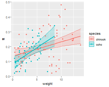
Using a Built-In Function
This plot can also be constructed with geom_smooth(), again making sure to map the color= and fill= to the species factor variable.
ggplot(Mirex,aes(x=weight,y=mirex,color=species,fill=species)) +
  geom_smooth(method="lm",alpha=0.2) +
  geom_point()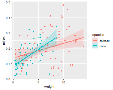
Logistic Regression
The code below fits a logistic regression to examine the relationship between the probability that mirex concentration is greater than 0.2 and salmon weight.
logreg <- glm(gt2~weight,data=Mirex,family="binomial")
summary(logreg)
##
## Call:
## glm(formula = gt2 ~ weight, family = "binomial", data = Mirex)
##
## Deviance Residuals:
## Min 1Q Median 3Q Max
## -1.7696 -0.7462 -0.5566 0.9537 1.9789
##
## Coefficients:
## Estimate Std. Error z value Pr(>|z|)
## (Intercept) -2.19359 0.41871 -5.239 1.61e-07
## weight 0.29822 0.06496 4.591 4.41e-06
##
## (Dispersion parameter for binomial family taken to be 1)
##
## Null deviance: 158.35 on 121 degrees of freedom
## Residual deviance: 132.32 on 120 degrees of freedom
## AIC: 136.32
##
## Number of Fisher Scoring iterations: 3
fitPlot() from FSA (before v0.9.0) shows the fitted logistic regression curve.
fitPlot(logreg)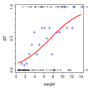
Using Manually Predicted Values
The first method for showing the logistic regression curve follows the general methodology for simple linear regression shown above. Note, however, that predict() does not produce confidence interval values for a logistic regression. Thus, the plot created in this way cannot have a confidence band.
logregdf <- dplyr::select(Mirex,gt2,weight)
logregdf$fit <- predict(logreg,newdata=logregdf,
                        type="response",interval="confidence")
FSA::peek(logregdf,n=6)
## gt2 weight fit
## 1 0 0.41 0.1119161
## 24 1 7.75 0.5293765
## 49 0 0.34 0.1098580
## 73 0 1.90 0.1642466
## 98 1 9.10 0.6272046
## 122 0 11.82 0.7910738ggplot(logregdf,aes(x=weight)) +
geom_point(aes(y=gt2),alpha=0.25) +
geom_line(aes(y=fit),size=1)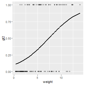
Using a Built-In Function
The best-fit logistic regression curve with a confidence band can, however, be added to a scatterplot with geom_smooth(). In this case, method= must be changed to glm and method.args= must be used as shown below so that glm will construct a logistic (rather than linear) regression.
ggplot(Mirex,aes(x=weight,y=gt2)) +
  geom_smooth(method="glm",alpha=0.2,
              method.args=list(family="binomial")) +
  geom_point(alpha=0.25)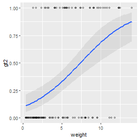
Note that this method easily generalizes to an indicator variable logistic regression (note that color= and fill= are mapped to the species factor variable).
logreg2 <- glm(gt2~weight*species,data=Mirex,family="binomial")

ggplot(Mirex,aes(x=weight,y=gt2,color=species,fill=species)) +
  geom_smooth(method="glm",alpha=0.2,
              method.args=list(family="binomial")) +
  geom_point(alpha=0.25)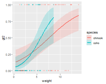
Polynomial Regression
The code below fits a quadratic (second degree polynomial) regression for the relationship between mirex concentration and salmon weight.
poly2 <- lm(mirex~weight+I(weight^2),data=Mirex)
summary(poly2)
##
## Call:
## lm(formula = mirex ~ weight + I(weight^2), data = Mirex)
##
## Residuals:
## Min 1Q Median 3Q Max
## -0.208068 -0.048257 0.000994 0.060883 0.244424
##
## Coefficients:
## Estimate Std. Error t value Pr(>|t|)
## (Intercept) 0.0875361 0.0209754 4.173 5.74e-05
## weight 0.0283282 0.0086331 3.281 0.00136
## I(weight^2) -0.0013524 0.0006953 -1.945 0.05413
##
## Residual standard error: 0.09059 on 119 degrees of freedom
## Multiple R-squared: 0.2064, Adjusted R-squared: 0.1931
## F-statistic: 15.48 on 2 and 119 DF, p-value: 1.06e-06
fitPlot() from FSA (before v0.9.0) shows the best-fit regression curve.
FSA::fitPlot(poly2,interval="confidence")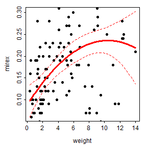
Using Manually Predicted Values
This regression can be viewed similarly to the way the simple linear regressions was viewed.
polydf <- dplyr::select(Mirex,weight,mirex)
polydf <- cbind(polydf,predict(poly2,newdata=polydf,interval="confidence"))
ggplot(polydf,aes(x=weight)) +
  geom_ribbon(aes(ymin=lwr,ymax=upr),alpha=0.2) +
  geom_line(aes(y=fit),size=1) +
  geom_point(aes(y=mirex))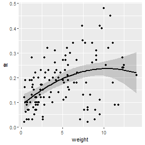
Using a Built-In Function
This type of regression can also be viewed using geom_smooth() but the formula for the polynomial must be given to formula=. However, note that in this formula you put y and x rather than the names of the variables that are mapped to y and x.
ggplot(Mirex,aes(x=weight,y=mirex)) +
  geom_smooth(method="lm",formula="y~x+I(x^2)",alpha=0.2) +
  geom_point()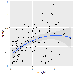
Nonlinear Regression
The following code fits a von Bertalanffy growth function (VBGF) to the total length and age data for spot found in the SpotVA1 data frame built into FSA. Fitting the VBGF is described in more detail here.
vb <- FSA::vbFuns()
vbs <- FSA::vbStarts(tl~age,data=SpotVA1)
nlreg <- nls(tl~vb(age,Linf,K,t0),data=SpotVA1,start=vbs)
fitPlot() from FSA (before v0.9.0) shows this model fit to the observed data.
FSA::fitPlot(nlreg)## Error in nls(formula = tl ~ vb(age, Linf, K, t0), data = SpotVA1, start = vbs, : object 'vbs' not found
Using Manually Predicted Values
A similar plot can be constructed from manually predicted values very similarly to what was described for previous models. However, as with the logistic regression, predict() will not return confidence interval values, so it is not immediately possible to create a confidence band with this method.
nlregdf <- SpotVA1
nlregdf <- cbind(SpotVA1,fit=predict(nlreg,newdata=nlregdf))

ggplot(nlregdf,aes(x=age)) +
  geom_line(aes(y=fit),size=1) +
  geom_point(aes(y=tl))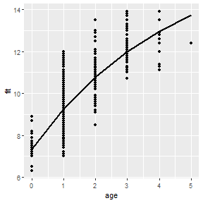
Using a Built-In Function
You can get a very similar plot using geom_smooth() with formula= set equal to the same formula as in nls() (except using y and x rather than the variables mapped to those aesthetics) and putting the start= argument in the method.args= list. Note that the algorithm used by geom_smooth() to computed the confidence bands will err for this non-linear model; thus, set se=FALSE to at least see the best-fit curve.
ggplot(SpotVA1,aes(x=age,y=tl)) +
  geom_smooth(method="nls",formula="y~vb(x,Linf,K,t0)",
              method.args=list(start=vbs),se=FALSE) +
  geom_point()
## Warning: Computation failed in `stat_smooth()`:
## could not find function "vb"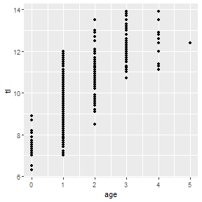
Make a similar plot but with a confidence band derived via bootstrapping is described in this previous post.
Conclusion
The fitPlot() function in FSA will be deprecated in v0.9.0 and will likely not exist after that. This post describes a more transparent (i.e., not a “black box”) and flexible set of methods for constructing similar plots using ggplot2 for those who will need to transition away from using fitPlot().
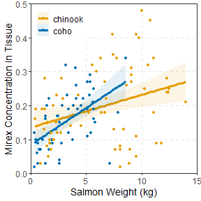
As mentioned in the examples above, each plot can be modified further using typical methods for ggplot2. These changes were not illustrated above to minimize the amount of code shown in this post. However, as an example, the code below shows a possible modification of the IVR plot shown above.
ggplot(Mirex,aes(x=weight,y=mirex,color=species,fill=species)) +
  geom_smooth(method="lm",alpha=0.1,size=1.25) +
  geom_point(size=1.5) +
  scale_y_continuous(name="Mirex Concentration in Tissue",limits=c(0,0.5),
                     expand=expansion(mult=0)) +
  scale_x_continuous(name="Salmon Weight (kg)",limits=c(0,15),
                     expand=expansion(mult=0)) +
  scale_color_manual(values=c("#E69F00","#0072B2")) +
  scale_fill_manual(values=c("#E69F00","#0072B2")) +
  theme_bw() +
  theme(panel.grid.major=element_line(color="gray90",linetype="dashed"),
        panel.grid.minor=element_blank(),
        axis.title=element_text(size=rel(1.25)),
        axis.text=element_text(size=rel(1.1)),
        legend.position=c(0,1),
        legend.justification=c(-0.05,1.02),
        legend.title=element_blank(),
        legend.text=element_text(size=rel(1.1)))