There has been a bit of a buzz recently about so-called “joyplots.” Wilke described joyplots as “partially overlapping line plots that create the impression of a mountain range.” I would describe them as partially overlapping density plots (akin to a smoothed histogram). Examples of joyplots are here, here, and here (from among many).
I thought that joyplots might provide a nice visualization of length frequencies over time. For example, we have a paper forthcoming in the North American Journal of Fisheries Management that examines (among other things) the lengths of Kiyi (Coregonus kiyi) captured in trawl tows in Lake Superior from 2003 to 2014. Figure 1 is a modified version (stripped of code that increased fonts, changed colors, etc.) of the length frequency histograms we included in the paper. Figure 2 is a near default joyplot of the same data.
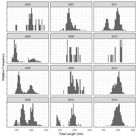
Figure 1: Histograms of the total lengths of Lake Superior Kiyi from 2003 to 2014.
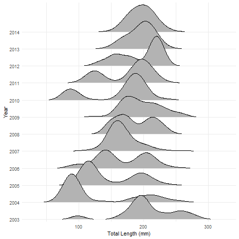
Figure 2: Joyplot of the total lengths of Lake Superior Kiyi from 2003 to 2014.
In my opinion, the joyplot makes it easier to follow through time the strong year-classes that first appear in 2004 and 2010 and to see how fish in the strong year-classes grow and eventually merge in size with older fish. Joyplots look useful for displaying length (or age) data across many groups (years, locations, etc.). Some, however, like the specificity (less smoothing) of the histograms (see the last example in Wilke for overlapping histograms).
R Code
The data file used in this example has the following structure.
str(lf)## 'data.frame': 9151 obs. of 3 variables:
## $ year: Factor w/ 12 levels "2003","2004",..: 1 1 2 2 2 2 5 5 5 5 ...
## $ mon : Factor w/ 3 levels "Jul","Jun","May": 3 3 3 3 3 3 3 3 3 3 ...
## $ tl : int 183 259 200 249 215 234 119 188 157 189 ...The histograms were constructed with the following code (requires the ggplot2 package).
ggplot(lf,aes(x=tl)) +
  scale_x_continuous(expand=c(0.02,0),limits=c(40,310),
                     breaks=seq(0,350,50),
                     labels=c("","",100,"",200,"",300,"")) +
  geom_histogram(aes(y=..ncount..),binwidth=5,fill="gray40") +
  facet_wrap(~year,nrow=4,dir="v") +
  labs(x="Total Length (mm)",y="Relative Frequency") +
  theme_bw() +
  theme(axis.text.y=element_blank())
The joyplot was constructed with the following code (requires the ggplot2 and ggjoy packages). See the introductory vignette by Wilke for how to further modify joyplots.
ggplot(lf,aes(x=tl,y=year)) +
  geom_joy(rel_min_height = 0.01) +        # removes tails
  scale_y_discrete(expand = c(0.01, 0)) +  # removes cutoff top
  labs(x="Total Length (mm)",y="Year") +
  theme_minimal()