Last week I posted about a modified age bias plot. In this post I began looking more deeply at an alternative plot called the Bland-Altman plot. Below, I describe this plot, demonstrate how to construct it in R, give a mild critique of its use for compare fish age estimates, and develop an alternative that is mean to correct what I see as some of the shortcomings of using the Bland-Altman plot for comparing age estimates. This is large a “thinking out loud” exercise so I am open to any suggestions that you may have.
Bland-Altman Plot
The Bland-Altman plot (Bland and Altman 1986) is commonly used in medical and chemistry research to assess agreement between two measurement or assay methods (Giavarina 2015). McBride (2015) used the Bland-Altman plot in his simulation study of the effects of accuracy and precision on the ability to diagnose agreement between sets of fish age estimates. McBride (2015) noted that Bland-Altman plots “readily depict both bias and imprecision” and that this was summarized for “the entire sample, rather than specific age classes.” Despite this, I am aware of only two entries in the fisheries literature that used the Bland-Altman plot to compare fish age estimates (one in the grey literature, one in a thesis). Below, I describe the Bland-Altman plot and then offer a modified version for comparing estimates of fish age.
The Bland-Altman plot is a scatterplot where the differences in two age estimates are on the y-axis and means of the two age estimates are on the x-axis. The plot may be augmented with several horizontal lines at the following locations Figure 1:
- Zero,
- Mean difference in ages (heavy red dashed line),
- Upper and lower 95% confidence limits for the mean difference in ages (dark red dashed lines),
- Upper and lower 95% “agreement limits” (usually 1.96 times the standard deviation for the difference in ages above and below the mean difference in ages; heavy dashed blue lines), and
- Upper and lower 95% confidence limits for the upper and lower “agreement limits” (dashed dark blue lines).
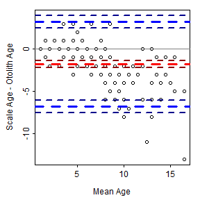
Figure 1: Bland-Altman plot for comparing scale to otolith age estimates of Lake Champlain Lake Whitefish. Thiw was constructed with BlandAltmanLeh.
As a general rule, a 95% confidence interval for the mean difference that does not contain zero suggests a difference (or a bias) between the two age estimates. For example, a bias is evident in Figure 1. In addition, one would expect 95% of the points to fall within the “agreement limits.” Points that fall outside this range may be considered further as possible outliers. Log differences have been used if the differences are not normally distributed and the percentage difference (where the difference is divided by the mean age) have also been used (Giavarina 2015).
The Bland-Altman plot in Figure 1 was created with bland.altman.plot() from the BlandAltmanLeh package (Lehnert 2015b). Other R functions exist for creating Bland-Altman plots (or the equivalent “Tukey’s Mean Difference Plot”). However, this is a simple plot that can be easily constructed from “scratch” as shown next. I then provide a mild critique of the Bland-Altman plot for use in age comparisons and offer an alternative (that is not an age bias plot).
Constructing a Bland-Altman Plot
In this example, a Bland-Altman plot is created to compare consensus (between two readers) scale (scaleC) and otolith (otolithC) age estimates for Lake Champlain Lake Whitefish.
library(FSA)  # provides WhitefishLC, col2rgbt()
data(WhitefishLC)
str(WhitefishLC)
## 'data.frame': 151 obs. of 11 variables:
## $ fishID : int 1 2 3 4 5 6 7 8 9 10 ...
## $ tl : int 345 334 348 300 330 316 508 475 340 173 ...
## $ scale1 : int 3 4 7 4 3 4 6 4 3 1 ...
## $ scale2 : int 3 3 5 3 3 4 7 5 3 1 ...
## $ scaleC : int 3 4 6 4 3 4 7 5 3 1 ...
## $ finray1 : int 3 3 3 3 4 2 6 9 2 2 ...
## $ finray2 : int 3 3 3 2 3 3 6 9 3 1 ...
## $ finrayC : int 3 3 3 3 4 3 6 9 3 1 ...
## $ otolith1: int 3 3 3 3 3 6 9 11 3 1 ...
## $ otolith2: int 3 3 3 3 3 5 10 12 4 1 ...
## $ otolithC: int 3 3 3 3 3 6 10 11 4 1 ...The mean and differences between the two age estimates are easily computed and added to the original data.frame. One way (of many ways) to do that is with mutate() from dplyr (as shown below).
library(dplyr)
WhitefishLC <- mutate(WhitefishLC,meanSO=(scaleC+otolithC)/2,diffSO=scaleC-otolithC)
head(WhitefishLC)
## fishID tl scale1 scale2 scaleC finray1 finray2 finrayC otolith1
## 1 1 345 3 3 3 3 3 3 3
## 2 2 334 4 3 4 3 3 3 3
## 3 3 348 7 5 6 3 3 3 3
## 4 4 300 4 3 4 3 2 3 3
## 5 5 330 3 3 3 4 3 4 3
## 6 6 316 4 4 4 2 3 3 6
## otolith2 otolithC meanSO diffSO
## 1 3 3 3.0 0
## 2 3 3 3.5 1
## 3 3 3 4.5 3
## 4 3 3 3.5 1
## 5 3 3 3.0 0
## 6 5 6 5.0 -2A scatterplot is constructed with plot() with a formula of the form y~x. In this case, the points are white (col="white") so that the points will not be evident.
plot(diffSO~meanSO,data=WhitefishLC,col="white",
     xlab="Mean Age",ylab="Scale-Otolith Age")
In this way, items can be added “behind” the points. For example, abline() is used with h=0 to add a horizontal reference line at zero.
abline(h=0,lwd=2,col="gray70")In addition, horizontal lines at the mean and approximate lower and upper 95% confidence limits for the differences may be added.
mndiff <- mean(WhitefishLC$diffSO)
sediff <- se(WhitefishLC$diffSO)
abline(h=mndiff+c(-1.96,0,1.96)*sediff,lty=2,col="red")
Agreement lines (without confidence limits) may also be added. [These could, of course, be eliminated to address the second issue below.]
sddiff <- sd(WhitefishLC$diffSO)
abline(h=mndiff+c(-1.96,1.96)*sddiff,lty=3,col="blue")
The data points are then added to this base plot with points(). “Solid dots” (pch=19) that are a transparent black such that when five points are overplotted the “point” will appear solid black (col2rgbt("black",1/5)) are used to address the first issue below.
points(diffSO~meanSO,data=WhitefishLC,pch=19,col=col2rgbt("black",1/5))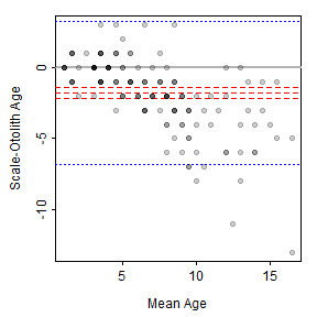
Figure 2: Bland-Altman plot for comparing scale to otolith age estimates of Lake Champlain Lake Whitefish. Thiw was constructed in parts.
My Critique of the Bland-Altman Plot for Age Comparisons
I like that Bland-Altman plots (relative to age bias plots) do not require that one of the variables be designated as the “reference” group. This may be more useful when comparing age estimates where one set of estimates is not clearly a priori considered to be more accurate (e.g., comparing readers with similar levels of experience).
However, I don’t like the following characteristics of (default) Bland-Altman plots.
- There may be considerable overlap of the plotted points because of the discrete nature of most age data. Various authors have dealt with this by adding a “petal” to the point for each overplotted point to make a so-called “sunflower plot” (Lehnert, 2015a) or using bubbles that are proportional to the number of overplotted points (McBride 2015). However, I find the “sunflowers” and “bubbles” to be distracting. I addressed this issue with transparent points above.
- The “agreement lines” are not particularly useful. They may be useful for identifying outliers, but an egregious outlier will likely stand out without these lines.
- The single confidence interval for the mean difference suggests that any bias between the sets of estimates is “constant” across the range of mean ages. This can be relaxed somewhat if the percentage difference is plotted on the y-axis. However, neither of these allows for more complex situations where the bias is nonlinear with age. For example, a common situation of little difference between the estimates at young ages, but increasing differences with increasing ages (e.g., Figure 1) is not well-represented by this single confidence interval.
A Modified Bland-Altman Plot for Age Comparisons
The third issue above has been addressed with some Bland-Altman plots by fitting a linear regression that describes the difference in age estimates as a function of mean age (Giarvina 2015). However, this only allows for a linear relationship, which may not represent or reveal more interesting nonlinear relationships. A generalized additive model (GAM) could be used to estimate a “smoothed” potentially nonlinear relationship between the differences in ages and the means of the ages.
A GAM may be fit in R with gam() from the mgcv package (Wood 2006). A thin-plate regression spline (Wood 2003) is used as the smoother by default when s() is used on the right-hand-side of the formula in gam(). The degree of smoothing is controlled by k= in s(). I have found (with minimal experience) that k=5 may be adequate for most age comparison situations (note that smaller values provide more smoothing, larger values provide less smoothing).
library(mgcv)
mod1 <- gam(diffSO~s(meanSO,k=5),data=WhitefishLC)
Summary of the model fit is seen by submitting the gam object to summary(). In this example, the approximate p-value for the smoother term suggests that there is a relationship between the differences and means.
summary(mod1)##
## Family: gaussian
## Link function: identity
##
## Formula:
## diffSO ~ s(meanSO, k = 5)
##
## Parametric coefficients:
## Estimate Std. Error t value Pr(>|t|)
## (Intercept) -1.7815 0.1525 -11.68 <2e-16
##
## Approximate significance of smooth terms:
## edf Ref.df F p-value
## s(meanSO) 3.438 3.827 33.53 <2e-16
##
## R-sq.(adj) = 0.461 Deviance explained = 47.4%
## GCV = 3.617 Scale est. = 3.5107 n = 151The smoother “line” with 95% confidence limits is added to the plot by first using the smoother to predict the differences in ages (along with the SE of those predictions) across the entire range of mean ages. Approximate confidence limits are then derived (using normal theory) from the predicted values and their SEs.
tmp <- seq(0,18,0.1)
pred1 <- data.frame(age=tmp,
                    predict(mod1,data.frame(meanSO=tmp),type="response",se=TRUE)) %>%
  mutate(LCI=fit-1.96*se.fit,UCI=fit+1.96*se.fit)
head(pred1)
## age fit se.fit LCI UCI
## 1 0.0 -0.2479616 0.7058686 -1.631464 1.135541
## 2 0.1 -0.2333355 0.6846088 -1.575169 1.108498
## 3 0.2 -0.2187095 0.6634582 -1.519088 1.081669
## 4 0.3 -0.2040835 0.6424276 -1.463241 1.055075
## 5 0.4 -0.1894574 0.6215291 -1.407654 1.028740
## 6 0.5 -0.1748314 0.6007766 -1.352354 1.002691The smoother “line” is then added to the plot with lines().
lines(fit~age,data=pred1,lwd=2,lty=2,col="red")The 95% intervals for the smoother line are added as lines with lines()
lines(LCI~age,data=pred1,lty=3,col="red")
lines(UCI~age,data=pred1,lty=3,col="red")
Alternatively, the 95% intervals for the smoother line may be added as a shaded region with polygon(). Note that rev() reverses the order of the elements in a vector and is a “trick” used to properly construct the boundaries of the polygon for plotting.
with(pred1,polygon(c(age,rev(age)),c(LCI,rev(UCI)),
                   border=NA,col=col2rgbt("red",1/10)))
Putting this all together results in the plot shown in Figure 3. These results suggest that there is little difference between scale and otolith age estimates up to a mean age estimate of approximately five, after which age estimates from scales are less than age estimates from otoliths, with the difference between the two generally increasing with increasing mean age.
plot(diffSO~meanSO,data=WhitefishLC,col="white",
     xlab="Mean Age",ylab="Scale-Otolith Age")
abline(h=0,lwd=2,col="gray70")
lines(fit~age,data=pred1,lwd=2,lty=2,col="red")
with(pred1,polygon(c(age,rev(age)),c(LCI,rev(UCI)),
                   border=NA,col=col2rgbt("red",1/10)))
points(diffSO~meanSO,data=WhitefishLC,pch=19,col=col2rgbt("black",1/5))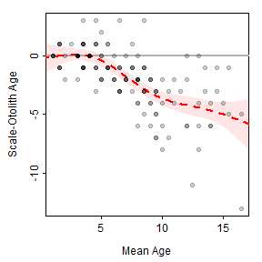
Figure 3: Scatterplot of the difference in scale and otolith age estimates versus the mean of the scale and otolith age estimates of Lake Champlain Lake Whitefish with a thin-plate regression spline smoother and 95% confidence band shown.
A similar plot is shown for the comparison of otolith age estimates between two readers in Figure 4. Also note (see below) that the smoother term is not significant for the between-reader comparison of otolith age estimates, which suggests no relationship between the differences in ages and the mean age. In addition, the intercept term is not significantly different from zero, which indicates that there is not a constant bias between the two readers.
##
## Family: gaussian
## Link function: identity
##
## Formula:
## diffOO ~ s(meanOO, k = 5)
##
## Parametric coefficients:
##             Estimate Std. Error t value Pr(>|t|)
## (Intercept)   0.0000     0.0611       0        1
##
## Approximate significance of smooth terms:
##           edf Ref.df     F p-value
## s(meanOO)   1      1 0.013   0.909
##
## R-sq.(adj) =  -0.00662   Deviance explained = 0.00881%
## GCV = 0.57128  Scale est. = 0.56371   n = 151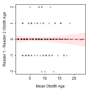
Figure 4: Scatterplot of the difference between otolith age estimates for two readers and the mean otolith age estimates of Lake Champlain Lake Whitefish with a thin-plate regression spline smoother and 95% confidence band shown.
Adding the GAM to the Age Bias Plot
In situations where one of the age estimates could be considered a priori to be more accurate, it seems to make more sense to put that age estimate on the x-axis rather than the mean between it and the less accurate estimate. In other words, return to the concept, though not the exact structure, of the age bias plot. The GAM smoother can also be added to this plot (Figures 5 and 6).
mod1a <- gam(diffSO~s(otolithC,k=15),data=WhitefishLC)
plot(diffSO~otolithC,data=WhitefishLC,col="white",
     xlab="Otolith Age",ylab="Scale - Otolith Age")
abline(h=0,lwd=2,col="gray70")
tmp <- seq(0,25,0.1)
pred1a <- data.frame(age=tmp,
                     predict(mod1a,data.frame(otolithC=tmp),type="response",se=TRUE)) %>%
  mutate(LCI=fit-1.96*se.fit,UCI=fit+1.96*se.fit)
lines(fit~age,data=pred1a,lwd=2,lty=2,col="red")
with(pred1a,polygon(c(age,rev(age)),c(LCI,rev(UCI)),
                   border=NA,col=col2rgbt("red",1/10)))
points(diffSO~otolithC,data=WhitefishLC,pch=19,col=col2rgbt("black",1/5))
Figure 5: Scatterplot of the difference in scale and otolith age estimates versus otolith age estimates of Lake Champlain Lake Whitefish with a thin-plate regression spline smoother and 95% confidence band shown.
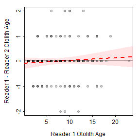
Figure 6: Scatterplot of the difference otolith age estimates for two readers and the otolith age estimates for the first reader of Lake Champlain Lake Whitefish with a thin-plate regression spline smoother and 95% confidence band shown.
Things To Do
If this all seems plausible then consider:
- Add histogram to right-side (show distribution of differences).
- Perhaps run McBride’s simulations through this.
References
-
Bland, J.M., and D.G. Altman. 1986. Statistical methods for assessing agreement between two methods of clinical measurement. Lancet i:307-317.
-
Giarvina, D. 2015. Understanding Bland Altman analysis. Biochemica Medica 24:141-151.
-
Lehnert, B. 2015a. BlandAltmanLeh Intro. Accessed on 18-Apr-17.
-
Lehnert, B. 2015b. BlandAltmanLeh: Plots (Slightly Extended) Bland-Altman Plots. R package version 0.3.1.
-
McBride, R.S. 2015. Diagnois of paired age agreement: a simulation of accuracy and precision effects. ICES Journal of Marine Science 72:2149-2167.
-
Wood, S.N. 2003. Thin-plate regression splines. Journal of the Royal Statistical Society (B) 65(1):95-114.
-
Wood, S.N. 2006. Generalized Additive Models: An Introduction with R. Chapman and Hall/CRC.
-
Ogle, D.H. 2015. Introductory Fisheries Analyses with R book. CRC Press.