Original Age Bias Plot
Campana et al. (1995) introduced the “age bias plot” to visually assess potential differences in paired age estimates (e.g., between two structures such as scales and otoliths, between two readers, or between one reader at two times). One set of age estimates serve as “reference” ages in the age bias plot. The reference ages are usually the age estimates thought to be most accurate (i.e., the most accurate structure, “best” reader), but could be from the first reading if two readings from the same reader are made. The reference estimates form the x-axis on the age-bias plot. The mean and 95% confidence interval for the nonreference age estimates computed at each value of the reference age estimates are plotted to form the age bias plot. A 1:1 line that represents agreement between the two age estimates is usually included. Confidence intervals that do not capture this “agreement line” suggest a difference in the two age estimates at that reference age. An example age bias plot is below.
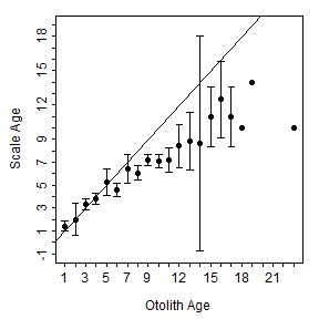
The age bias plot above was constructed with the code below. Briefly, the foundational calculations for the age bias plot are constructed with ageBias(), where the variable with the reference age estimates follows the tilde. The age bias plot is then constructed by submitting the ageBias() results to plot(). The col.CIsig=, pch.mean.sig=, sfrac=, lty.agree=, and col.agree= arguments are used here to modify default settings for these arguments so that the resultant age bias plot most closely resembles that described by Campana et al. (1995). These arguments are discussed further in the next section.
library(FSA)       # provides ageBias(), plot() and WhitefishLC
data(WhitefishLC)  # example data
ab1 <- ageBias(scaleC~otolithC,data=WhitefishLC,
               nref.lab="Scale Age",ref.lab="Otolith Age")
plot(ab1,col.CIsig="black",pch.mean.sig=19,sfrac=0.01,
         lty.agree=1,col.agree="black")
Making a “Cleaner” Age Bias Plot
I found the age bias plot to be useful for detecting systematic differences in estimated ages between two sets of readings, but I also found the plot to be “clunky” with some data sets. Thus, I modified the original design in several ways. The first set of changes were simply to make the plot “cleaner” and easier to interpret. Specific changes I made are described below.
- Used a 1-sample t-test to determine if mean nonreference age (i.e., y-axis) differed significantly from the reference age for each reference age (i.e., x-axis). In other words, for example, does the mean nonreference age at a reference age of 3 differ from 3? This test was repeated for each reference age and the resultant p-values were corrected for multiple comparisons. Reference ages for which a significant difference was detected were plotted by default with an open symbol and a different color. The symbol and color for the ages where a significant difference was detected are controlled by
col.CIsig=andpch.mean.sig=, respectively. - Confidence intervals for reference ages with small sample sizes can be very wide, which can cause poor scaling of the y-axis on the age bias plot. The
min.n.CI=argument inageBias()sets a sample size threshold for when confidence intervals are constructed. The default for this argument is 3 (i.e., a confidence interval will be constructed if the sample size is at least 3). - Made the agreement line a ligher gray and dashed so that it can be seen but it is less bold. The type and color of the agreement line are controlled by
lty.agree=andcol.agree=, respectively. - Removed the “caps” on the ends of the confidence intervals to reduce clutter. The length of the confidence interval ends are controlled by
sfrac=.
These modifications are the defaults settings in ageBias() and plot().
plot(ab1)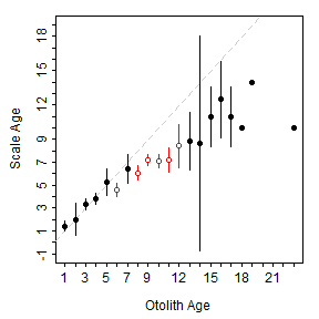
Plotting Differences on the Y-Axis
Muir et al. (2008) were the first (to my knowledge) to modify the age bias plot by using the difference between the reference ages and the mean nonreference ages on the y-axis. I modified this concept by first computing the difference between the nonreference and reference ages (nonreference-reference) for each individual and then computing the mean of those differences for each reference age. With this modification, the mean difference between nonreference and reference ages is plotted against the reference ages. The “agreement line” is now a horizontal line at 0 on this plot. This modified age bias plot is constructed by including difference=TRUE in ageBias().
plot(ab1,difference=TRUE)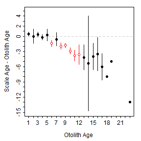
Showing Individual Variability
I often wanted to have a feel for the individual variabilty underlying the age bias plot. A faint gray line “behind” that stretches from the minimum to the maximum nonreference age for each reference age is plotted behind each confidence interval by including show.range=TRUE.
plot(ab1,difference=TRUE,show.range=TRUE)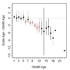
Alternatively, individual points (for paired age estimates) are included with show.pts=TRUE. There tends to be considerable overplotting of individual points because of the discrete nature of age data. To make individual points more obvious, a transparent color can be used for each point such that more overlapping points will appear darker. The level of transparency is controlled by including an integer in transparency=, with values further from 1 being more transparent.
plot(ab1,difference=TRUE,show.pts=TRUE)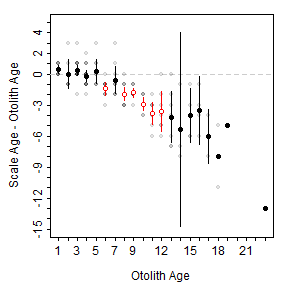
Illustrating Sample Size
I also often want to know the sample sizes underlying the age bias plot. In particular, it is useful to know the number of nonreference age estimates that contributed to each mean and confidence interval. My first attempt at providing this information on the plot was to simply print the values on the plot (usually above the plot or just above the x-axis). The sample sizee can be added to the plot with show.n=TRUE.
plot(ab1,difference=TRUE,show.n=TRUE)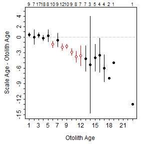
These values, however, are often either so crowded or so small as to be of little utility. Recently I added the ability to add marginal histograms to the age bias plot. For example, a histogram of the sample sizes in the previous plot can be added by using xHist=TRUE.
plot(ab1,difference=TRUE,xHist=TRUE)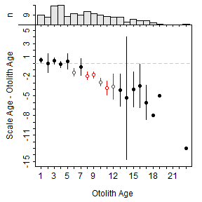
The same can be added for the nonreference ages with yHist=TRUE. This plot has the added advantage of showing the distribution of differences in age estimates, with the bar at a difference of zero representing the amount of perfect agreement between the sets of age estimates.
plot(ab1,difference=TRUE,xHist=TRUE,yHist=TRUE)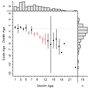
The same plot, but with a marginal histogram of the nonreference age estimates rather than the difference in age estimates is also nice for showing the age distributions for both sets of age estimates.
plot(ab1,xHist=TRUE,yHist=TRUE)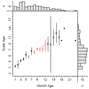
My Preference
My current preference for an age bias plot is to use the differences in age estimates, plot both marginal histograms (I like to see the distributions for the reference age estimates and the difference in age estimates), to show the individual points, and to remove the coloring for significantly different ages (though, I like the difference in symbols). An example of my preferred plot is shown below for ages estimated from fin rays for two readers.
abOO <- ageBias(finray2~finray1,data=WhitefishLC,
                nref.lab="Reader 2 Age",ref.lab="Reader 1 Age")
plot(abOO,difference=TRUE,xHist=TRUE,yHist=TRUE,
     col.CIsig="black",show.pts=TRUE)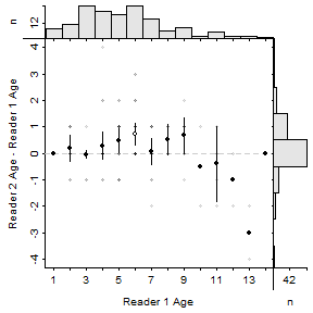
A Couple of Details
The modifications of the age bias plot described here are available in the development version of the FSA package, but not yet in the stable CRAN version. They will appear in v0.8.13.
Several of the options illustrated above can be modified with other arguments to ageBias(). See the documentation for further details (i.e., use ?ageBias).
The plots in this post used the following modifications of the default base graphing parameters. These changes make narrower margins around the plot, move the axis labels closer to the axes, and reduce the size of the axis tick marks relative to the default values.
par(mar=c(3.5,3.5,1,1),mgp=c(2.1,0.4,0),tcl=-0.2)Final Thoughts
Please let me know what you think about my preferred age bias plot. In general, I like it and feel that it is more informative than other age bias plots. However, I am not quite satisfied with how I separated the “axes” labels for the main age bias plot and the marginal histograms. It looks “hacky” to me.
In addition, I thought about putting a horizontal line on the top marginal histogram that shows the cutoff for when a confidence interval is calculated. I also thought about highlighting the “zero bar” in the right marginal histogram when difference=TRUE to further highlight the amount of agreement between the age estimates. In the end, I did not make these modifications because they would seem to add clutter or draw too much attention.
Let me know if you have other ideas for how these age bias plots could be modified to be more informative.
UPDATES 1 (14-Apr-17)
One Twitter follower said: “I think open and closed symbols say all that is needed about 95% confidence limits. Just show mean, range, and 1:1 line.” It took some modifications to do this, but there is now a show.CI= argument that will turn off the confidence intervals when set to FALSE. In addition, the user can now control the color and line width of the range bars with col.range= and lwd.range=. I decided not to color code the mean symbol or range bar for significance because I felt that that would be misleading (i.e., the user would view the “interval” as a confidence interval rather than a range interval). However, the mean symbol still represents a significant difference. Below is one example of this type of plot (don’t forget to ask for the range bars with show.range=TRUE). This might become my preference.
plot(ab1,show.CI=FALSE,show.range=TRUE,col.range="black",
     difference=TRUE,xHist=TRUE,yHist=TRUE)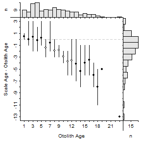
Another Twitter follower said: “Add border to outside of plot? Fill histogram bars or outline with same color as mean and CI intervals?” I tried the second request but did not like the look. Even that simple change in color or outlining seemed to clutter the plot, especially as it only reinforced the ages where a difference was detected. The first request can be accomplished by using box() following construction of the age bias plot. Just make sure to include which="figure".
plot(ab1,show.CI=FALSE,show.range=TRUE,col.range="black",
     difference=TRUE,xHist=TRUE,yHist=TRUE)
box(which="figure")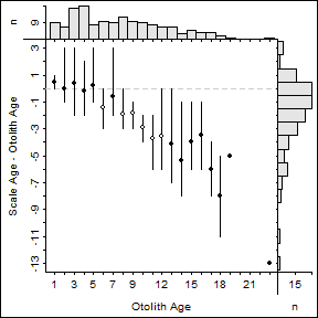
References
-
Campana, S.E., M.C. Annand, and J.I. McMillan. 1995. Graphical and statistical methods for determining the consistency of age determinations. Transactions of the American Fisheries Society 124:131-138.
-
Muir, A.M., M.P. Ebener, J.X. He, and J.E. Johnson. 2008. A comparison of the scale and otolith methods of age estimation for lake whitefish in Lake Huron. North American Journal of Fisheries Management 28:625-635.
-
Ogle, D.H. 2015. Introductory Fisheries Analyses with R book. CRC Press.