Background
This is the same data set introduced here (which included code for accessing the data). If you did those exercises, then you can use the same data and package (e.g., tidyverse) loading portion of your script. If you did not do those exercises then please see that page for the instructions on loading the data.
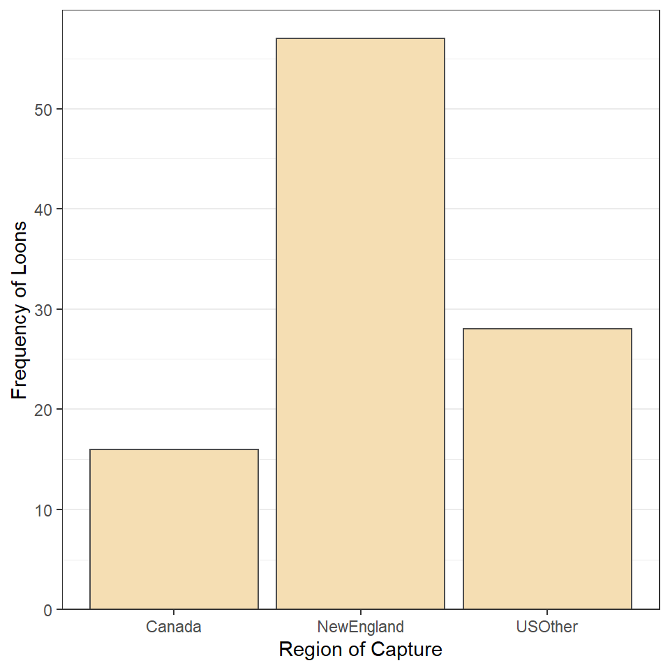
Region 1
Construct ggplot2 code to match the graph below (as closely as you can).
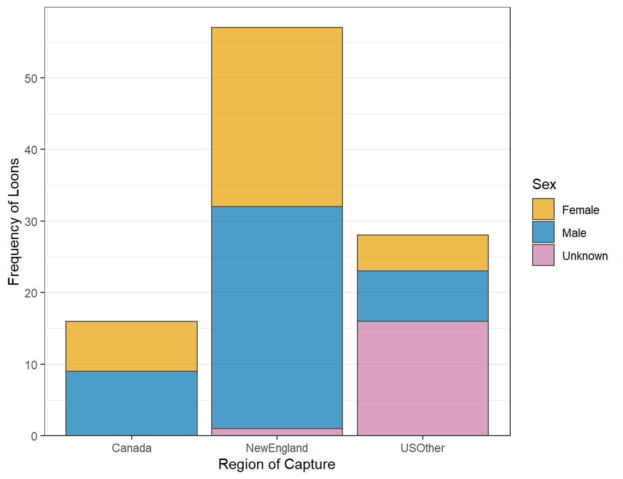
Region and Sex 1
Construct ggplot2 code to match the graph below (as closely as you can … you don’t have to match my colors, but do use other than the default colors).
Region and Sex 2
Construct ggplot2 code to match the graph below (as closely as you can).
Region 2
Recreate the plot in the “Region 1” section but using summarized data (i.e., summarize the data first and then use that to construct the plot).
Region and Sex 3
Recreate the plot in “Region and Sex 2” using summarized data. [Hint: you will be asked to use percentages in the next section, so you should prepare your summaries here for that.]
## `summarise()` has grouped output by 'region'. You can override using the `.groups` argument.
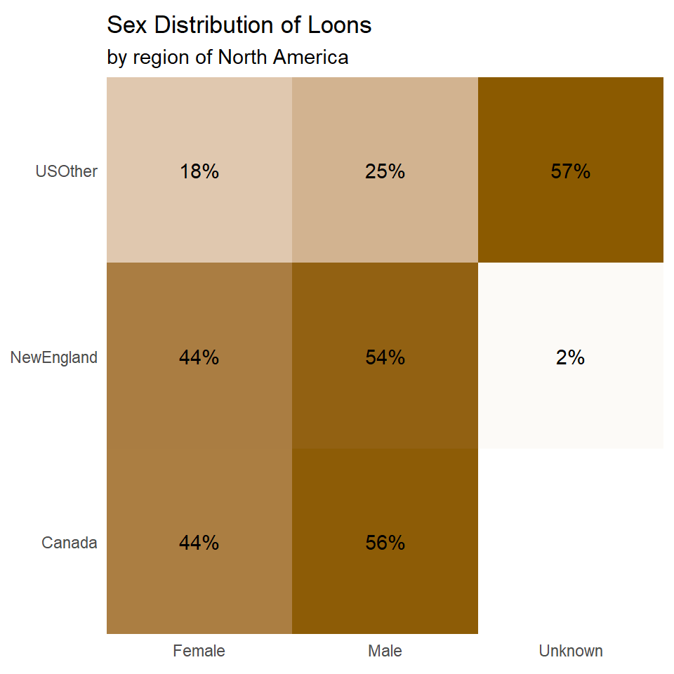
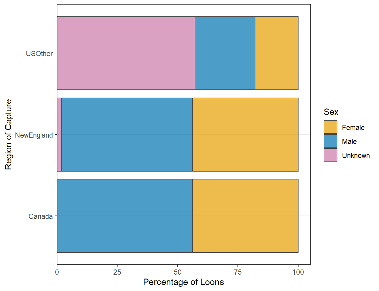
Region and Sex 4
Construct ggplot2 code to match the graph below (as closely as you can).
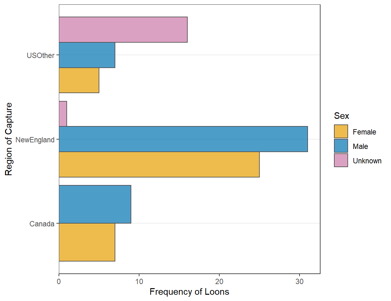
Region and Sex 5
Construct ggplot2 code to match the graph below (as closely as you can).