Example 1
Litter depth is very slightly left-skewed with no obvious outliers (see histogram below). The center as measured by the mean is 2.222 cm and the dispersion as measured by the standard deviation is 0.591 cm (see summary statistics below). I chose to use the mean and standard deviation as measures of center and dispersion because the shape was not strongly skewed and there were no outliers.
- These results are for a quantitative variable (litter depth); thus, you must describe shape, outliers, center, and dispersion of the distribution. In addition, you must explain why you chose to use either the mean and standard deviation or the median and IQR as your measures of center and dispersion (see last sentence).
- For the histogram, make sure you choose a binwidth= that results in roughly 8-10 bars.
- Make sure to completely label the x- and y-axes.
R Code and Results
> firedf <- read.csv("http://derekogle.com/NCMTH107/modules/CE/1_CE_KEYS/Fire.csv")
> str(firedf)
'data.frame': 48 obs. of 6 variables:
$ sttype: chr "d" "d" "d" "d" ...
$ tslf : chr "0-100" "0-100" "0-100" "0-100" ...
$ tdw : num 27.7 22.6 26.2 43.6 27 41.2 46.6 27.6 89.2 39.6 ...
$ litdep: num 0.62 1.33 1.46 1.92 2.9 2.13 2.33 1.46 2.25 3.08 ...
$ fuel1h: num 0.06 0.07 0.08 0.05 0.06 0.15 0.02 0.04 0.04 0.3 ...
$ tltd : int 2382 1978 1234 1478 1901 1111 748 1055 3422 1045 ...> ggplot(data=firedf,mapping=aes(x=litdep)) +
geom_histogram(binwidth=0.25,boundary=0,color="black",fill="lightgray") +
scale_y_continuous(expand=expansion(mult=c(0,0.05))) +
labs(x="Litter Depth (cm)",y="Frequency of Stands") +
theme_NCStats()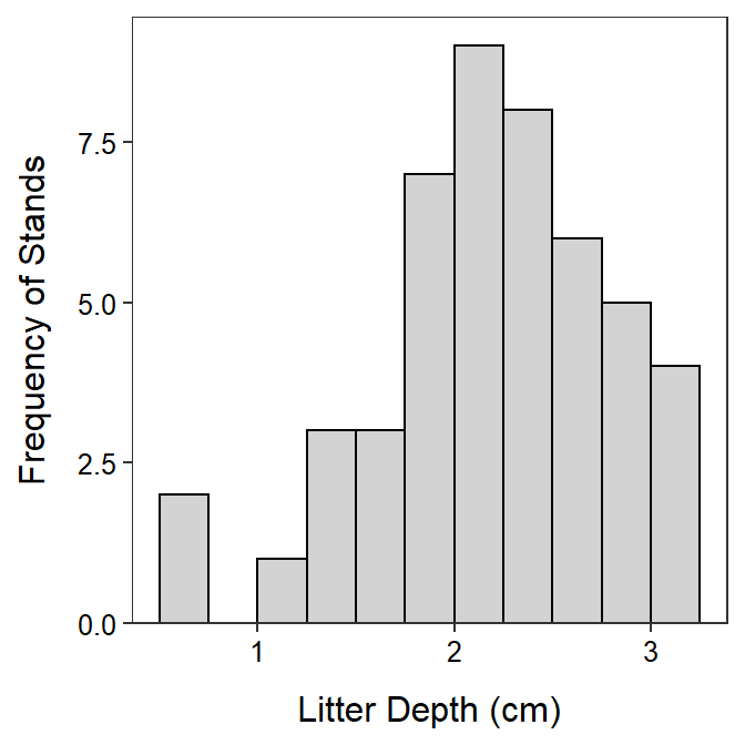
> Summarize(~litdep,data=firedf,digits=3) n mean sd min Q1 median Q3 max
48.000 2.222 0.591 0.620 1.915 2.190 2.710 3.130 Example 2
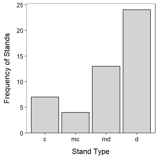
Most of the stands tend to be deciduous (50.0%) or mixed deciduous (27.1%; see bar chart and percentage table below).
- These results are for a categorical variable (stand type); thus, you must describe the most outstanding result or results in the tables or bar chart.
- This variable was ordinal so I made sure to appropriately order the levels as R will default to an alphabetical order.
- Make sure to completely label the x- and y-axes.
R Code and Results
> firedf$sttype <- factor(firedf$sttype,levels=c("c","mc","md","d"))
>
> ( tbl <- xtabs(~sttype,data=firedf) )
sttype
c mc md d
7 4 13 24 > percTable(tbl)sttype
c mc md d
14.6 8.3 27.1 50.0 > ggplot(data=firedf,mapping=aes(x=sttype)) +
geom_bar(color="black",fill="lightgray") +
scale_y_continuous(expand=expansion(mult=c(0,0.05))) +
labs(x="Stand Type",y="Frequency of Stands") +
theme_NCStats()