State and No Good Deer Hunting
I have a colleague/friend who prefers Excel over ggplot graphs (yes, this has strained our friendship). His main issues are that he wants the following:
- A dark, but not black, background.
- Light, but not white, text.
- More “muted” and dashed gridlines.
- Axis labels that are slightly larger.
- Axis titles that are slighly larger than the axis labels and bold-faced.
- The ability to put the legend inside the plot (if it will fit).
- The ability to add notes (if appropriate).
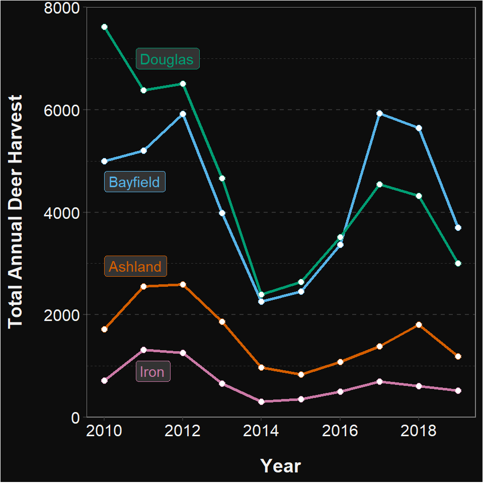
To demonstrate that this is all possible in ggplot2, I created the plot below (similar to what you did here). Construct ggplot2 code to recreate this plot.
Create New Theme
Create a new ggplot theme called theme_excel_dark that reflects my friend’s preferences (start with theme_bw()). Hint: don’t include the parts that control the legend position … that will be specific to each plot and should not be part of this new theme.
Total Annual Harvest by County and Year
Apply the theme you just created to the plot you made in “Total Annual Harvest by County and Year” on this page. Note that you may want to tweak your colors from the plot you made on the previous homework.